Mailbag: Some Radical Jersey Concepts
 Friday · Aug 10 · 2007 | 4:05 PM PDT
  8 Comments
 Um... it's a slow day so I apologize in advance, but this is pretty much all I have to offer. Forgive the image and design quality, but I was emailed this fan art. I'll try to find some good stuff before I call it a night.
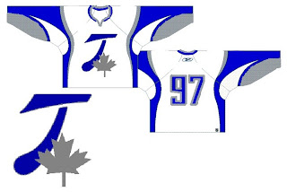
For those who haven't deduced it, this is a radical concept for the Toroto Maple Leafs. It's interesting. Can't think of much to say beyond that. It looks like it makes use of the leaf on the Canadian flag in place of the team's logo. I like the extra silver, but on the whole, what do you guys think?
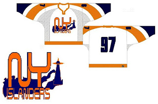
The next one is another radical concept for the New York Islanders.
Many of the Isles concepts we've seen have incorporated a lighthouse in some way and I'm a big fan of that. I don't think we need to lose the classic crest from the jersey, but could it hurt to add a secondary on the shoulder?
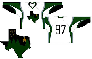
This next design is pretty far out as well.
If you hadn't guessed, that would be a concept for the Dallas Stars. You've got a starry night scene set in the forest inside the outline of the state of Texas. It's a very interesting concept but Texas doesn't seem to me like a forest state. Those trees make this feel more like the Minnesota Wild logo.
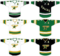
 Why don't we take a look at less-radical idea. I kind of like the notion of the Stars going with "DALLAS" written across the crest on the road jersey. These are backwards if that's the case, but it's interesting to look at nonetheless. What do you think of the green jersey in the middle? Too North Stars or should Dallas adopt something in that vein veering from the black?
Anyway, hopefully I'll have more to offer later. I know this isn't spectacular artwork, but still worthy of looking at I thought.


Reader Comments (8)
I'm going to have nightmares!
I do what I can.
i like the leafs jerseys actually. the islanders ones creep me out. the stars are ok.
Those Islanders jerseys are repaints of the San Jose jerseys
Nice jersey design concepts, horrible logos.
2 of the 3 are ripped from the sabres jerseys
wuts wrong with jerseys he stars have now there sick
I don't like all three of those jersey concepts. The Islanders should simply leave their current jerseys alone (except change their alternate to the retro royal blue one we saw late last season, but with white nameplate and numbers).