NHL Tournament of Logos

Entries in mailbag (17)

Saturday
Nov102007

Mailbag: Canucks Logo

I got an email this morning that really made me think.

Hey, love your website,
Do you think that the canucks have a good logo?


That question is so simple yet the answer is so complicated.

Whether you consider the logo to be the orca alone or with the city name arched above it, the long and short of it is I don't really have an answer.

From a personal standpoint, while I do think it is a strong logo, at the same time I feel it could be so much better and so much more representative of the city and the team name.

Having said that, I think the person asking this question would be better served by getting a response from the readership here at NHLToL. For the most part, you guys know your stuff and have very strong opinions. I think they should be heard now.

Let the debate begin!

Friday
Nov022007

Mailbag: Sens Replace Sweaters

Things just keep getting more and more interesting with these Rbk EDGE jerseys. I posted some info last week about the possibility Reebok would be replacing the new "hi-tech" fabric with the old stuff. Here's an email I received earlier.

Hey Chris,

Just thought I’d pass this on. Today in the Ottawa Citizen, it had a brief clipping about the Senators-Thrashers game last night. The Sens wore ‘modified’ versions of the new jerseys and are the first to do so. They look the same, but they did look baggier, or looser when I watched the game last evening.

I still wished they had put horizontal stripes on the bottom of the sleeves and jersey. I loved the contrasting number they had on the white jersey of last year (white jersey had white numbers on the sleeves, red jersey had red numbers on sleeves against white material) That’s just me. But these new ones are starting to grow on me.

I agree with you, the Sens are a black team first, the red was adopted later. I think its time for BACK IN BLACK!

Nevill

First of all, partly I just wanted to show that someone actually agreed with me on the black thing. Seriously, the Sens were black from the beginning. "Be Red" is a new-fangled thing — like the Rbk EDGE jerseys.

Here's a pullquote from that article in the Citizen.

November 2, 2007

Sweat Surrender

Ken Warren
The Ottawa Citizen

The Senators last night wore modified Reebok game sweaters, becoming the first NHL team to wear the new models. Countless NHL players have complained that the overly hyped Reebok re-design, which included a moisture-repelling substance, was a disaster.

Turns out that players' sweat was dripping off the sweaters into the players' gloves, socks and skates, making them heavier than before — the polar opposite of what was intended. Egg is now dripping off the faces of the sweater designers, and all the NHL and Reebok officials who promoted the "uniform systems" in the first place.

Raise your hand if you saw all this coming.

This failure by Reebok has caused me to realize something depressing. More and more I'm losing faith in the things that I love. First, the hockey players get locked out and lose an entire season in 2005. Now, as a lover of scripted television — my shows are Lost, 24, The Office, and now Pushing Daisies — the writers in Hollywood are striking. Hopefully they get their issues resolved quicker than the hockey folks did.

Anyway, in the meantime I have my Wii and Super Mario Galaxy will arrive at my door in 10 days. All is well.

Sunday
Sep302007

Mailbag: For The Habs' Shoulders

I got an interesting email the other day with a new concept logo for the Montreal Canadiens. It wouldn't replace the primary, but rather serve as a secondary.

I don't think it's a necessary addition to the Habs' look, but I still like it a lot on its own merits. The designer, Gary, had this to say about it in his email to me.

There's two motivations behind it. One is political, the fleur de lis within the maple leaf clearly shows Quebec as a part of Canada, and not a seperate entity. However, using it as the base of the maple leaf is symbolic of the fact that the true Canadian identity requires a strong Quebec. The other reason is to honour Quebecs former NHL team, the Nordique, who proudly displayed the fleur de lis on their jerseys. Despite the rivalry between the Nords and Habs, NHL in Quebec City was great for the province and country.

I've had the idea for a long time but never tried it out. Your blog/website gave me the motivation to give it a try today while I should have been working.

We appreciate his work and he even went the extra mile to show us how it might look on a couple of jerseys.

I have to say, I don't hate it and it goes rather well with the logo and uniform. My only problem is that when I look at it all I see is Nordiques. And I'm pretty sure they don't exist anymore.

So what do you guys think? Love it? Hate it? Have any suggestions for improving it? Comment away.

Saturday
Sep292007

Mailbag: New Canucks Logo Looks Familiar

This morning I woke up to find one of the funniest emails I've received since starting this blog.

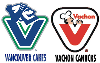
To set things up for you, one of the sites I frequent is Chris Creamers SportsLogos.net. It's an excellent resource for a blog like mine. When the Vancouver Canucks unveiled their new uniforms last month, a bunch of alternate/secondary logos appeared on that site — none of which I saw in any official NHL/Canucks capacity, however.

Anyway, among them was a logo that I personally thought could serve amazing well as a primary mark for the club. This is it.

Now the email.

Hey Chris!

Is that really an official secondary logo? If so, I've attached this! You may find it funny!

In Canada, we have these things that are like Hostess Cakes in the States.... Vachon Cakes! They're very popular.... and tasty! And I've heard that ol' goalie Rogie Vachon is a close relative to the family that started the company!

I knew I had seen the Vancouver 'Johnny Canuck' logo somewhere before..... hmmmm! I mean, mmmmmm!

So what do you make of that? I just thought it was very funny and felt it was worth sharing.

Wednesday
Sep262007

Mailbag: Silly Bolts Concepts

It occurs to me I haven't written a Lightning posted in a while — six days to be precise. It's all right though because some folks have been creating some crazy Tampa Bay concept art. These were emailed to me this past week and they're worthy of the Freak Out series, but I just could bear to wait any longer to post them.

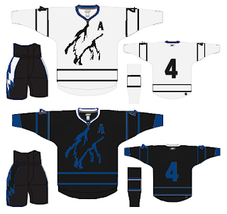
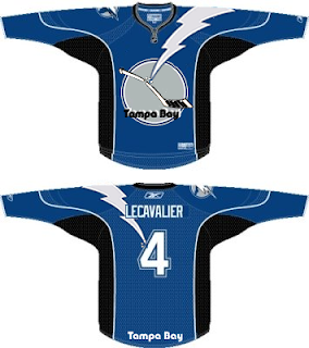
This first one is a rather simple concept. The team is called the Lightning. So let's put some lightning on the jersey.

I wasn't amused. More like horrified. But it was a good effort. Though I've never seen black or blue lightning bolts in my life. Perhaps 23 years in Florida isn't enough.

Then, along the lines of sharks and panthers biting through hockey sticks comes this idea.

What worse is that this was stolen from my own design — the only one I've ever made for this site. It's frightening, really.

By the way, I hope you all understand I'm not trying to be mean. It's just a team that's close to my heart. Anyway, that's all I got. If you've come up with anything or seen anything that hasn't been posted already, please send it along. I'd love to see it.

Friday
Aug312007

Mailbag: Retailers Talk Leafs

I've gotten about a dozen emails with a link to yesterday's post by Howard Berger of HockeyBuzz.com. The post is about speculation on the new Toronto Maple Leafs Rbk EDGE uniforms. By all means, it's worth a quick read. But I'll sum up here.

The Leafs will stay pretty much the same. While the design of the jersey will be slightly altered, the club will not tinker with its blue and white color scheme. Nor will the Leafs dip into their last Stanley Cup dynasty for the uniform's primary logo. It will remain as it's been since Harold Ballard re-worked the crest in 1970. The nine-point emblem (with "TORONTO MAPLE LEAFS" printed in a straight-line font) will not be replaced by the more stylish "stem" (or 35-point) logo of the 1960s ("TORONTO" being displayed in a dome-like curvature) — a time when the Maple Leafs were frequently winning championships. The stem logo had been re-introduced on the club's third jersey of recent years: the predominantly white uniform with blue shoulder piping that was a virtual copy of the jersey the Leafs wore in road games from 1963-64 to the end of the 1966-67 regular season.
He doesn't specify a source, but I'm led to believe it's a loose-lipped retailer with the scoop. Today, he added an update quoting another store owner.


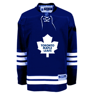
"Exact same shirt as last year, minus, TML shoulder patches, bottom stripes are gone, (sleeves stripes remain). Silver twill is gone. Number font is the same as last year, block style, basically Marlies lettering — blue, white blue, and white blue white. Names remain one colour as per last year. Very, very plain."

For a visual aid to what we're talking about here, Jeff writes in: "From what I heard from a store owner, this is what the jersey should look like..."

I should also point out that the unveiling date of September 13 I have in the sidebar countdown comes from a reader citing a retail source. It all remains to be seen however and the speculation shall continue until we have official word from the Leafs.

Tuesday
Aug212007

Mailbag: In Need Of Flyers Rumors

I got an email today from a Philadelphia Flyers fan, eager to obtain information on the new Rbk EDGE uniforms.

Chris,

Can you please help us Philadelphia Flyers fans out there. We're voted the best fans in the NHL country, yet we have to wait forever to see and learn anything about our jerseys. We all want Orange, but the rumors are black. Can you give us some much needed information to tide us over till September? Thank you!

Adam

I don't know what makes you the "best fans" necessarily, but I'll leave that alone. I just wish I had some hard facts for you, Adam. Unfortunately, there's nothing new available. Based on the alleged Simon Gagne leak, the home jerseys will likely be black. Sorry.

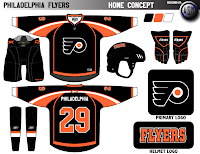
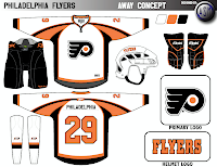
But since I can't offer any real information, I can at least offer some fan-made concept designs for you to peruse at your leisure to tide you over. So let's get to that.

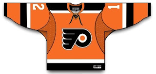
There's some orange for you. Loads of orange. But wait, there's more.


I think that's sort of a neat concept. I haven't really seen any earth-shattering concept art for the Flyers, though, which surprises me. I guess you guys like things the way they are. Not that you shouldn't. It's a nice uniform.

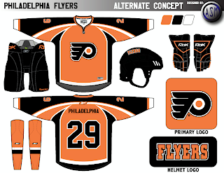
I had some other fan work submitted to me. This one has a unique design. Interesting striping pattern.

Anyway, like I said, I wish I had more to offer you guys. As soon as new information becomes available, I'll have it right here. Any thoughts on these designs?

Friday
Aug172007

Mailbag: You Can Stop Sending These Now

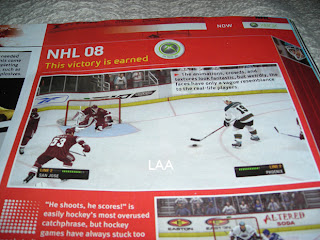
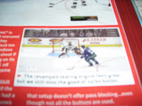
All right, I've said I don't want to get bogged down in the whole video game screen grab thing, but I think popular demand almost requires this one. I've gotten about a dozen emails in the last 24 hours with the following images attached or linked.

From what I've been told, what you're seeing in these pictures is a page from the official Xbox magazine — a yet-to-be released issue I'm assuming. Apparently, the picture above shows a game between the Coyotes and Sharks (a completely new San Jose design we've yet to be treated to officially) in EA Sports' NHL 08. The picture you see here to the left, although blurry, supposedly shows the Oilers and Canucks.

I can't speak to the veracity of these pictures nor really anything else with regard to them. But I just wanted to post them in the hopes that my awesome readers would stop sending me them.

Once again, I don't mind you guys sending in screen grabs from video games, but don't expect me to post them too often. If we're going to see official new jerseys, I'd prefer photos. Thanks everyone!

Monday
Aug132007

Mailbag: New Sens Logo On CIPO Site

Got some interesting emails from a reader regarding the new look of the Ottawa Senators. He emailed me links to pages on the Canadian Intellectual Property Office web site showing what appears to be the new primary and secondary logos of the Sens.

According to the CIPO, this is the primary logo:

It matches the "leaks" we've been seeing all along. You can link to the CIPO's page directly, here.

And apparently, this is the secondary logo:

This is the first time we're ever seeing this logo. Like I said, the guy who emailed me says this will be the secondary mark. Expect it to be unveiled along with the new primary and Rbk EDGE jerseys on August 22 at Scotiabank Place.

You can link to the page directly, here.

Sorry they're only black and white, but this is what I have to offer. What do you guys think?

By the way, huge thanks to Greg on the awesome find!

UPDATE (4:36 PM): In case anyone was wondering, here's how these two logos might look with a little color splashed on.

Friday
Aug102007

Mailbag: Some Radical Jersey Concepts

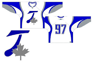
Um... it's a slow day so I apologize in advance, but this is pretty much all I have to offer. Forgive the image and design quality, but I was emailed this fan art. I'll try to find some good stuff before I call it a night.

For those who haven't deduced it, this is a radical concept for the Toroto Maple Leafs. It's interesting. Can't think of much to say beyond that. It looks like it makes use of the leaf on the Canadian flag in place of the team's logo. I like the extra silver, but on the whole, what do you guys think?

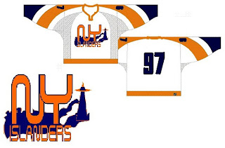
The next one is another radical concept for the New York Islanders.

Many of the Isles concepts we've seen have incorporated a lighthouse in some way and I'm a big fan of that. I don't think we need to lose the classic crest from the jersey, but could it hurt to add a secondary on the shoulder?

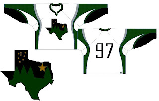
This next design is pretty far out as well.

If you hadn't guessed, that would be a concept for the Dallas Stars. You've got a starry night scene set in the forest inside the outline of the state of Texas. It's a very interesting concept but Texas doesn't seem to me like a forest state. Those trees make this feel more like the Minnesota Wild logo.

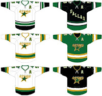
Why don't we take a look at less-radical idea. I kind of like the notion of the Stars going with "DALLAS" written across the crest on the road jersey. These are backwards if that's the case, but it's interesting to look at nonetheless. What do you think of the green jersey in the middle? Too North Stars or should Dallas adopt something in that vein veering from the black?

Anyway, hopefully I'll have more to offer later. I know this isn't spectacular artwork, but still worthy of looking at I thought.