Wild, Lightning Fan Art
 Friday · Aug 10 · 2007 | 4:27 PM PDT
  2 Comments
 Like I said, it's a light day. Sorry about that. Things are going to get interesting this weekend though. I hope everybody drops in to start voting on Sunday. I need you all to decide which team has the best logo. Not me.
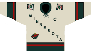
Here's a different sort of design for the Minnesota Wild.
It sort of steals the whole text across the chest thing from the Avalanche — who stole it from the Rangers. I'm not sure how Wild fans will feel. Probably won't be "wild" about it. Get it? Okay, stop. That's enough. Kind of like the "State of Hockey" logo on the shoulder. Thoughts?
 This design is a reimagining of this one I posted the other day. It's kind of funny. Not to worry though. Don't expect anything like this to ever seen the light of day.
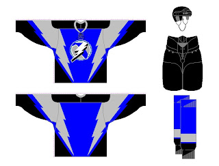
But wait, I have more. I was sent a few designs for the Tampa Bay Lightning. See the following image.
That blue might not be quite the right shade, but I've often wondered what the Bolts would look like in blue. The infamous third jerseys from the late '90s were mostly blue and I sort of liked those. As for the laced collar, I'm not sure that would work well for the Lightning.
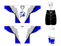
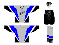
There were also these two designs. A lot of people have commented that a gray third might be the way to go for the Bolts. I'm not so sure, but I guess it would depend on the overall design so I don't really know how I'd feel about it.
How do you all feel about these designs? You think something along these lines would be the way to go for these teams or should we let it be handled another way?


Reader Comments (2)
I'm not "wild" about those wild jerseys. They're to boring, and dull for me. I like the Wild's third jersey that is supposedly suppose to be our new home jersey. although I don't like the cirle logo, I like the giant bear head with all the wilderness inside of it.
That Lightning concept is a blatant http://stocktonfanattic.com/shop/pc/viewPrd.asp?idproduct=2" REL="nofollow">Stockton Thunder ripoff.