Time To Get Your Blackhawks On
 Friday · Aug 10 · 2007 | 4:35 PM PDT
  9 Comments
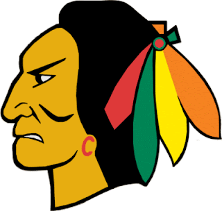
 All right, if you've been reading my nonsense in the tournament matches, I have good news and bad news. The good news is, today was the last day of that. Reader voting starts Sunday. The bad news is somebody else, it turns out, thinks the Chicago Blackhawks could use a logo upgrade. (See, I'm not the only person who doesn't think it's the best in all of sports.)
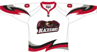
Now I'm not saying this design is totally the way to go. I think it's a good start, but also that it could use a little work. Sneak a peek.
Don't freak out! It's just fan-created concept art. It's not a real 'Hawks logo by any stretch.
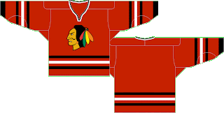
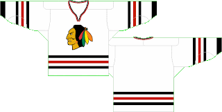
But that, I'm a little more impressed by. I still think a team's logo should be dominated by its primary colors (here: red, black and white), but this wouldn't be all bad. Well, at least as far as I'm concerned, it wouldn't. What do you guys think? Should I take the advice of John Tortorella and shut my yap on this subject or could we have something here? While you consider, check out these jersey designs.
Oh, and just to freak you out a bit, somebody emailed me this concept.
Now lay it on me. I can take it.


Reader Comments (9)
....the apocalypse is here.
I agree that the Blackhawks' logo is SLIGHTLY overrated, but it's still a mighty snazzy crest. I definitely wouldn't want to replace it with that...thing.
I wouldn't mind seeing them bring back their logo from the 40's and 50's (back when they were known as the "Black Hawks")as an alternate or something:
http://img.search.com/thumb/2/20/Chicagoblackhawkslogo40s.gif/200px-Chicagoblackhawkslogo40s.gif
I still think it's funny that in 2007 there are pro sports teams that have indian heads as its logo. Imagine if that was the head of a black man.
That being said .. I still like the logo on the jersey the way it is. I know I know ..Im a hypocrite
Thought I would puke.
There is nothing derogatory with the Blackhawks logo. Its not the same as the redskins and it is representative, depending on what story you believe, of a real person. Maybe its my white man ignorance, but i believe I would be honoured if my ancestors were worthy of being chosen as a name of a team as long as it was respectful of the culture and its people. I understand Natives not wanting to be associated with the idea they were all warriors, but there is a lot of honour in their culture and I think that would be something a team would want to be associated with. Names like the redskins or redmen are insulting, the Blackhawks is classy. As for putting other races on a logo. Notre Dame calls themselves the fighting irish. Are we to assume that all irish are fighters? I think teams like to be associated with leaders and that's what the blackhawk logo represents. Leadership. Too bad the organization is not as good as its logo.
I'm a Habs fan and would never want to see the Blackhawks logo modernized for those among you who lack respect for tradition and the NHL's rich hockey loving history (e.g. Gary Bettman). The habs and Blackhawks logos are classics from all sports, celebrate them.
Also, the Vikings (their secondary logo on their jerseys) and the Pats use "white" men as part of their logos. Why is that OK? I think as long as the logo is tastefully done and there's a history to the name, there shouldn't be any problems. Just my two cents.
The Blackhawks should not change their logo one iota. That should be left alone.
this would be a great jersey for the blackhawks