A Few Ideas For Bolts
 Wednesday · Aug 15 · 2007 | 2:20 PM PDT
  5 Comments
 As is probably more than painfully clear, I am a huge Tampa Bay Lightning fan. So when artwork for my Bolts gets submitted, naturally I'm more than eager to post it. First off, as a reminder, this is allegedly the Lightning's new logo.
Anyway, today I have lots to share. We'll start off with the cream of the crop.
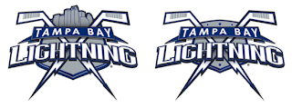
This pair of Lightning logos was designed by a local advertising firm, apparently. I was an overall fan until my girlfriend pointed out that the hockey sticks look more like golf clubs. Now that's all I can see. But if the sticks could look more like sticks, I think this would make for a very strong shoulder patch. Not a great primary, but definitely an awesome secondary. I like the skyline in the one on the left.
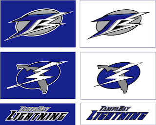
Moving along, though. Another designer emailed me some ideas for a new Lightning logo.
Everything there seems like it's about to fall over. I'm not sure why it all needs to lean so far to the right that way. I also can't speak very highly of the secondary mark, which appears to be drawn by hand. I applaud the effort in trying to make the "B" in "TB" look like a lightning bolt, but I don't think it's working out.
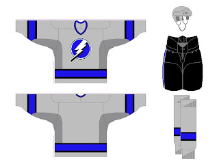
And finally, another fan designer sent in these concepts. How about a Lightning jersey in gray?
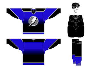
Same artist also came up with a design borrowed from the Vancouver Canucks' previous third jersey. Have a look at that one.
Any other Lightning fans out there? What do you think of these ideas? Anything worth considering in here or should we tie it all to a kite in a thunderstorm?


Reader Comments (5)
the top concepts look like golf clubs not hockey sticks.
I think they would look less like golf clubs and more like hockey sticks if the blades were down. I'm a fan of the current logo. It's simple and elegent. The grey and blue gradiant concepts looked cool.
im not impressed with the 2nd drawings of the lightning's logo. ive already posted my criticisms about the artists techniques on chris creamers sportslogos forum. to me, the bolt doesn't really look like a bolt and the T is too top heavy. if this was supposed to be an improvement, it is more of a downgrade.
As a Lightning fan myself, I personally have not seen anything better then the supposed "official" new logo. As far as I'm concerned it is the best one out there.
I love the concept drawing of the skyline and hockey sticks turning into lightning bolts. I think it would make a terrific shoulder patch logo and while I'm not overly crazy about too much text in a logo, I think it makes a great primary logo too.
The Lightning could do a lot worse than switching ot this concept. In fact, they already have. Anyone who thinks the current Lightning logo is superior to that needs to have their heads examined. The Bolts have had the most amateurish logo and jersey since their inception.