Getting All Conceptual On Logos
 Friday · Aug 17 · 2007 | 11:55 AM PDT
  14 Comments
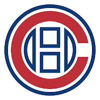
 One of my favorite things is seeing the ideas people have come up with for new team logos. I always like to start off with the most outrageous stuff. So Montreal Canadiens fans, prepare to gouge out your own eyes (because I know you will).
 That's an idea someone came up with to update the Habs' logo. Personally, I think it's interesting but that it doesn't outdo what they have now.
I'm sure the Montreal faithful have lost their lunch, but I'm all right with that. But in all fairness, what do you guys think? Is it really that bad, or would this be the way to go if things needed to change?
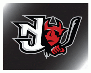
This next concept logo comes from designer Ian Baker. He worked on an idea for the New Jersey Devils.
It's interesting, I kind of like it but again I'm not sure it would be much of an improvement on what they currently wear. I really like the Devils logo. It's one of those logos that will live on as an NHL classic a century from now.
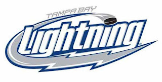
It turns out the same ad agency who designed the first Tampa Bay Lightning logo I posted on Wednesday, came up with another idea. More of a word mark, but here it is.
It's pretty cool. I don't like the puck in it, but that's just me.
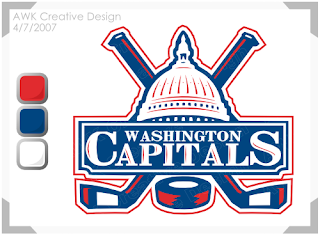
And finally, I'll leave you with a design that I feel would actually be an improvement for the Washington Capitals. I don't really like their new logo. I was a fan of the bronze and blue. But even if they had to switch back to the red, white and blue, what about keeping the logo. Something like this?
If you've got any thoughts or comments on these designs or any others, you know where to put them. Right down there in the comments section.


Reader Comments (14)
That habs logo is just awful. Same with the Devils, but the habs logo is absolutely offensive.
I could pull a better one out of my ass.
Lightning word mark isn't bad.
hahaha that canadiens logo makes it look like after almost a century, the chicago cubs finally gave up baseball to give hockey a try.
I like the Devils one.
The Habs one doesn't do anything for me, nor does the Lightening one. I think that'd just be a cool wordmark.
The Capitals one is stupid. No offense to the creator, but it's just a re-coloration.
Personaly I like the Habs concept, but can't imagine how much is possible to change one of the most recognizable sports logos. But it's a nice idea, remind me the Chicago Cubs logo.
I think the Capitals logo may be alright as a secondary (I personally don't dig the WEagle all that much), but having the Capitol dome for the Capitals main logo is just too confusing (plus I've never had a problem with the word mark; hey, it's got a subliminal goal formed by the pita so its cool).
The Devils logo is kinda cool on its own, but its just too much of a change from what they have now, goes too far into the "satan devil" rather than the "jersey devil" (and yes, I know their mascot does too, which kinda bugs me, but oh well).
The Lightning logo is interesting, no real opinion on it other than to say it's probably better than what they have now.
Can't say I like the basketballesque Habs logo, it's too classic to make such alter it like that without coming up with something completely new (plus it makes them look like they're trying to rip off the Bruins).
I'm a Habs fan since a long time and I think that logo really doesn't work. It looks like that he have been crushed by the side. It's a team that it's hard to find a new logo. This one is so old and classic that he can't be changed. And what can we design with this name? Really hard.
The Devil's one is pretty cool, good job!
Lightning is really interesting too if they have to change, that one could fit pretty well I think. I'm not a fan of script logo but it looks good.
For the Caps, I don't know if it's because I saw it so often in other colors but I think the colors don't match with the logo.
I really hoped the Capitals would keep something similar to the dome logo just with red white and blue. I agree that it looks better than their new logo.
This is my first comment, just found the site and definitely want to give props to you Chris. Excellent work.
The Capitals logo just screams Don Beaupre to me. Hey maybe bringing him back can turn the team around...
"hahaha that canadiens logo makes it look like after almost a century, the chicago cubs finally gave up baseball to give hockey a try."
Hahahahaha. The Habs organization would probably get sued by the Cubs if they ever tried to switch to that logo - that is, unless the fans (rightfully) rip them to shreds first.
The "NJ" on the Devs' concept isn't that bad, but that logo is weak and tacked-on.
The Lightening one looks like something that should be plastered across the chest of a minor league baseball player.
The Caps' concept looks okay - the color scheme works well with that picture of the Capitol, and it isn't flanked by those goofy-looking stars like the old logo was. Still, I think the current one is just fine. I don't usually go for wordmarks, but it works well with the Capitals' uniforms.
Being a Habs fan I really almost lost my lunch looking at the Habs logo. Sorry, but that's about the worst "fan" created logo I've seen on this blog. I like the idea for the Devils a lot, although they do have a pretty sharp logo anyway. Same goes for the Lightning.
BTW thanks for comming up with all this information, fan-concepts and stuff! Really like your blog!
That Habs concept logo is atrocious. Don't mess with a classic.
Go 'Canes!
im happy with the caps logo as it is. even though it probably wouldnt be my first choice, i just think they should just stop changing it and keep it the same for some time i.e. more than 5-10 years. in all reality, if the rangers or red wings current jersey was released as "brand new" tomorrow, i would have to say that the overall reaction would be negative. stick to what you have and you just might have a classic someday.
They're all fucking horrible besides the Caps re-coloring.
I can't stand the Canadiens and I still think that logo is an abomination and would be a disgrace to that great history they have. haha
I really like the Capitals logo, maybe whoever made it could put together a whole jersey just to see how it looks all together.
The Devils logo looks like a minor leagues logo.