Sens, Sharks Uniform Fan Art
 Friday · Aug 17 · 2007 | 12:49 PM PDT
  9 Comments
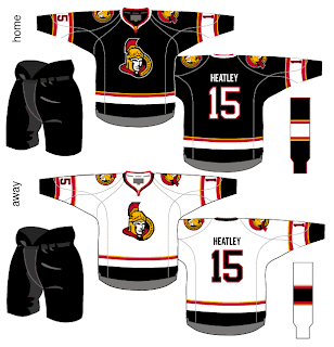
 We've seen the new logos (unofficially for one) but we've yet to see the new uniforms that go with them. So why not muse on the Ottawa Senators and San Jose Sharks briefly?
I like the red Senators jerseys a lot, but the black doesn't look half bad. Though in reality, odds are highly in favor of the Sens wearing the red at home this fall. The teaser pic on their web site seems to suggest that. Could be misleading, but I doubt it. I like the larger shoulder patch. More teams should do that. It looks really good.
The only problem I see with these two jerseys is the placement of the numbers on the sleeves. Way too low. Needs to be above the elbows. But wait! There's more!
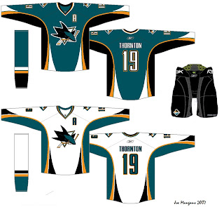
Consider these concepts for the San Jose Sharks.
They're pretty sharp, if you ask me. They could do a lot worse. The new logo looks very good on these. I'd like to see a bigger shoulder logo a la the previous Ottawa concepts. But otherwise I don't have a lot to complain about. Though from everything we've read and heard, I'd lean more towards expecting less curved lines and more straight lines. However, I'm not sure how well that would go with this logo. It's quite curvy.
Anyway, it all remains to be seen. The Sharks have yet to announce a date for unveiling their jersey, but the Sens have said August 22 will be their release date.
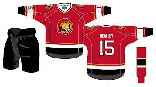
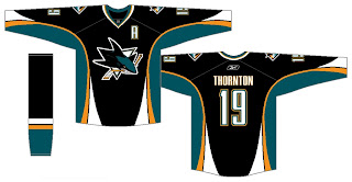
Before I leave you to your own devices for the evening, though, I have a couple of alternates from the same artists who came up with these designs. I know the NHL is dropping the third jersey program for this season, but we can dream, can't we?
Enjoy the rest of your night and don't forget to vote on the Senators-Rangers poll tomorrow morning!


Reader Comments (9)
I disagree that the bigger logos on the shoulders look good. They're too distracting and would look much too cramped with the numbers up higher where they should be.
The red ones with the gold ivy stripes were so much better then these. They're not bad, but not great. I hope we stick with red as the primary colour.
I really like the Sharks jersey. I wouldn't mind seeing this be their main home jersey.
Hey,
this comment doesnt relate to the Ottawa or Sharks jersey concepts, but I thought i heard that the new Reebok jersey's couldnt have vertical stripping on them.
Im thinking you know way more about this than me so i was just wondering if you could inform me on the latest about these new Reebok jerseys?
thanks
I post whatever info I learn regarding the new Rbk EDGE uniforms. It's funny the different isolated things people have heard regarding these jerseys. Rumors someone started which stuck somewhere along the way.
As far as using vertical stripes (or for that matter, horizontal as well), just http://picasaweb.google.com/nhllogos" REL="nofollow">take a look at what's already been unveiled. We've got examples of both being used.
Thanks for the comments, guys!
Love all 3 Senator concepts. The Sharks are only slightly better than what they've had in previous years, and I don't like those much.
As far as the comment about the 3rd jerseys, I know many people were saying that the 3rd jerseys were being eliminated this year, but doesn't the unveiling of the new Blackhawks jerseys contradict this notion?
The deal with the third jersey program being dropped for this season comes straight from the league, specifically Gary Bettman himself.
As far as the Blackhawks unveiling jerseys, I'd like to see photos because I've heard nothing about this. Let me know you find anything you can send along. Thanks!
i think the sharks uniform would be amazing if that was it
I think the black jersey should be the home jersey. Not that the teal ones aren't great, The black ones make the logo seem better cause it isn't so great. The white ones are good for a road jersey.