NHL Tournament of Logos

Entries in nordiques (9)

Saturday
Mar222008

Just To Freak You Out XXXI

I began the last Freak Out post with a similar image, so this is not a repeat. Look closely.

Yes, the duck is wearing himself on his own jersey. This is like some sort of weird fractal, right?

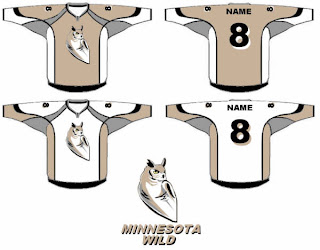
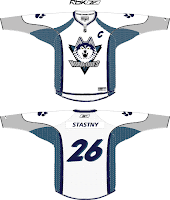
Anyway, we've also got an odd Minnesota Wild concept that scares me.

There's a reason teams choose bright colors. I can't remember what that is at the moment.

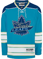
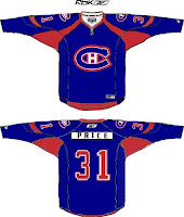
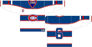
Got some stuff for Toronto and Montreal.

Does that Leafs logo look familiar to anyone? I've always thought the Habs should try blue — but on the jersey, not the logo.

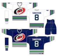
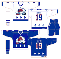
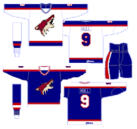
And then of course we've got a string of "If They Mated" concepts for some of the clubs that found new homes in the '90s.

The Hartford Hurricanes?

The Quebec Avalanche?

The Winnipeg Coyotes?

No, no and no. Lastly, I've got a little something to celebrate St. Patrick's Day albeit a bit after the fact.

He's got shamrocks on his shoulders! You guys absolutely slay me.

Friday
Jan182008

Just To Freak You Out XXIV

Can you believe yet another Friday is already upon us? I've had a long day (which began with me waking up at 1 AM) so forgive me if I make this a quick one. Just trying to freak you out a little.

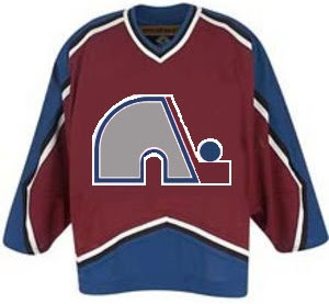
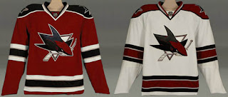
Last week's theme was crazy logos. This week's theme is crazy jerseys. For instance, what if when the Quebec Nordiques moved to Denver, they opted not to change their name or logo — just their colors?

Yep, that would've happened. Good guess.

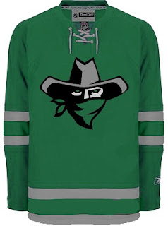
I think this next one was submitted as a Dallas Stars concept, but I don't really get it.

Are all Texans also banditos? On second thought, don't answer that.

This next one is a little disturbing.

Blood in the water.

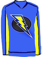
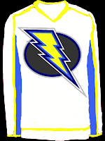
I posted a concept Lightning logo a couple weeks ago. Here are the jerseys that go with it.

I'm still not a fan.

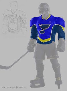
Giant hockey player... smash!

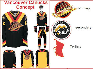
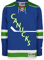
And what sort of person would I be if I didn't work in some Vancouver Canucks art? (Yes, arguably the most well-represented club on this blog much to the dismay of a handful of you.)

The weird thing is I sort of like the whales. Here's what I really don't like.

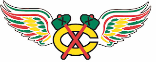
And finally, I've got this logo that serves as a great followup to last week's insane logo fusions.

There's why the Chicago Blackhawks and Detroit Red Wings will never merge. The logo just wouldn't work as you can plainly see.

So it turns out this post was a little longer than I planned. I impress myself. By the way, at some point this weekend I hope to update the Concepts Gallery as I have over 100 images waiting to be added. I'll let you know when I get it done.

Hope you enjoyed the 24th Freak Out post. See you again right here next week!

Saturday
Oct272007

Poll: Avalanche Franchise Logos


NORDIQUES
AVALANCHE


Place your vote and then feel free to leave a comment as to how you came to your decision. Tell all your friends to drop in and vote! The more voices heard, the more accurate the results!

Poll opening date
Sat Oct 27
Poll closing date
Wed Oct 31

07BONRF | RFCOL

Saturday
Oct202007

Result: Sabres vs Nordiques

Buffalo
SABRES

54% 1,261 votes

Quebec
NORDIQUES

46% 1,064 votes

2,325 total votes

Buffalo Sabres
Advancing to face Jets or Rockies

Quebec Nordiques
Eliminated


Poll opening date
Mon Oct 15 @ 12:33 PM
Poll closing date
Fri Oct 19 @ 11:59 PM

07VNTRN | #2A | BUF70vQUE

Monday
Oct152007

Poll: Sabres vs Nordiques


vs
Buffalo
SABRES
Quebec
NORDIQUES


Round Two has now begun! Place your vote and then feel free to leave a comment as to how you came to your decision. Tell all your friends to drop in and vote! The more voices heard, the more accurate the results!

Poll opening date
Mon Oct 15 @ 12:33 PM
Poll closing date
Fri Oct 19 @ 11:59 PM

07VNTRN | #2A | BUF70vQUE

Saturday
Oct132007

Result: Blackhawks vs Nordiques

Quebec
NORDIQUES

75% 2,125 votes

Chicago
BLACKHAWKS

25% 693 votes

2,818 total votes

Quebec Nordiques
Advancing to face Buffalo Sabres

Chicago Blackhawks
Eliminated


Poll opening date
Mon Oct 8 @ 4:23 AM
Poll closing date
Fri Oct 12 @ 11:59 PM

07VNTRN | #1C | QUEvCHI37

Monday
Oct082007

Poll: Blackhawks vs Nordiques


vs
Chicago
BLACKHAWKS
Quebec
NORDIQUES


Place your vote and then feel free to leave a comment as to how you came to your decision. Tell all your friends to drop in and vote! The more voices heard, the more accurate the results!

Poll opening date
Mon Oct 8 @ 4:23 AM
Poll closing date
Fri Oct 12 @ 11:59 PM

07VNTRN | #1C | CHI37vQUE

Monday
Aug272007

Avalanche Concept Art

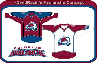
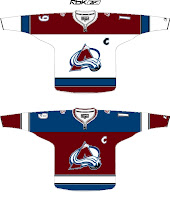
The Colorado Avalanche are one of five teams we have yet to see jerseys or get word of unveiling dates for. (The other four teams are the Sharks, Ducks, Sabres and Devils, by the way.) Anyway, I've got concept designs to share, as usual.

I'm beginning with something recognizable. Something like that would look very similar to what the Avs currently wear and there would likely not be the upheavel of discontent like what we're hearing out of Ottawa. And all said, those are pretty sharp anyone. The Avs would be lucky to wear something that nice.

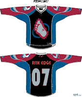
These are pretty interesting too. The one on the left completely does away with the angled stripes along the sleeves and bottom of the jersey. I'm not sure how I feel about it — probably because its unfamiliar. I've always thought the Avs have been among the best in the league with regard to logo and uniforms. To see a big change from them would be jarring.

So you can imagine how I might feel about the "alternate" jersey on the right. I'm a fan of the over-sized shoulder patch but that's about the extent of it. Black does not work with the Avs' look. However, the bigfoot secondary logo on the front of the jersey is growing on me a little. Maybe they could go in that direction with the new jerseys.

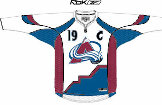
Then I have this design. If the numbers on the front didn't turn you off, check out the bottom of the jersey. I'm not really sure what's going on there or what the artist was trying to achieve.

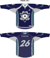
And finally, while I was in the middle of writing this post, I got a great email from Capouel. Check out these works of art.

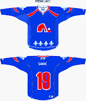
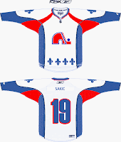
Being that the Avalanche once existed as the Quebec Nordiques, I felt these were relevant to this post. For those who don't know, the crest featured in these designs were not created by the designer. In fact, this logo was meant to be used by the Nords beginning in the 1995-96. But before they could put the logo into effect, the team was moved to Denver.

This is what the Nordiques might look like today if they never moved. Anyway, that's all I have to say on the matter. What do you guys think?

Thursday
Aug232007

Hey, Canada! Part 3

I'm heading to Quebec for the next stop on my trek across Canada today. The only team there today is the Montreal Canadiens. So let's start with them. I was emailed a concept design that is rather unique.

Interesting choice with the striping. What do you Habs fans think? Do you like the bars across the chest?

I got a really cool piece sent to me recently, as well, for a team that now exists under a new moniker in a new city. This designer contemplates what the Quebec Nordiques might look like in the "new NHL."

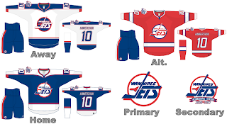
Gets you all nostalgic, doesn't it? Speaking of nostalgic, let's "jet" on over to Manitoba and muse on what the Winnipeg Jets might hve looked like in Rbk EDGE jerseys, had they not moved to Phoenix.

Talk about a trip down memory lane. Feel free to leave a comment about any of these designs. I'm sure their creators are interested in your responses.

Still to come today: A preview of the new uniforms of the Toronto Maple Leafs.