Friday
Aug242007
At Last: Devils Concept Art
 Friday · Aug 24 · 2007 | 12:05 PM PDT
  10 Comments
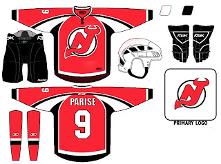
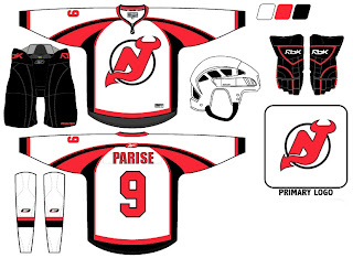
 This one goes out to all my New Jersey Devils fans out there. Go get hit by a train! No, I'm kidding. But your team has knocked mine out of more than its share of playoff series. And for that, I — on behalf of my Lightning — hold a grudge. Still, I'm willing to help you out here. I've been sent concept jerseys for the Devils. Peruse at your pleasure.
You might notice the basic layout looks an awful lot like what the San Jose Sharks have worn in recent years. But I like these because they suggest horns. What do you guys think? Worth considering or should they stick with what they know and avoid any big changes?


Reader Comments (10)
Meh, I always thought the devils jerseys were ugly.
Even though we've had the same jerseys since 1993, I still don't think there's anything wrong with them. I wouldn't be totally opposed to a re-design but after seeing some of the new jerseys teams have released, I would be happy if they just adapted the current design like Carolina didl
i like them but i don't think they need an improvement they've already got a great jersey and logo, one that could go down as classic at IMHO
the logo is too high to place the C or the A; OR they could pull a Detroit and move it to the other side.
I think your train suggestion is excellent.
I doubt there will be much change. Just a transition of the current awesome layout to the new RBK EDGE jerseys.
Terrible jersey designs - way too busy. Actually somebody on a group I belong to thought these were real. I hope not. Ugh. My Devs will probably stick with what they've got.
I like the concept
Hope the Devils, keep the one they have now to.
wow i like those alot! they look great. current ones are nice, but too simple, i like that design.