Musing On Minnesota
 Friday · Aug 24 · 2007 | 12:18 PM PDT
  15 Comments
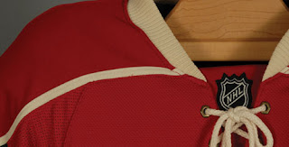
 With the Minnesota Wild releasing a teaser photo yesterday and the official unveiling date of their new Rbk EDGE uniforms, it's gotten the wheels turning within the graphically-inclined among you.
A widely held belief based on that image is that the Wild jerseys will closely resemble those unveiled by the New York Islanders recently. Here's the image I'm speaking of.
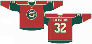
Colors aside, the basic design seems to match the Isles so far as we can see. Here's what one fan came up with.
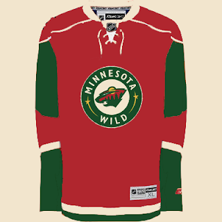
I can't really lodge a complaint over that. I've always like the Wild's jerseys — green, white or red. These would be especially nice though. For another look, a reader recolored an Isles jersey for us.
Also pretty cool if you ask me. Now I'm asking you — Wild fans, especially. Are these the way to go? Would they make the Wild one of the NHL's best-dressed teams? Or do they leave you more or less indifferent?
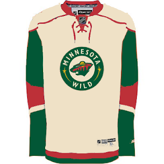
UPDATE (4:10 PM): Our friend Lucas who came up with the concept based off of the Islanders new Rbk EDGE jersey, sent in a road version of the jersey. See what you think.


Reader Comments (15)
Awesome! I hope they use this, and make the road jerseys the same.
if you look very closely at the bottom left corner of the teaser, you can see a dark color, probably the green that is on the sleeves so the fan rendering might be on point besides the crest.
Not the best dressed, but this would make a nice jersey.
looking @ the recolored-isles-jersey, i like the color on it, but the design of the (past) Wild jersey wasn't like that.
I think it would look a little more like this:
http://tinyurl.com/2l2hcx
I had no intent of making it like the past 3rd jersey, and I don't think it will look like it.
I just made a white one, and I sent it to Chris. Let's see if he posts it.
-Lucas
I'm hoping the jerseys don't change much from the current Red Jerseys.
Michael Russo DID say that they weren't going to change at all, but then the teaser picture reveiled a change (shoulder piping).
Hoping these new jerseys change as little as possible, I'm hoping that it's no different than this:
http://tinyurl.com/yvxekk
PLEASSSSSSSSE Don't use the circle logo! I think it looks so bad. Honestly I thought the green jerseys were awesome but I know many would disagree but red is so boring
lunt_23...
Take a look @ the Wild website. Their main banner is the circle logo. They announced at the end of last season that they're switching to their 3rd jersey (which has the circle logo). I think it's safe to say they're using the circle logo next season.
I have no issue with it except for the circle logo ... it still reminds me of herbal essences shampoo.
Looks like both the Carolina and Phoenix jersey from that little snippet. I hope they incorperate the green and tan on the rest of it.
I don't like the circle logo, and I dont hate the red, but I prefered the green. and I hate the away jersey in wheat. I think that would be a mistake. I really hope they don't change to much.
the wheat thing can't happen anyway people so relax and the circle logo isn't bad cause its still got the same logo just in a circle surrounding it with two star ufffff!
i hope the don't use the circle logo on the road for some reason
Very nice! This shows that one of the newer teams can have a uniform with old-time character. No complex striping patterns. No comical fish with hockey sticks in their mouths. Just solid primary colors. And that logo looks much better framed within the bold circle.
Am I missing something? Why can't the wheat happen for the away? There are plenty of minor league and college hockey teams using a non-white jersey. For one, Milwaukee in the AHL has a grey jersey base, the Lakers in Basketball have a yellow. There are precedents, maybe not directly in the NHL, but nowhere have I seen that the aways have to be white by NHL mandate, just lighter in color.
I'd love it if the Wild wore wheat, but it's got to be the right color because if it ends up looking like Nashville's old 3rds it would make me sick. As a former season ticketholder of the Wild I kind of got sick of seeing green/red play white. You go to 40+ games, its nice to have some change here and there. The Wild have a chance to be a bit different and play up the game's roots up there. I'm not a huge fan of their old thirds, but I didn't hate them. I think they'll have a pretty classy jersey compared to some of what else is showing up