Your Daily Dose Of Canucks
 Friday · Aug 24 · 2007 | 12:40 PM PDT
  23 Comments
 You'd think my favorite team was the Vancouver Canucks the way I post about them. (Actually, the Lightning are as you know and I have lots for them later on today!) Anyway, I think it's just that Canucks fans are the most curious about their team's new logo and uniforms based on their decades old identity crisis.
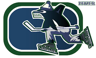
Epitomizing that identity crisis is the mish-mash logo I posted on Tuesday. But the designer of it made some adjustments and improvements in coloring. I think they're worth a look so I thought I'd post that.
Drool over that, Vancouverites! And try and convince me you wouldn't give your left nut to have your team wear a jersey with this on the crest. Anyway, in all seriousness it's a very clever design. Whoever designed it needs to work for Conan O'Brien.
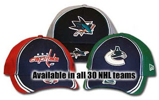
In addition, the Hockey Hall of Fame web site apparently leaked the new Canucks logo on a hat.
While the primary logo seems to lack green, it certainly seems to be a part of the overall team colors. It also appears we should expect the old stick-in-rink logo on the shoulders as a secondary.
That's all for today. Until the next time, enjoy this look back at the history of the Vancouver uniform, courtesy of Canucks.com.


Reader Comments (23)
Errr, yeah. Not a fan of that new Canuck logo that you showed as a modification. I'll be waiting with baited breath on the Lightning logo though, see if it really was the true logo that got leaked.
So sick of Canucks concepts!
-Johnny Griswold
ok, so ive seen this logo twice now, whats up with the lumberjack? ive dont recall ever seeing it on any canucks jersey. any help guys?
It's definitely a hot topic around town here in Vancouver. Fans like the the blue green jerseys, so we're glad to hear that we're at least keeping those colours on the new Rbk ones.
(Lumberjack was a shoulder crest on the first Canucks sweaters)
Love this blog by the way, great work!
They really should have incorporated the green into the logo. It looks like when they take a logo, and make it 100% white for Hats. Just too empty.
i wish i lived in couver
i live TO but i liv in an asian/indian area so there isn't much attention paid to hockey (not trying to make a racist comment)
but anyway the new jerseys aren;t what i hoped but it looks like they might come out as half decent
I was looking at the hats and why is the Capitals logo red on their hat. The words capitals are supposed to be blue. Why change it for the hat?
I still don't understand why they refuse to show the 85-86 to 88-89 jersey.. it was 1000 times better than the one just previous to it, was the first jersey to show the skate logo, and doesn't seem to make any sense to have been forgotten about whatsoever. lol.
Crazy organization
The "V" jerseys showed the logo. It was on the arm and about twice the soze of a standard shoulder patch.
true.. true, but I meant as a main crest.
I guess the thought is that they were basically just an amalgamation of the V and the White/Black 90s sweater, and not really a significant change on their own.
the canucks new shorts are green look in all the training at 8 rinks video's LOOK!
Why!! Why the freakin' whale! The rink with a stylized jersey would be great! Why the whale!
Apparently, if we look at the caps… Sharks' colors should be gray and black because Capitals and Canucks' colors are the jerseys' colors. (well, i suppose that Canucks' colors are green and blue)
Sorry if my English is not perfect, I'm from Quebec and i speak french.
I liked the blue, green, and white colouring of the orca logo that we saw in some of the made up stuff. I hope an all silver logo doesn't show up as the primary logo on the jerseys. But with that said I've seen the orca logo on hats in pretty much every colour: all white, all black, brown..... pink! So this could just be for this hat.....but it does look like the colours will be blue, green, and silver. Guess I'll see for sure on Wed. at GM Place. I know he Canucks Org. will put on a great show for this!
The Johnny Canuck logo was used between 1945 and 1970 as the primary logo on the pre-NHL version of the Vancouver Canucks. This team played in the minor professional Pacific Coast Hockey League (1945-1952) and the Western Hockey League (1952-1970).
yeah what gives with the color changes on the caps logo?
http://www.fathead.com/nhl/vancouver-canucks/canucks-logo/ new canucks logo
That hustling whale has grit! I love that thing in all of its hideousness. Something like that could gain way more affection as a bad logo than that of the slug.
-Charlie
SabresNotSlugs.com
u hate that logo (slug ) as much as u do i like that
The whale on skates with pants and a hat at least has character. It doesn't look as though all soul and personality has been sucked out of it by overexposure to focus groups and marketing surveys. I kind of like it.
Awesome blog, by the way. You are doing a tremendous job. :)
i checked out that fathead site that the guy posted and they have every team except the canucks
y's that?
u have to go under nhl logos and its on the 2nd row last one
On the Canucks's site, when you watch a video they use that logo in their player's background, and at the start of each video.
So I wouldn't get too excited yet.
http://canucks.nhl.com/team/app/?service=page&page=NewsPage&articleid=336220
Under video on the right, click on "Mike Kelly's advice for tryouts" and you'll see what I mean.