Just To Freak You Out, Part 1 of 5
 Monday · Aug 27 · 2007 | 11:55 AM PDT
  24 Comments
 Today I'm starting a weeklong feature I hope you all will enjoy. As the title implies, the images I post here are meant to freak you out a bit so don't be surprised if you see the weird and wacky in what follows.
I've gotta kick it off with this photo because it's what gave me the idea for this series.
This photo comes from a bored fan at a Vancouver Canucks message board. Talk about identity crisis. How about those colors? Black, silver and neon green. Don't miss the recolored flying skate logo on the shoulder and the neon green Johnny Canuck on the side of Roberto Luongo's helmet. Stunning. Absolutely marvelous.
It gets better.
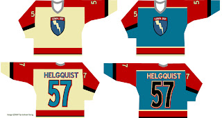
Now speaking as a Lightning fan, I can honestly say that is one color scheme I would have never dreamed up. It's not a horrible design on its own, but I'm afraid I wouldn't be able to recognize Vinny, Marty and Brad underneath all that... whatever it is.
But let's not stop there.
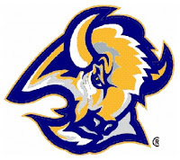
 Sabres fans, have you ever considered going with a blue and gold goathead for your primary logo?
Part of me wants to think someone was just trying to prove how silly a yellow buffalo would look (see the current "Buffaslug" logo). But the part of me that attempts the use of logic fears someone honestly considered that to be a decent option.
Take me now!
If none of that has given you nightmares, then I'm not doing my job. Read on.
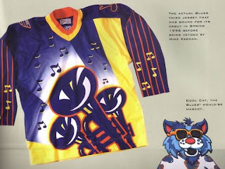
Friends, you won't believe the scariest thing about this beast. It's real. This sweater — if we can call it that without sullying the name of actual hockey sweaters everywhere — was actually produced for the St. Louis Blues. I'm not kidding. Surnames and numbers were stitched onto it. But with thanks to the holiest of gods, it was never actually worn during an NHL game.
Mike Keenan may have made some bad decisions in his life, but his refusal to allow his team to wear this monstrosity in 1996 is not among them. Can you imagine? Blues fans, you dodged a bullet and you will forever be in Keenan's debt. And do not ever forget that!
All right, now it's your turn. What do you guys think of these designs? Comment below.
I'll have more crazy designs all week. And as always, if you've seen any crazy designs or have some of your own, I'd love to see them. Email me at nhllogos@gmail.com.


Reader Comments (24)
I think I just threw up a little looking at those.
Can we really claim ignorance on these?!? I mean, there has to be a certain level of insanity here. I would love to be a fly on the wall of the office when these designers get fired from their jobs (if they had a designer job in the first place).
Wow those are really ugly designs. Oh Golly Gee, wouldn't I love to see some Panthers designs in this jumble of bad jerseys.
I actually don't mind the electric green and black... not for the canucks, but it's cool color combo.
Kyle, stay tuned. That's all I have to say right now.
I actually own that blues jersey...it's one of my favorites in my collection
where did u get the blues jersey?
i think the st.louis jersey is too busy for an nhl jersey and theres no real logo
Haha, I loved that Blues jersey! I'm a big Jazz and blues fan, so I thought it looked kinda classy. :P
I'd so wear it.
IS THAT THE LIGHTNING OR HARRY POTTER!
I'm still wondering about the Canucks uniform that Luongo is wearing on the top picture. It can't really be a fake - I'd like to see the guy who creates such a fake - so what's the reason Luongo is wearing this jersey, even with a matching mask??!!
Do you have an answer Chris?
(btw: thanks for the blog, you're doing a great job!! keep going!)
i guess that's the one good thing keenan ever did for us. it would have been funny to see on the ice, and almost a welcome break from the butt-ugly sweaters we wore during that era. almost.
I'm still wondering about the Canucks uniform that Luongo is wearing on the top picture. It can't really be a fake - I'd like to see the guy who creates such a fake - so what's the reason Luongo is wearing this jersey, even with a matching mask??!!
Do you have an answer Chris?
It's a fake. The concept was based off of the third jersey the Canucks wore last season. All the designer had to do is replace colors. Trade out the blue for black, the green for neon green, etc.
Like I've said, Photoshop is a very powerful tool and there are plenty of people in this world who know how to operate it well.
I apologize if I was unclear in the post. I just felt like it was fairly obvious that this was fan-created work. It's very good work, but not as clean as a professional's. A trained eye could spot the various artifacts that prove it isn't a real photo, but a doctored one.
Hope that helped. Thanks for the comments, all!
I like the 'Nucks one...
WHAAAT?? I really love that Lighting logo!! seriously, i think it's genius. the actual jerseys leave a little to be desired and i'm not sure about the red either, but the cream and blue are great as is the retro logo. what i like is that it doesn't try to be 3D with shading and all that crap, it's just plain, retro and very cool. i like it a lot.
that's the kind of thing the NHL needs more of.
where'd you find that blues jersey i've lookedeverywhere an can't find one
I prefer those Lightning mock ups more so than the new/old Jerseys. At least it appears to be trying to have a personality, and be rememberable. The Lightnings new/old logo is about nearly as stock as it can get for anything. Lightning Bolt + Circle, and wordmark. Nothing amazing in anyway. Add the fact that the jersey itself lacks any pizazz, almost like the stock jersey a high school would have, almost a practive jersey.
The mock up is much more fun and memorable.
Once again, check out the work of John Slabyk. Don't know the guy but his reinvention of logos and identities are great.
Check out the Canucks logo at www.humanot.com - "sports, than canucks"
Love it love it love it....
Someone should send a letter to the Vancouver management.
Wow. Go figure... MORE Canucks concepts. How about creating a sidebar featuring all the Canucks crap? This is a fantastic site other than the daily Canucks concept stuff. Enough already.
I actually don't mind the Canucks jersey and the old Sabres logo in blue and yellow is an improvement from the current Sabres logo. The rest were really bad.
That Tampa design isn't so bad actually. Unfortunately they already have an identity that they shouldn't really be compramising.
I'm all about the 2-D logos that even kids can draw.
actually really like the black/neon/silver canucks jersey... looks distinctive but the neon is quite subtle on it so it's not too crazy. references all three canucks uniform eras too (green = 1970s, black = 1980s/90s, silver = orca bay era).shame they won't be going in that direction
and actually the canucks jersey looked kinda kool compared to the other ones
oh my goodness, thankfully the Blues didn't go with that ugly sweater. who in their right mind would even dream up of something like that for a hockey jersey????