Avalanche Concept Art
 Monday · Aug 27 · 2007 | 11:00 AM PDT
  16 Comments
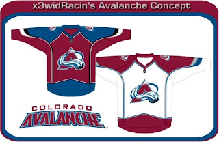
 The Colorado Avalanche are one of five teams we have yet to see jerseys or get word of unveiling dates for. (The other four teams are the Sharks, Ducks, Sabres and Devils, by the way.) Anyway, I've got concept designs to share, as usual.
I'm beginning with something recognizable. Something like that would look very similar to what the Avs currently wear and there would likely not be the upheavel of discontent like what we're hearing out of Ottawa. And all said, those are pretty sharp anyone. The Avs would be lucky to wear something that nice.
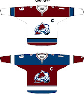
These are pretty interesting too. The one on the left completely does away with the angled stripes along the sleeves and bottom of the jersey. I'm not sure how I feel about it — probably because its unfamiliar. I've always thought the Avs have been among the best in the league with regard to logo and uniforms. To see a big change from them would be jarring.
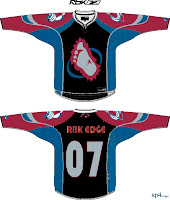
So you can imagine how I might feel about the "alternate" jersey on the right. I'm a fan of the over-sized shoulder patch but that's about the extent of it. Black does not work with the Avs' look. However, the bigfoot secondary logo on the front of the jersey is growing on me a little. Maybe they could go in that direction with the new jerseys.
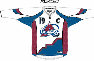
Then I have this design. If the numbers on the front didn't turn you off, check out the bottom of the jersey. I'm not really sure what's going on there or what the artist was trying to achieve.
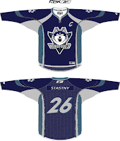
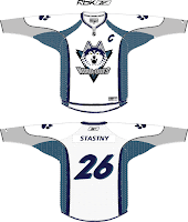
And finally, while I was in the middle of writing this post, I got a great email from Capouel. Check out these works of art.
Being that the Avalanche once existed as the Quebec Nordiques, I felt these were relevant to this post. For those who don't know, the crest featured in these designs were not created by the designer. In fact, this logo was meant to be used by the Nords beginning in the 1995-96. But before they could put the logo into effect, the team was moved to Denver.
This is what the Nordiques might look like today if they never moved. Anyway, that's all I have to say on the matter. What do you guys think?




Reader Comments (16)
Stars? you mean sabres?
As a matter of fact, I do. My brain said Sabres while my fingers said Stars. Thanks for catching that.
haha ok, your welcome.
Die all star template. Die.
also u said the one of the teams that we dont have a date for is the blackhawks yet their in the countdown
Sharks also haven't given a date for their uniforms yet. We just have the new logos
Yeah Chris, I think you meant Sharks and put...Blackhawks?
Wow, I screwed that up all kinds of ways didn't I? I don't think I'm on my game at all today. It's been fixed now.
But yes, we have a date for the 'Hawks and not the Sharks — despite having already seen the Sharks' new logo. Thanks for catching all that crap, guys. Apologies. I'll try to pay a little more attention from now on.
Thanks for posting the Avalanche Concepts, hoping at the worst to see something like the first concept, don't want to see any major changes, or any changes at all for that matter.
as much as i don't like teams relocating, it may have been more upsetting for the nordiques to stay put and switch to that logo. i rather liked the logos and jerseys they had.
whats with the # on the shoulder
i hate that and its getting out of hand
As much as I like seeing the various concepts for many of the teams, there is a caveat that I feel should be brought to your attention.
Don't expect a Sabres new jersey unveiling. It will be no different from what was worn last season (aside from template). In fact the template that the Sabres jersey uses is the RBK Edge design, if you look closely enough.
So four teams remain.
Hi jrzman! With regard to the Sabres jerseys being designed last year with the Rbk EDGE style in mind, you're right on the money (from everything I've heard). However, no team wore an actual Rbk EDGE jersey last year — Sabres included.
So technically, whether they hold an unveiling ceremony or not, the Sabres will have a new uniform this season just like everybody else. This is not to contest, however, that the design may very well be exactly the same as what they wore in 2006-07 — just adapted to the new Reebok cut.
Again, you're right in expecting no change to the overall design, but what they worse last season was not the Rbk EDGE uniform. The only teams that you could say wore those last season were the Eastern and Western Conference All-Star teams.
Thanks for the comments!
Aww, you beat me.
Actually, they don't use RBK Edge.
They used more of practice jersey style. RBK Edge was first used in the All-Star Game. It will be a bit different. And it still hasn't been unvieled, so it still counts.
what about the Leafs?