Just To Freak You Out, Part 3 of 5
 Wednesday · Aug 29 · 2007 | 3:44 PM PDT
  23 Comments
 So this week I'm running a series of crazy concept designs meant to freak you out a little bit. Let's get to it now.
I have to start with the colors we've all grown fond of this afternoon. Yes, you know the ones. But beware, you're about to see them on a jersey that will make you blink a few times and perhaps tap the side of your monitor. No need, though.
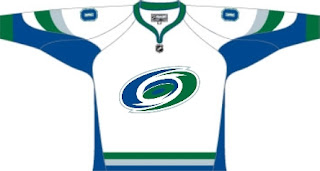
Being of generally slow wit, it took me a moment to realize that this Carolina Hurricanes jersey was being recolored based on the team it used to be. Yes, friends, the Hartford Whalers. But just look at that blue and green hurricane. Scary.
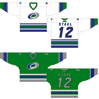
Somebody else had a similar idea. Look at that thing.
And then somebody with a twisted soul had an idea. Let's go all the way back to the New England Whalers... and kill Pucky... on a jersey... made by Reebok.
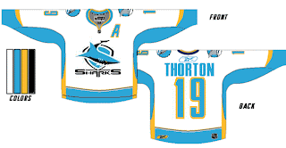
Yeah. And while we're on the topic of creatures of the deep, let's see what could've happened if certain fans had been asked to design the new uniforms and logo of the San Jose Sharks.
Huh? Wait, that one's actually kind of good. Dude, I like that logo. What is it doing here? Oh I remember. It's serving as a segue to this.
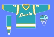 I can hear the screaming all the way from here. But before you go all thinking this design is completely without merit, don't forget about our friendly California Seals. Yes, this design is based on that old '60s uniform.
Completely and utterly crazy if you ask me. And I know no one did, but I'm sharing my thoughts anyway.
Let's roll on, now. Because before I go, I need to show you this logo someone emailed me for the Dallas Stars. Yes, the Stars need a logo redesign, but is this really the answer?
There's only one way to find out. Comment now and come back tomorrow for Part 4.




Reader Comments (23)
the white sharks concept is the only one that doesn't look like it was done by a 6 year old.
...and the offcolored hurricanes ones as well, sry.
thornton was spelled thorton on the sharks jersey...
Hey Chris , do you think its possible that any teams will change their name like the ducks did last year?
All these concepts are just starting to be a joke. I can see putting up concepts that look somewhat professional, but all these MS Paint versions are just a joke.
That Stars logo did freak me out,its just a circle with 2 stars , very sloppy work!
Hey Chris , do you think its possible that any teams will change their name like the ducks did last year?
No. No teams have announced any plans to change their names. It's too late now, anyway.
All these concepts are just starting to be a joke. I can see putting up concepts that look somewhat professional, but all these MS Paint versions are just a joke.
Dude, that's the point of this series. They're just so bad. So, so bad. Let loose, a little. Just enjoy it.
Thanks for reading!
Actually that first Sharks logo is way better than the one they have now. The Sharks should go with that one instead. As for the second Sharks sweater I like it in a retro/modern twist sort of way.
To the person who designed the Stars logo ... remember ... hockey is played with hockey sticks ... not boomerangs.
The only logo that looked halfway decent should - that Sharks logo actually is a logo used in Australia for either a rugby or Australian Rules Football team or something. But, I know I've seen it before. The Dead Pucky logo was pretty funny too.
Lighten up, folks, this is refreshingly funny and some of the serious logos that Chris has posted haven't been that much better anyway...not to mention the Tampa Bay Lightning's actual logo being ridiculous!
...not to mention the Tampa Bay Lightning's actual logo being ridiculous!
Ouch. I love my Bolts. And their lopsided logo. So there!
Ouch. I love my Bolts. And their lopsided logo. So there!
I know, Chris, and I hate to pick on them but even though their new logo is an upgrade from their old one, it's still pretty lame.
I wish it weren't so!
That sharks logo is from the Cronulla-Sutherland Sharks of the National Rugby League in Australia.
I like the pseudo-Whale 'Canes sweaters. I can hear the Brass Bonanza playing already!
Those Sharks concepts are nightmarish. I love the old Seals jerseys, but the amount of teal on that thing is only exceeded by the crowd at a Rick Astley concert circa 1989.
I love the Sharks as Seals of the early Seventies! That is absolutely classic! I vote for this as their potential third jersey.
boo.. you're wrong, dallas doesn't need a logo change.
I love the blue and green Carolina design.
I love the dead pucky logo. It fits where the Hartford Whalers are now, DEAD!!!
oooh, burned! haha
But as a Winnipeg Jets believer/psychopath, I've got to say, "Lay off of Hartford. It's not really there fault that their team left."
...Still, that dead Pucky logo is the funniest concept logo I've ever seen on this site.
The dead whale is funny...but Reebok would never want PETA to get after them! Although I don't know if they would be too upset about a cartoon whale, since you never hear the PETA people sticking up for poor Wile E. Coyote.
Pucky the Whale will resurface again in Hartford. Best logo and jersey combination ever. They would surely contend for best logo in the NHL currently.
The Hartford/Hurricanes color combo actually works. Think blue seas and stormy green skies.
Gotta drop the hurricane warning flags on the bottom though. They're red for a reason.
"Pucky the Whale will resurface again in Hartford. Best logo and jersey combination ever. They would surely contend for best logo in the NHL currently."
I disagree with your whole post. There were many other far great logos in the NHL before the whalers logo and uniform. Such as: Pittsburgh,Chicago, Detroit, Toronto, Montreal, Calgary, Boston and New York(Rangers). The NHL had its stop in Hartford and its not coming back again. Get over it! THE WHALE IS DEAD!!!
Pucky's Dead GET OVER IT