Mailbag: Flames Concept Logo
 Monday · Aug 6 · 2007 | 12:20 PM PDT
  5 Comments
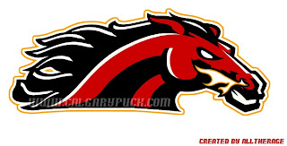
 I had a reader send in this Calgary Flames logo which seems pretty cool. It gives a new perspective on the recent secondary logo that featured a horse with flames in its nostrils.
Flames fans might also notice the similarities between the flames coming off the traditional "C" and the mane of the horse in this fan-designed concept logo. It's pretty sharp. But can anything really be better than the flaming "C" or should the Flames go in this artistic direction?
As a side note, it also seems that we'll be getting a first look at the Calgary Flames new uniforms at the Flames Celebrity Charity Golf Classic on September 4. I can't completely vouch for the reliability of this info, but what could it hurt to add it to the sidebar countdown? Check it.


Reader Comments (5)
That looks very cool. I think it would be great as a shoulder patch. And/Or the primary logo on a 3rd jersey (when 3rd jerseys are used). I think a black 3rd jersey with this logo on the front would look pretty cool.
Western Michigan called. And they want their logo back.
I like the idea of integrating a horse for their alternate logo since it's significant to the region. But I never liked seeing flames out of the horses nose.
And as the Western Michigan logo shows, this logo needs a word mark beneath it. It's just too horizontal without.
Ah, nice catch on the Western Michigan thing. I thought it seemed a little uneven as far as things being added to/removed from it. Thanks for the comments!
I edited that logo and in the email i did note that it was not entirely original, just so people know I'm not trying to pass it off as entirely my own work.
If the Flames had that logo instead of the ugly flaming horsehead logo they've finally gotten rid of, I wouldn't be as against it. But I don't want them to have a secondary logo on the shoulders.
That concept also reminds me of the current Denver Broncos logo a bit, too.