Amazing Ducks Concept Art
 Wednesday · Aug 8 · 2007 | 2:27 PM PDT
  34 Comments
 Earlier in the week I posted some awesome concept art that went over a storm with you guys. We saw designs for the Ottawa Senators and Boston Bruins as well as the New York Islanders and Atlanta Thrashers.
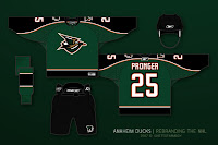
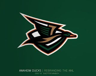
Today we're treated to some work on the Anaheim Ducks. These designs were based on concepts that "leaked" prior to the unveiling of the new Ducks logo last summer. Have a look and be impressed.
 If you ask me, that's what the Anaheim Ducks should look like. And it couldn't be further away from the old Mighty Duck look. However, while the green is sharp, tan doesn't make for a vivid secondary color. So what about orange?
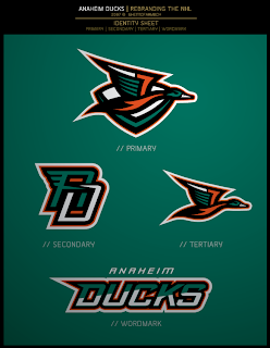
Our favorite designer upgraded his original logo with much more vivid colors. Can anyone deny this would be one killer logo package?
 If the logos weren't enough for you, check out the uniform designs. Any NHL team would be lucky to look that good. How come this guy doesn't already work for the league?
Are there any Anaheim fans reading that would be repulsed by something like this? Would that even be possible?
Anyway, it's artwork like this that gets me so excited to do a blog like this. So what do you think? Am I going a little over the top with my glowing praise? Or are these designs really that good?


Reader Comments (34)
The colors in the original concept here does remind me of the Long Island Ducks (Atlantic League minor league baseball team).
The concepts themselves are quite nice and certainly much better than what they have now. I would be curious to see what the original Ducks crest logo would look like on the front in the new colors from this person's concept.
The numbering and lettering font looks very much like what the old Phoenix Coyotes jerseys had.
Wow! I never thought I would see a Ducks logo that didn't suck. Nice job!
like the logo but keep the colors they have now. you are almost trying to create the ducks into the miami dolphins. think about it?
i want this photoshopped onto a player,i love it
The only thing that would make me want to buy that jersey any more would be if it was a tie neck
this is one of the best concepts ive seen on this site.. does the nhl know about you guys?? this is awesome and some of you should be getting paid good money by the nhl..lord knows they need a marketing messiah!!
All of the rebrands are super-professional and stunning! I especially love the Ducks one. These make me pumped to do logos!
incredible. this is the best thing anaheim could do to their team
I think if it was rightly made and had the right look, an Orange Ducks alternate jersey would be pretty cool.