Looking Ahead: Third Jersey Concepts
 Monday · Sep 10 · 2007 | 11:26 AM PDT
  14 Comments
 As we all know, the NHL is abandoning the third jersey program for this season. However, there are many indications that it will make a comeback as early as the 2008-09 season. Having said that, some people are getting a jump on things. Here I have a few alternate jersey concepts to share.
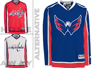
We'll start with the Washington Capitals. While the return to red, white and blue has grown on me, the wordmark logo has not. However, they've got a great shoulder logo that could use a little more mileage.
I especially like the idea of a blue jersey. Moreso than the red. Kudos to the designer on this one.
Keeping it in the Southeast Division, I've also been sent some Tampa Bay Lightning art.
Speaking as a Lightning fan, I do like the idea of a blue alternate jersey, but the logo needs the circle. What do you guys think of that? I think it looks even plainer without it.
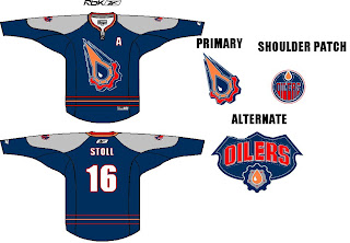
Moving on to the Northwest, check out this rather colorful Edmonton Oilers rendering.
I like the gear logo better in silver. But that's just me. Let's finish up with a look at some Minnesota Wild concepts.
I remember back in 2000 when the Wild first unveiled their logo — the crest you see on these jerseys — and I was horribly afraid the jerseys might look like this. (I was thrilled by the bear head logo.) However, I kind of like the green as an alternate for some time in the future. Might be a little much though. Thoughts?


Reader Comments (14)
I really dig the Capitals design and would buy that in a second. The Weagle looks great and would make a cool primary logo on the alternate jersey.
As for the Lighnting design, I think the logo actually looks a little better without the circle and I do like the blue jersey concept.
I don't like the Wild wordmark as a wordmark let alone a logo. They've got a great primary logo already - the bear head and I really like the alternate logo I've seen bandied about in some of the concepts - the one of the shape of the state of Minnesota with a lake and wilderness motiff inside it. Put that on a green jersey and you have a real winner.
I'm with you on the idea of a blue jersey, but still can't get over the piping on the new Caps jerseys.
The Habs did it right, straight red. Wish the Caps had followed suit.. (Even though ours was released first)
How about a Lightning third in blue with the bolt in a circle WITHOUT the wordmark? Would be a great, simple superhero kind of look.
I think the blue-winged eagle on the Blue caps jersey is a little too much blue. I agree with Bryan's remarks on the piping, but i think it actually looks good on the white jersey. I think the Eagle logo would look best on the white jersey.
I could live with the Weagle on a white jersey.
I love the Weagle 3rd jersey idea, especially on road white.
And if the Wild don't go with some sort of dominant green 3rd jersey, I'll have stressed out all this season in vain. I'm not a fan of the green in the concept, though--to bright. A deep, murky forest green would do it.
that Oiler 3rd sweater is beyond hideous...They should bring back the Rigger shoulder logo that is rumoured to be taken off this year's EDGE sweater and use it as a primary on a 3rd.
I'm not a fan at all of the gear logos.
hey man, coming from a hardcore bolts fan just like yourself i've always wanted them to explore a Blue third, something different than the disasterous "thunderstorm" third jersey from back in the day.
Picture this: Last years Islanders third jersey, but replace orange with the Bolt Blue (black and silver trim). Center logo is the Bolt thru FLA. Shoulder logo are the Silver, black, and white stripes.
the old caps logos (the eagle and the capital building)were awful. i love the new one because it is a return to their retro logo. who cares if its just a word. it looks a lot better than any of the 90s to pres expansion team logos.
i wish we could go back to the 21 team nhl. the product on the ice would be far superior. bring back winnipeg, quebec, and hartford. they are great hockey cities and had cool logos. i can't stand the preds, ducks, wild (although minn totally deserves a team), coyotes. brutal names and logos
Washington and Tampa look fine. The other two, not so much. Especially the Oilers one! No!
God the Caps have sick jerseys
I wish the Caps would go redskins-ish and wear white at home. I hate dark colored jerseys at home. Regardless, as awesome as the weagle is as a shoulder patch, I think it's terrible as a primary logo. It just looks big and out of place, but it's in my opinion the best shoulder patch in the league. That said, I'm buying a white caps jersey as is the second I have the cash.
It also deserves note that, as terrible as the caps unis look in screen shots without players on them, when I saw Clark and Johnson and the gang at the unveiling actually in them, and then Clark, Schultz, Clyms, and Pothier skating around in full regalia, they looked fantastic.