Wednesday
Sep122007
Altitude Exhibits Avs Uniforms
 Wednesday · Sep 12 · 2007 | 9:44 AM PDT
  34 Comments
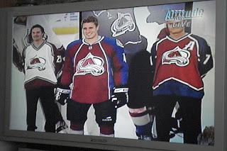
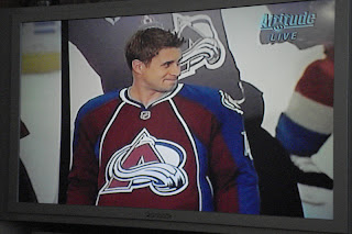
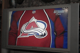
 The images were just sent to me, showing the Colorado Avalanche unveiling their new Rbk EDGE uniforms on Altitude. Our first look compares last year's sweaters with this year's.
I'm not normally one to judge these new jerseys negatively, but yikes.
I guess it's not the worst thing in the world, but it's certainly not an improvement. It's a shame because I always thought the Avs were among the league's best uniforms. Not so much anymore. Doesn't do the logo as much justice anymore.
But that's all just my opinion. Feel free to share yours below.


Reader Comments (34)
the last tv screen cap looks like a fat guy wearing an apron.
Here's a pic i found online
http://images.sportsline.com/u/ap/photos/CODZ101091213_1024x768.jpg
I think its an improvement over the old jersey
Photo Gallery: http://avalanche.nhl.com/team/app/?service=page&page=MediaGalleryPlayer&galleryId=2381
The look like a Circus tent...
i actually think that they're pretty slick. the old "mountain stripes" were really showing their 90s-ness. These are sharp as hell.
"Did you say SMAPRON?" -Homer Simpson
Smockron!
shoot me... just shoot me now... these are so ugly words can't even explain.
Horrendous. As a long-time Avs/Nordiques fan, these are horrible. I thin my eyes are bleeding...
Two-tone sleeves, nothing to break up the color change, different colored underarm gussets, no horizontal elements, nor room for the C and A, the apron/bib look, the giant RBK logo on the back... Did the Avs use a reject from Project Runway to design these?