Maple Leafs Unveil New Uniforms!
 Wednesday · Sep 12 · 2007 | 1:29 PM PDT
  73 Comments
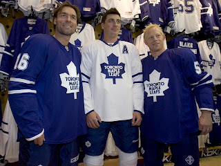
 UPDATE (6:37 PM): Normally I wouldn't put an update at the top of a post, but this one is the exception. Just got a hold of an excellent photo of the new jerseys that should leave no doubts.
Darcy Tucker, Tomas Kaberle and Jason Blake model the brand new Rbk EDGE jerseys for the Toronto Maple Leafs. You can read the original post below. Thanks to Jimmy who also linked to this image in the comments!
-----
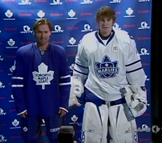
Today the Toronto Maple Leafs unveiled their new Rbk EDGE jerseys. We're getting our first look via screen grabs of the Leafs TV broadcast. Not impressive quality but it'll do until photos are out there.
Plain is the word here. I expect many of you will have that to say. And could there be more blue? You can't really see the socks in this image, but here's hoping they aren't solid blue too. More to come when I get it.
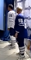
 UPDATE (5:11 PM): I mentioned that I hoped the socks wouldn't be solid blue. Thankfully, as you can see in this video still, they are not. The traditional three stripes can be found down there.
You can click on the picture to the left to enlarge it for a better look. (I think it's funny Kaberle and Blake are wearing tennis shoes with their uniforms. But the little things make me laugh.)
I'm still waiting for additional photos, but I'm adding more video stills to the Rbk EDGE photo gallery right now.


Reader Comments (73)
i feel so violated
I was at the press conference and saw the jersey up close. They got rid of the silver around the numbers.
I think they are nice and simple. Very classy. Unlike 90% of the other jerseys in the NHL. It's hillarious to watch the rest of you cry over it. I'll enjoy them...but I'll get my jollies laughing at the rest of you folks.
After watching the video, I feel a lot better about them. In the picture it looks like Tucker is wearing jammy-jams.
Hey Chris, a cool feature of this site would be a little voting about: rate the new Rbk jersey's from best to worse.
It would be a cool feature. Of course Avalanche and Panthers would be the worse ones, but people would tell.
For the Toronto Unis, remember that is the Maple Leafs. They have history, and they have sharp jersey's that reflect their roots. Great one.
I'm a step ahead of you there. It's all coming!
When all of the uniforms have been unveiled, I'm going to do reviews for all 30 teams. Part of the review will include a poll that will be left open indefinitely for readers to rate and rank all the new sweaters.
So stay tuned for that. I'll let you guys know all the details as soon as I've worked them out. Gotta give you a reason to keep coming back, right?
Thanks for all the comments, everyone!
Hey Chris you can add this to the LEAFS pictures, its a good one
http://images.sportsline.com/u/ap/photos/FNG114091218_1024x768.jpg
Man, those Marlies jerseys are pretty solid.
The blue blob next to it needs work, though...
Just saw you posted my pic, if I see anything else out there, i'll post links to the pics in here unless there is any other way of me contacting you..
Terrible!!!!!!!!!! So bland, and boring. Why get rid of the stripes on the bottom? What do the practice jerseys look like? Or are they just trying to save money by not having a difference?
I'll never own one of these RBK jerseys, and based on some comments from players I've read I expect them to die off, three seasons...tops.
200 bucks for a blue jersey? If they wanted to give the jersey a classy look go to the third jersey from the last few years adapted to the RBK, that I could deal with the jersey would be okay, though the RBK jersey is god awful!
These are like those crappy t-shirts you can buy that have the logo and a number on the back with a name...no stripes...I hate them possibly more than the 80's jersey..I was so happy in 92 when they changed it...this has to go!
Um, so what was the wait for? These jerseys are too damn sparse. Yes I know the only real difference is no stripe at the bottom, but wow what a difference it makes.
Terrible effort.
Just saw you posted my pic, if I see anything else out there, i'll post links to the pics in here unless there is any other way of me contacting you..
Hi Jimmy! You can post links here in the comments if you'd like. Otherwise, you can reach me personally by email at nhllogos@gmail.com. Thanks again!
They look like practice jerseys. Would it have killed them to put some kind, any kind, of striping at the bottom? It's like they woke up at noon today and realized they had to debut a jersey and just slapped something together in 10 minutes and hoped it would fly.
Hey Chris,
Don't forget in your voting pool to separate a white away jersey than a dark (home). I like the away lightning, but the home one is not my style, for example. Keep the job like that!
Hey all,
I think the only real way to let the Maple Leafs know that this jersey is uninspired and lacking the stripe, and that it looks like it was just thrown together today, it to go flood them with e-mail about how disapointing this look is, and if you're like me you dont intend to buy one, and you'll stay with last years jersey.
http://mapleleafs.nhl.com/team/app/?service=page&page=NHLPage&id=12715
Fan mail is where to send it. It's just so boring...I dont get it, the Red Wings, Canadiens, Bruins, Rangers all got it right..I'm sure the Hawks will...but the leafs yet again drop the ball.
I just want to agree with Jimmy -- these are basically practice jerseys with a couple of stripes on the arms...
what'd they do, let one of Ferguson Jr's kids design them?
I don't understand why everyone is hating on these uniforms. I'm a lifelong Leafs fan, and these look simple and classy. Yeah, a horizontal stripe would be nice, especially on the blue one, but it's not horrible without it. The fact that the shoulder logo is gone and that the silver trim is gone are both huge improvements.
It could be worse. You could have got something as butt ugly as those Vancouver sweaters or the Dallas ones if that pic of Turco is accurate. Be happy that tradition didn't get messed with.
Leafs got it right. Nothing wrong with those jerseys. Sometimes plain is good. They stayed with tradition, like Montreal, Detroit, and Boston, so far. It was the right thing to do. They can get all wacky next year with a 3rd jersey for all you freaks who need crazy styling.
this jersey honestly makes me feel sad. i cannot believe this is what the choose it's nasty. they should have brought back the old 70s jerseys.
This doesn't bother me. I'd have loved seeing the old 11 point leaf logos on the shoulders again, but it's not bad.
Also, if you think it looks too much like a practice jersey, watch the videos of them moving around. It looks much better in motion than in stills.
That's a hell of a lot of blue on the homes. A simple horizontal stripe at the bottom could have broken up the flood of blue and looked so much better.
I'm not a Leafs fan at all, so I don't really care. I was a fan of their jerseys, though.
AMAZING!
It's true that you can't please anyone.
A lot of people have bitched at all the new jerseys for being too different, too wild, too crazy.
Now, with the Leafs, we're hearing: too simple, too blue, too normal, too plain, too boring.
I like 'em. They look fine.
Is it just me or did RBK ruin all of the NHL jerseys because of the vertical designs they need to get serious i expected the leafs to have some stripping at the bottom of the jersey and if they did that it would look fine but because they didnt it looks horrible what is RBK thinkin they should be shot for doing this
No complaints.... but no complments either.. obviously with it being the Leafs they weren't going to go nuts with this jersey. it's exactally what i expected. but for all you people who think it's to plain, can you imagine the leafs in calgary or the islanders new jerseys? now that's something for the "just to freak you out"