Maple Leafs Unveil New Uniforms!
 Wednesday · Sep 12 · 2007 | 1:29 PM PDT
  73 Comments
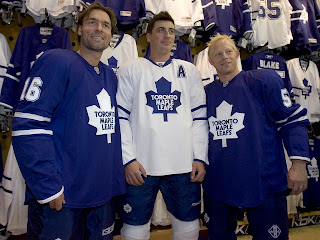
 UPDATE (6:37 PM): Normally I wouldn't put an update at the top of a post, but this one is the exception. Just got a hold of an excellent photo of the new jerseys that should leave no doubts.
Darcy Tucker, Tomas Kaberle and Jason Blake model the brand new Rbk EDGE jerseys for the Toronto Maple Leafs. You can read the original post below. Thanks to Jimmy who also linked to this image in the comments!
-----
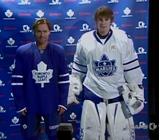
Today the Toronto Maple Leafs unveiled their new Rbk EDGE jerseys. We're getting our first look via screen grabs of the Leafs TV broadcast. Not impressive quality but it'll do until photos are out there.
Plain is the word here. I expect many of you will have that to say. And could there be more blue? You can't really see the socks in this image, but here's hoping they aren't solid blue too. More to come when I get it.
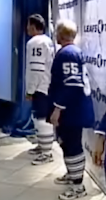
 UPDATE (5:11 PM): I mentioned that I hoped the socks wouldn't be solid blue. Thankfully, as you can see in this video still, they are not. The traditional three stripes can be found down there.
You can click on the picture to the left to enlarge it for a better look. (I think it's funny Kaberle and Blake are wearing tennis shoes with their uniforms. But the little things make me laugh.)
I'm still waiting for additional photos, but I'm adding more video stills to the Rbk EDGE photo gallery right now.


Reader Comments (73)
I hate these uniforms so much, I know the uniforms do not make the team, but they will never win another Stanley Cup wearing that Harold Ballard designed Leaf. And now they got rid of the bottom stripes. Jeez, why couldn't they just return to the third jerseys (circa 1964). Look at all the other original six teams keeping their classic look. So typical of the Leafs to screw it up.
Would you expect MLSE to make a bold move? All these guys do is play it safe. They have no vision. I love the leafs but we have the worst owners in the league and THE STUPIDEST FANS IN SPORTS who continue to buy inflated tix. I got news for you morons there's NO CUP COMING TO T.O. they dont have the talent, skill, or drafting ability to even make the playoffs. and even if they do make it they will get destroyed by ACTUAL CONTENDERS in the first round. Hockey fans know this. Most leaf fans don't
how sweet would those have been just with the 35 point leaf patches on the shoulders
Even if they added white accents to the bottom of the jersey and the collar of the blue one and added blue accents in the same area for the white, it would add a little bit more to these jerseys.
They're far from the worst out there - the Original Six look well on their way to being the only teams to remain virtually unscathed from RBK's aesthetic genocide - but they look like they didn't have time to add decorative striping before the unveiling date and just said 'screw it'. Vancouver/NYI/Buffalo have jerseys that are way too busy, these aren't busy enough.
As a die hard habs fan, I must say that the Leafs could've done a little better for their jersey. It does look like a practise jersey actually. I'm a traditionalist, I don't like to see too much change but a little more wouldn't have hurt!
Wow! These are great.
What is everyone complaining about. Have a look back at the history of the Leafs jersey. What has made them great is their consistancy.
CHECK OUT THE 1930'S UNIFORMS
http://www.nhluniforms.com/1930s/Images/MapleLeafs5.gif
To any Leaf fan that has said that this jersey is the ugliest by far must then think that their teams look is the worst the NHL has ever seen.
Dumb dumb dumb
I love the minimal design. Clean! They will look awesome on the ice.
I was hoping for something comparable to their recent 3rd jersey. At first sight I wasn't big on this one but that's normal, by November we'll be so used to it anyway. If I was asked to make a couple of changes I'd add a little more blue to the white jersey by adding a shoulder coloring like Montreal and Boston, I'd dump the trim from the numbers and add a white vertical stripe to the pants.
As is, this uniform will look far better than the overdone projects out there this year.
Really though, is it really necessary for Rbk to have the stupid looking tails on their jerseys, it's an eye sore for all the white bottomed designs.
I don't know why they don't get rid of the Ballard Leaf, do you really want to remeber the guy who destroyed the history Con Smythe built. I'd be keeping my distance from that sucker as much as I could. I still like the old old school leaf.
The most interesting thing to me, is that in the first photo of the post, all three are wearing different pants. And, to top it off, Tucker is wearing CCM. What's up with that?
Wow, it seems like it's either one extreme or the other with these new jerseys (too over the top or too plain). These are really boring in my opinion. Some sort of horizontal striping at the bottom of the jersey would have jazzed things up a little bit.
HAHA... I can't believe the Leafs will be wearing practice jerseys for real games!
Actually, they play real games as if they're just skating around in practice, so maybe it's fitting!!
Enjoy another 40 cup-less years Leaf fans!
Fantastic! Now I can finally afford a (nearly) authentic jersey for my kid. I'm off to the dollar store to find a long sleeved blue t-shirt and an iron-on Maple Leaf logo.
He'll never know the difference.
Way to go Leafs!!
As a Leaf fan I know I'm biased, but although I was expecting something flashier I am really happy with the jersey.
For those of you who wanted major changes ( see Vancouver ) come and talk to me in 5 years and see which jersey still looks good...
Hey Chris !
Love your site buddy !
Another vote that would be nice is to compare jerseys from last year and this, this for every team...
lots of future after the logos tournament !
at least vancovers jerseys look like they are ment to be played in a game, not a plain white/ blue practice jersey with two stripes on it. I thought that the old ones where boring, but now i really see wat is boring. I have seen minor hockey jerseys that blow these out of the water. oh well leafs jerseys reflect how they play, shitty.
as a huge leafs fan i am impressed with what they have done with the new RBK jersey. Its okay for all those southern American teams to have "freaky" designs because they dont have tradition and most of the fans just want something flashy and most dont understand the history and importance of the hockey jersey. As long as the leafs unis are blue and white and they didnt change the best logo in the NHL, im happy. I was very afraid after i seen brutal jerseys like Dallas. Do they know they are playing in the NHL and not in the NCAA? But the main thing is there are no drastic changes to the leafs unis and i am going to buy one the first chance i get
Not much to change for the Leafs unless they want to go radical, ditch history and opt to go Red, White and Silver.
U....G.....L.....Y These Jerseys Got no Alibi, they ugly!, Hey, Hey they UGLY!!!!!!!!!!
Sooo.. those are the practice jerseys when do the game Game jerseys get released... ohhh those are the game Jerseys ewhhhh
Well I though Vancouver's was Ugly congrats Toronto on even making our jerseys look good.. EWHHH thats Awful..
I am disappointed, it is too plain, much like a practice jersey. The body stripes and shoulder patches should be retained. Hopefully the third jersey will not be similarly oversimplified.
i wouldve appreciated the new leaf jerseys if they brought the old school 35-point leaf logo back for both jerseys and kept the 2 bottom stripes at the waistline. other than that, as a dedicated leaf fan, i cant possibly picture the leafs winning the stanley cup with those practice jerseys on.