Canucks, Here's How You Fix It
 Saturday · Sep 22 · 2007 | 4:40 PM PDT
  14 Comments
 I'm starting another new series tonight — because you know I just love series. In "Here's How You Fix It," I'm going to post Rbk EDGE concept art designed by fans who feel their team's new uniforms are less than stellar. The reason I'm starting with the Vancouver Canucks is because of the sheer volume of work I've gotten for them.
So we'll start with the most conservative and work our way out.
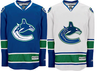
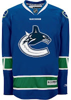
The biggest complaint these jerseys have garnered since August 29 is about the text over the logo on the chest. Along with that is the fact that the logo and jersey colors don't match. The jersey has prominent green stripes yet there's not a hint of green in the logo. This design takes care of both of those problems, it's already so much improved.
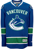
Now I say that despite being among the less-vocal group that isn't bothered by the giant VANCOUVER across the chest. So, consider leaving that — we'll just add some green to it.
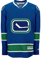
Either that or move the stick-in-the-rink logo to the crest. Also a good option because now it matches the design scheme of the jersey much better.
But back to the text. What say we dump the logo all together on one sweater and go the route of the mid-90s Pittsburgh Penguins.
But if that's a bit to liberal for your tastes, there's no reason we can't just leave the logo how it is and simply shrink the name of the city. Hell, even a couple of Vs around the elbow might be all right.
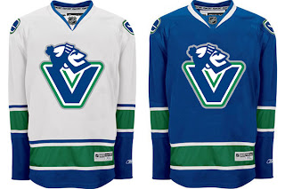
Now if you really want to go wild and crazy, among the new logos unveiled by the Canucks as part of their rebranding was the one you see featured on these sweaters.
To me, that is what a logo should be. I'd venture to say it's damn near perfect for this team. I recognize not everyone will agree but that's why you can never make everyone happy with these things. Half of everybody wants to relive the "good 'ol days" while the other half wants to unload a stale image. Personally, I think this makes for a pretty good mix but what do I know?
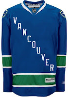
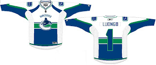
One thing to note is that the designs above have changed nearly everything but for the striping pattern on the jersey itself. So I'll share one more concept that toys with that.
It approaches the Montreal Canadiens a very small bit, but doesn't work because of the contrast between the top and bottom. You'd never be able to read the number on the back of the sweater. The nice thing this design makes use of is smaller text above the logo on the crest.
By the way, all of these designs and many more can be found in the Concepts Gallery.
What do you guys think? Would any of these be a good fix for the Canucks' Rbk EDGE jersey? Is it irreparably broken or is great just the way it is? Comment below.
Up next: Colorado Avalanche.




Reader Comments (14)
the first concept of taking away the lettering and adding green would make this jersey perfect.
The first concept is cool, but I think it needs to incorporate a giant V into it somehow, like around the neckline or something.
That green in the logo makes him almost phosphorecent. A great upgrade.
As a side note, I think I'm one of the first person to own a Rbk jersey in Quebec city. Only one store has them, and not even on display. So I got mine on tuesday.
I choosed a Capitals red one. First thing I noticed was the poor quality of the shoulder patch. Completely cheap. But great looking because that eagle rule.
The crest is ok. I tried several times a Medium and a Large jersey finally opting for a Large. Not sure even now about that one. The medium I used for my test was a Pittsburgh one, and the crest was not exactly in the same league than the Capital. So it was a difficult call.
But a too great jersey is better than a small one, so I went for conservative guess.
Overall my new jersey is great. The red blends perfectly with the blue on the color scheme.
As for the display, these new jerseys don't have the same cut than the others ones. So on the wall, the jersey is not perfectly flat. Irritating.
And, as the Rangers fans, I wonder why the jersey has a tail.
But all said I'm more than happy to have my first jersey of that new era. The next one I'm getting is the St-Louis Blues, the blue one.
Fix the Logo huh? :) I think you need to call in us experts when it comes time for the Sabres, Chris.
This is my crazy plan. Once I am able to check out a pro version of the new sweater in person and see how it is stitched, my plan is to buy one, take off the Vancouver and move the crest up a bit.
The other part of my plan involves putting the crest onto a blank Oiler's third jersey from last year. I think the logo (from the home sweater) would work well with the dark blue and grey/silver.
Then I am gonna wear it to GM Place in the new year when we're there. :-)
If I can't have the jersey I wanted, I will make the jersey I wanted.
The first one is brilliant. I didn't realize how much difference the green made until I took another look at their actual jersey.
Same with the lettering. I wasn't crazy about it, but didn't think it was horrible.
But now I have seen the(green)light.
The first concept is 100 times better than what they have.
The Johnny Canuck one is pretty nice too.
I guess I'm in the mood for crazy ideas tonight. But what if they kept the orca flying out of the ice, but forming a V instead?
Man I really wish I had artistic ability. I'd love to see my ideas on paper. Not because I think they're good mind you :p. Just because they're crazy. I like crazy.
New Jersey + More Green = Best Jersey Ever.
What Else Can I Say, Most People Hate the "VANCOUVER", I Hate the Lack of Green. Adding the Green to the Orca and the "VANCOUVER" Makes it Look Much Better.
I Think this Should be the Basic Outline for the New Orca,
Blue and Some White for the Orca,
Green as the Outline,
White for the Ice,
and Silver for the Outline of the Ice
This should apply for both Home and Away, Because When I Look at the Away Jersey The Blue on the Orca and the Ice looks like it's the Same Colour, Even though it isn't.
The Outlining of Green on the "VANCOUVER" Blends Quite Well, I wonder if it would work on the Name and Number?
Wouldn't Mind Seeing The Re-Done Stick and Rink as a Third Jersey Logo. Not Sure about Johnny Canuck one though.
P.S. Great Blog Site You Have Here!
I can't believe that the designer of that jersey didn't see that adding green to the logo and removing that VANCOUVER across the chess was the thing to do.
If their jersey was the first on the post, the one with the green added and the wording removed, I'll go buy one right now.
More Cansucks bias. Ridiculous!
I too am not a huge van of the giant word Vancouver across the chest....but for what it's worth, they look 100 times better on the ice in an actual game. so much so that I actually like them! The colours look amazing, especially the royal blue. (Thank goodness for an original colour scheme).
With that said, adding green to the logo and removing the word vancouver would make it absolutely perfect. We'll see what happens next year after enough complaints.
More Cansucks bias. Ridiculous!
Is something bothering you, J.R.? (By the way, you misspelled a word. lol)
Thanks for the comments, all!
I think the Canucks jerseys are great the way they are! I thought it would be nice to add green to the logo, but looking at these concepts I now think the green would stand out too much and take away from the logo itself.
I too believe these jerseys look great on the ice. I've seen them live twice now and the royal and green combo has really got character to it...not to mention that it is way more representative of the region. The Vancouver wordmark is pretty unique and historical and I've now heard from so many people in Vancouver that disliked the jerseys at first, but now like them and even, god forbid, love them. They're the type of uniforms that, years from now, people outside of Vancouver are still going to dislike but Vancouverites will think are the best in the league. It's cool to have recognizable character jerseys like that!
The white jerseys look like short sleeve shirts from a distance. Why is the cuff blue? It's not white on the home jersey. Just other mistake on the already hideous new jerseys. I hate the cheezy mixture of old and new. Either stick with the old style (maybe tweek it) or go with a bold new style, but both just looks lame.
I wish the Canucks did not have the "VANCOUVER" on the front of their jerseys. Everything else is just fine. I'd support the use of the modernized stick logo as the crest logo or that updated Johnny Canuck logo with the V on it.
No damn way do I want to see "VANCOUVER" written diagnolly across the jersey! Talk about cheapening the look of a jersey.