Toying With TML
 Saturday · Sep 22 · 2007 | 4:55 PM PDT
  9 Comments
 I don't know why I've been skimping on the concept art posts. I have plenty of stuff to share. Tonight, we're going to take a look at the Toronto Maple Leafs logo. I'll be the last person to say it needs to go, but I'll be among the first in line to call it dull. (Consider its early exit in the tournament.) In other words, dull logos are all right for teams with a history as rich as these guys.
Now having said that, let's mess around a little. Seems like the Leafs have always have a logo that featured a leaf. Makes sense. But a few years ago they introduced a secondary mark that wasn't shaped like foliage. If I'm to understand correctly, it was met with disinterest by fans. Many were happy to see it go when the Leafs unveiled their Rbk EDGE jerseys recently.
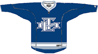
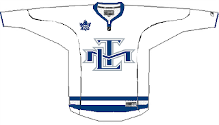
So to those people, prepare to have your eyes assaulted by this.
It's just the skeleton of an idea someone had. Not a bad idea but it needs some work. No matter what, a leaf needs to don the crest of both main jerseys. However, I don't see why these couldn't work as an alternate sweater.
Something cool I ran across a long while back is this logo.
The TML actually forms a leaf. The leaf. Very creative if not slightly awkward to look at. So what about this?
I think there are enough logos enclosed in circles and this probably wouldn't work on a jersey, but there it is anyway. It sounds like I don't have anything good to say about any of these designs, but that's not true. I like them to some degree but I'm not oblivious to why they wouldn't work. While I understand the double-lines in the logo above, it just seems empty.
Anyway, what do you guys think? Does the leaf need some work? Or is it untouchable?


Reader Comments (9)
That's probably the best set of Maple Leafs logos in the history of Toronto having a hockey team. Much better than the stale looking logo that they kept around for the utterly BORING jerseys they flaunt nowadays.
I think the only thing that would make it better would be to switch the color scheme from blue and white to either red and white or green and white. I mean, who has ever seen a blue maple leaf?
Anyways, that's just my opinion. I'm sure I'm going to be in the minority on this one....
The TLM in the form of the leaf is interesting. I guess it is a little awkward, but it isn't bad. I like it.
But really, they should go with a plain leaf. Preferably the 1838 one. Get rid of the team name on the logo completely. Maybe incorporate the CN tower or something(like maybe have it as the stem).
Or something else that symbolizes Toronto. On the coat of arms, theres a leaf on a gold hexagon medallion hanging from a Beavers neck. What if you leafs changed their logo to a gold hexagon with their blue maple leaf in the middle. It would be a very subtle reference to the Coat of Arms.
Toronto is known as Hog Town and the Big Smoke. So how about changing the logo to a pig smoking a maple leaf? haha Man, I would love to see that, I wish I had some artistic talent. That was the Sens fan in me talking.
I meant 1938.
the TML leaf is awesome. id be interested in seeing the empty white space be filled up with blue so its only a subtle TML outline in silver
Sorry...but that's hideous! The TML logo was a horrid idea and I'm glad it's gone. Most people who like it are not Leaf fans. I'll stick with my "boring and bland" leaf logo and jersey, Thank you very much!
good riddance to bad rubbish, I'm glad the TML logo is gone. The jerseys is another story too plain if the organization took a hard look the piping that they removed from the bottom of the jersey was usually there on the jerseys historically. the bottom line the jersey is too...PLAIN but glad they got rid of the TML logo
i kind of like that tml in the shape of a leaf, it's more interesting than the original tml logo. that might not be too bad as a shoulder patch on a jersey with the 1938 logo as the crest. leafs fans may abhor that though.
This is a subliminal logo that the Maple Leafs made when they shortened the number of
Montreal Canadiens games shown on HNIC, and showed more Maple Leaf games...The initials TML actually form MTL, which stands for MONTREAL! They used this to submlinally ease Habs Fans to cheer for the Leafs, as the city initials are on the Leafs jersey
Oh God, yuck! I'm thrilled that the TML logo on the Maple Leafs' shoulders are gone. Putting it on the front as a crest logo? That's even worse.
Sorry, I have zero support for such a concept... no offense to the designer, of course.