Ducks, Here's How You Fix It
 Wednesday · Sep 26 · 2007 | 3:31 PM PDT
  6 Comments
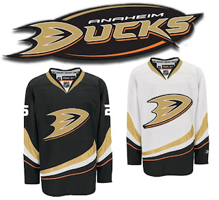
 We're working our way through the less accepted jerseys that have been introduced at the hands of Reebok this offseason. Today we're addressing the Anaheim Ducks, specifically.
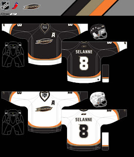
One of my pet peeves is wordmarks passing themselves off as logos. So you can imagine my disdain for the Ducks' new logo when it was introduced last summer. Now it's the smallest crest on any of the new Rbk EDGE uniforms (Dallas' home sweater doesn't count because that's another animal altogether). So here's a simple fix.
How hard would that have been? Really? So disappointing.
But let's just say for the sake of argument that this suggestion is too drastic. What about this?
It's very subtle, but adding that black oval behind the wordmark does wonders for it. If you ask me, it doesn't do enough, but it's definitely better.
Am I way off base here? Ducks fans, do you approve? If you have any suggestions yourself, email me and you might just see it posted here one day soon.
Coming up next: Edmonton Oilers. And Oilers fans, you aren't going to want to miss it. Man, did your club miss the boat on this one. Knowing you guys the way I do, you're going to love it.


Reader Comments (6)
Just the D by itself is too plain.
I actually think that the ducks did pretty good considering their crappy logo, and hopefully next year they will maybe use that other duck logo that was leaked but not used(or a better one). And maybe they will also move to Milwaukee or Kansas City so the name and logo is more appropriate for the area. Why does Los Angeles have two NHL teams Anyway?
Why does Los Angeles have two NHL teams Anyway?
Thanks, genius, but why not ask the hard questions? Why can't Phoenix field an NHL team?
they need to go back to the duck goalie mask. that was cool
touche, earl sleek
The big "D" logo is a no brainer. They should have gone with that design last year. I still need time to get use to the 'stripes'. The other duck logo would have been a good choice too.
I still think the classic Disney duck mask is better.
Having the city and the name (Anaheim Ducks) is a too much to read, like the Dallas Stars (away). At least the Ducks elected NOT to go with "ANAHEIM" on their chest.
The Big D would be fine. Although I pretty much hated it when it was first released. Funny how a Stanley Cup can get you attached to something.
I wouldn't mind the new colors with that leaked duck logo. I also wouldn't mind seeing something like the Penguins 90's logo or even the cartoon like current Penguins logo.
I ALSO wouldn't mind seeing the Disney Logo come back. Maybe with harder edges or more angular or something. A remix of it if you will to match the black, gold and orange style.