Rbk EDGE Review: Avalanche
 Wednesday · Sep 26 · 2007 | 2:04 PM PDT
  7 Comments
 Part 3 of 30. All 30 NHL clubs have unveiled new jerseys under the new Rbk EDGE Uniform System for the 2007-08 season. Here at the NHLToL, we're going to review every one of them. Read up and then rate the new sweaters. We'll do a full ranking after completing all of the reviews.


The Unveiling
Wednesday, September 12. The Avalanche unveiled their new uniforms to the public at a press conference.
Home vs. Road
Home: Burgundy. Road: White. The two sweaters are essentially mirror images of each other in terms of overall design and both feature secondary logo shoulder patches.
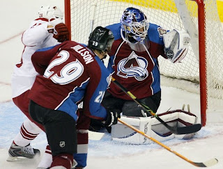
The burgundy home jerseys feature thick, blue stripes down the sleeves. There is also a blue panel extending up the side of the torso to the armpit. Thin black and white piping lines the sides extending down from the collar.
The white road jerseys feature thick, burgundy stripes down the sleeves. There is also a burgundy panel extending up the side of the torso to the armpit. Thin silver and blue piping lines the sides extending down from the collar.
In The Details
The same shoulder patches featuring the secondary logo are found on both shoulders of each sweater. The collar is blue, outlined in a thick silver stripe. The unique numbering and lettering style has been retained.
New & Old
The biggest difference between the old new sweaters is the new striping and pattern of the Rbk EDGE jerseys. Gone are the zig-zag, mountain range-shaped stripes extending the length of the sleeve. A similar element around the waist is also gone, leaving the waists of the new jerseys blank.
Standard FAQ
Numbers on the front? No.
Laces at the collar? No.
NHLToL Editorial by Chris
If you'd asked me a year ago which NHL club had the best uniform, among the list of those I'd seriously consider would've been the Avalanche. That was until now. I recognize the limitations of the EDGE design but refuse to accept it as a valid excuse. I really liked the mountain range thing along the arms and waist. It's sad to see it go. Though, to be fair, the overall look of the jersey remains largely unchanged. Beyond that, the piping extending down from the collar makes the logo seem trapped. All in all, this could've been so much better. 3/5


Reader Comments (7)
I could do without the piping on the cest of the jersey. But to say that it's a complete downgrade from the old jersey is wrong.
It's the best overall jersey in the NorthWest division (Vancouver's has the city name, Calgary has the Alberta clash patch, Edmonton's looks like a practice jersey, and Minny looks like a christmas tree with a giant circular ornament)
I love this jersey!
Don't understand all the hate being put on it.
(Not just to you Chris)
One word...piping!
Overall I like them, but the vertical piping takes it down a notch. So unnecessary.
I agree that the logo looks trapped, maybe they should remove the oval around the a. I wonder if that would look any better.
I think that a stripe down the arm to seperate the blue and burgundy would help. It looks unfinished like this.
Piping seems to be the popular theme this time around (every team) Must have been on sale at Rbk. Yuck
I was not impressed that the 3rd Avs jersey had to go, it really became a favorite of mine. Now seeing the new set of home and aways I just find them avaerage if not a step down. The main reason is the piping on the front that traps the crest, I hate looking at Joe Sakic on the ice because his C goes right over the piping, it just isn't clean looking. I was hoping Colorado would have jumped on the popularity of the 3rd jersey and used it as the new home but that's ok it will come back someday.
The only other thing that stands out poorly to me is when looking from the back, the blue goes up the shoulders and tries to encompass the nameplate, almost too clean looking. All in all, the jersey just fell a bit short to me.