Mailbag: New Canucks Logo Looks Familiar
 Saturday · Sep 29 · 2007 | 1:07 PM PDT
  3 Comments
 This morning I woke up to find one of the funniest emails I've received since starting this blog.
To set things up for you, one of the sites I frequent is Chris Creamers SportsLogos.net. It's an excellent resource for a blog like mine. When the Vancouver Canucks unveiled their new uniforms last month, a bunch of alternate/secondary logos appeared on that site — none of which I saw in any official NHL/Canucks capacity, however.
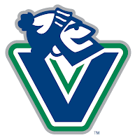
Anyway, among them was a logo that I personally thought could serve amazing well as a primary mark for the club. This is it.
Now the email.
Hey Chris!
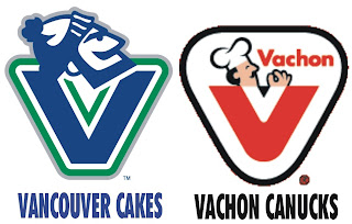
Is that really an official secondary logo? If so, I've attached this! You may find it funny!
In Canada, we have these things that are like Hostess Cakes in the States.... Vachon Cakes! They're very popular.... and tasty! And I've heard that ol' goalie Rogie Vachon is a close relative to the family that started the company!
I knew I had seen the Vancouver 'Johnny Canuck' logo somewhere before..... hmmmm! I mean, mmmmmm!
So what do you make of that? I just thought it was very funny and felt it was worth sharing.


Reader Comments (3)
I still want to know if that Johnny Canuck logo is official, and if so, in what capacity is it being used?
Well we don't have those in Western Canada.....but it is a little too similar!
I'm glad I wasn't the only one who saw a similarity between that Canucks logo and the Vachon logo!