Capitals, Here's How You Fix It
 Saturday · Sep 29 · 2007 | 1:28 PM PDT
  7 Comments
 The sixth entry in the Here's How You Fix It series will take a look at the Washington Capitals' new duds.
One of seven teams to introduce new or updated logos, the Caps we the route of the old days by creating a wordmark logo that harkens back to the 1970s and the arrival of the team on the NHL scene. Now it may just be a personal complaint I'm voicing, but I don't really understand the striping patterns on the new sweaters. They just do something strange along the arms and sides if you ask me.
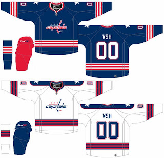
So in the interest of considering a more traditional — heaven forbid — striping pattern, I thought I'd post this concept which was emailed to me by a reader.
The striping is simple and I love the stars on the shoulders. I also like the Capitals in blue as opposed to red or black — like the had been wearing. Another neat aspect of this concept is that the colors of the logo are swapped for the home and road jerseys. Little things like that are what make me like a uniform.
How do you feel about it? Leave your comments below.
Coming up: San Jose Sharks.


Reader Comments (7)
after picking up tickets for the caps home opener, i browsed the verizon center store and their sweaters consistently remind me of the russian national hockey team, quite fitting as their main star is from russia so it makes one think what they are trying to capture with the updated or modern logo and sweaters.
in case anyone is wondering, a replica ovechkin jersey costs $190 whereas a tshirt jersey costs $27. both overpriced indeed and the quality felt quite inferior.....
Very nice and much better than what they have now. I totally agree about the vertical arm stripes. They're just wrong looking. I don't understand why so many seem to love the Caps' new look.
im a huge caps fun and i love the new look. although i was leery about both the new logo and the jersey design at first, they've grown on me a lot. the concepts are cool, but i would much rather see them wearing what they already have.
This "Fix" is too Columbus Blue Jackets in my book
The new Capitals jersey ia a winner.
this jersey aint broke- dont 'fix' it. this concept looks more like the rochester americans to me.
The concept is too boring. If you are going to have a wordmark as a logo, you have to do something a bit more interesting with the pattern.
I also really like the "Weagle" shoulder patch, and the star replacement dulls it down. The concept might look a little better with the Weagle on the shoulders to give it something a little more interesting.
I do want to see a Weagle logo on the third jersey though.