Flyers vs Bruins
 Sunday · Jun 17 · 2007 | 10:19 AM PDT
  Post a Comment
  |  | |
The Aesthetics
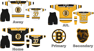
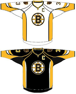
Here, both logos are very simple and very similar. Black and white are featured primarily with a slim helping of a color and each features the first letter of the home city. While the Bruins logo simply features a "B" in a circle, the "P" attached to a wing in the Flyers gives the feeling of movement and is therefore more eye-catching.
Flyers
The Nickname
Assuming the Flyer is a bird, when it lands in the tree, the Bruin will climb up and eat it. Yum!
Bruins
The Analysis
Both teams have been around for a long time. And while the Bruins emblem has gone through many alterations and upgrades, the Flyers logo has remained largely the same throughout its lifetime. Cheers to staying power and Halloween colors.
Flyers
 |


 2007 Qualifying Tournament