NHL Tournament of Logos

Entries in bruins (66)

Monday
Aug272007

Result: Bruins vs Capitals

Boston
BRUINS

61% 6,438 votes

Washington
CAPITALS

39% 4,123 votes

10,561 total votes

Boston Bruins
Advancing to Quarterfinals to face Ottawa Senators

Washington Capitals
Eliminated


Poll opening date
Aug 20 @ 4:22 AM
Poll closing date
Aug 27 @ 11:59 PM

07CHTRN | #E1E | BOSvWSH

Monday
Aug202007

Poll: Bruins vs Capitals


vs
Boston
BRUINS
Washington
CAPITALS


Place your vote and then feel free to leave a comment as to how you came to your decision. Tell all your friends to drop in and vote! The more voices heard, the more accurate the results!

Poll opening date
Aug 20 @ 4:22 AM
Poll closing date
Aug 27 @ 11:59 PM

07CHTRN | #E1E | BOSvWSH

Thursday
Aug162007

Stars, Bruins Concept Art

A while back I posted this idea for a redesigned Dallas Stars jersey. Well, another fan put a twist on that design by doing a little reworking of the current Stars logo.

The 3D effect in this version of the logo is pretty cool, though personally I'd prefer to see a complete overhaul of the Stars logo. Keep the colors but come up with a new symbol for the team.

I also have some Boston Bruins concept art to share. These sweaters were designed after the B's unveiled their new logo back in June.

Not too bad, but I'm a big fan of the Bruins' new Reebok uniforms. I can't see any reason to alter them. Classic. Regal. The same designer also came up with an alternate in yellow.

As usual, if you've got an opinion on any of these designs, feel free to post them in comments area.

Tuesday
Aug072007

Hurricanes vs Bruins


vs
HURRICANES
BRUINS
12-1
8-5

The Aesthetics
I've always thought the puck in the eye of the storm was a clever feature of this logo. But I just don't know if it necessarily stands up to the Bruins logo. It's a piece of hockey history that despite what some of you may have come to believe, I don't hate. I think the recent changes/updates brought about make a world of difference to it. Kudos the Bruins for refreshing an NHL icon.
Bruins

The Nickname
Hurricanes bring hell on nature. Even a Bruin wouldn't be able to escape its wrath.
Hurricanes

The Analysis
We're right down to it now. One point apiece makes this the deciding factor. It's also the last match of the tournament for each of these logos. Time to analyze. The hub reference of the spoked "B" is excellent. But so is the hurricane, which has proved its greatness in the last 13 matches — at least my opinion (call it what you will). Under normal circumstances, I might've taken this point from the Bruins for lack of a bear in the logo. But I'm feeling generous today and the simple fact is, it says Boston. The same can't be said for the 'Canes logo.
Bruins


WINNER
2-1


Monday
Aug062007

Cool Sens Concept, Bruins Too!

A lot of people responded well to the Islanders concept art I posted yesterday. It came from the artist who also designed the Thrashers concept art from Friday. (NOTE: I updated that post with higher-resolution graphics if anyone's interested.)

Anyway, I have some more work from that same artist who posted his work on Chris Creamer's Sports Logos Community. As a disclaimer, I need to point out that none of this is official team artwork, but I thought it was fun to look at just the same.

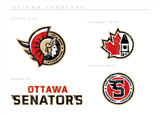
This logo set appears to be merely a revision of the current look of the Ottawa Senators. Personally, I prefer leaning more toward the yellow-gold over the beige color seen here. That's not to say that this color scheme doesn't work well, though.

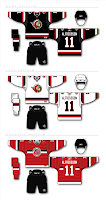
Do you guys like this designs, the current one, or the one rumored to be taking over in the fall?

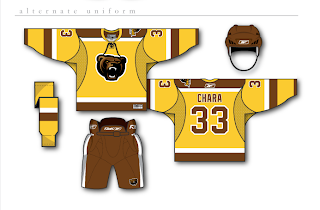
Next, we have a look at some logos that are irrelevant when you consider the Boston Bruins just changed their logos back in June. But have a gander anyway, if you're inclined.

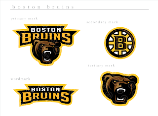
If you ask me, that's a pretty sweet Bruins logo, setting aside the fact that a drastic change like this would likely send the Boston faithful into a frenzy. I'm not sure how I feel about the re-imagining of the spoked "B" though. It isn't sitting well with me.

I'm loving the bear, though no one's asking me, and wondering whether I like it more than the new one that was unveiled a couple months ago.

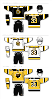
And then for those of you longing for the days of the yellow and brown, our talented designer leaves us with this other alternate uniform design.

Monday
Aug062007

Bruins vs Canadiens


vs
BRUINS
CANADIENS
8-4
9-4

The Aesthetics
Ah, old time hockey at its finest. I think the Canadiens could stand a logo upgrade in the vein of the Bruins. Not that there's anything wrong with how it is right now, I'm just in the mood of modernizing logos. It's looked exactly the same for almost 60 years. Anyway, forget that. Don't change it. I like it just the way it is. But the Bruins get this point for being cooler.
Bruins

The Nickname
I would say that a Bruin could eat a Canadien like it was nothing, but I've recently been informed that a number of Canadians are rather rugged folk so I'll have to put my money on them taking out the bear with their rifles and stuff.
Canadiens

The Analysis
I like the symbolism in both logos that alludes to the history and home cities of each club. More than that though, I still keep thinking I'd rather see an actual bear in the logo as opposed to the traditional spoked "B." This isn't to say the "B" has no place on the uniform. Place is on the shoulder. But take the new secondary logo and use it. But the spoked "B" is such a classic. What would the NHL be like without it? It's really a tough call. Anyway, there's no confusion with the Habs' logo. It is and always will be a classic. And that's all there is for the Canadiens in the qualifying round.
Canadiens


WINNER
2-1


Friday
Aug032007

Bruins vs Devils


vs
BRUINS
DEVILS
8-3
12-1

The Aesthetics
I was going to make a comment about how both of these logos have circles for primary elements. But what's wrong with circles, anyway? They've long made for great logos worldwide in every aspect. Anyway, they each also have letters inside their circles. Though, here's where I think I'd be more impressed if the "B" formed some sort of bruin since the "NJ" manages to form a devil. Good stuff.
Devils

The Nickname
Devil, all-powerful, et cetera. Bruin, itty-bitty bear in comparison. Fire, brimstone, hell, move on. Stupid Satan. Go ahead, smite me with your pitchfork! (Okay, that's enough.)
Devils

The Analysis
I don't know what it is that makes the Bruins logo stand out so much. Maybe its the thick black lines over yellow. Not that the Devils logo has nothing to offer. This is a tough one. But I have yet to actual mention this so I'm going to take this opportunity. It's been pointed out to me that the spokes behind the "B" form a wheel, a hub if you will. And why is this significant? In fact, Oliver Wendell Holmes referred to the State House in Boston as the "hub of the solar system." Long story short: It stuck. And here we are. The Hub of Hockey. End of the road for the Devils, by the way. Count 'em up.
Bruins


WINNER
2-1


Thursday
Aug022007

Lightning vs Bruins


vs
LIGHTNING
BRUINS
6-5
7-3

The Aesthetics
The Bruins have a logo that despite only minor changes, is significantly improved. The Lightning logo spells out the team name. And if the rumors of the new logo hold to be true, at least one of those words will be removed. Anyway, no point for the Bolts here.
Bruins

The Nickname
Not even a Bruin could withstand getting struck by a bolt of Lightning.
Lightning

The Analysis
At least there's a bolt of Lightning in that logo. There's no bear in the Bruins logo. But that can't be the only factor for this point. The Bruins logo is just much bolder. I think it makes a better logo. Maybe the Lightning can make an improvement when they unveil theirs later this month.
Bruins


WINNER
2-1


Monday
Jul302007

Bruins vs Penguins


vs
BRUINS
PENGUINS
6-3
3-7

The Aesthetics
Looking at these two logos side-by-side, it's fairly obvious why the Penguins shouldn't have switched to the Vegas gold. Which one of these stands out more? But like all you Pens fans know by now, the hockey gear the penguin is wearing bothers me. I can't explain it.
Bruins

The Nickname
Giant carnivore versus tiny, flightless bird. Is there any question the Bruin eats the Penguin?
Bruins

The Analysis
Unfortunately for the Bruins, this won't be a sweep. The reason is that I see a penguin in the Penguins logo but a bruin is nowhere in sight. (I take that back. Check the shoulder of the jersey.) If only they'd make that bear in the secondary mark the primary logo. But the truth is, the B's logo is one of the most recognizable in sports so to change it would probably be silly. Still, I stand by my rules for this tournament, despite the bullshit they produce.
Penguins


WINNER
2-1


Sunday
Jul292007

Sabres vs Bruins


vs
SABRES
BRUINS
5-4
6-2

The Aesthetics
It's a bit of a toss-up here. I think both logos are pretty aesthetically strong. But these are both logos that have been changed in the last couple years. As far as improvements, I think both are better than what they had, but that the Bruins logo is more of an improvement than the Sabres. The return to traditional colors was nice but for a way to make it better, just ask John Slabyk.
Bruins

The Nickname
This would have been a good showdown if it was bruin and buffalo. But instead, it's Bruin versus Sabre, and with the latter in the hands of an experience swordsman, I have my doubts for the big bear.
Sabres

The Analysis
Neither logo portrays its name it's meant to very well — although the case has been made that there's a blue sabre along the back of the buffalo with the horn also serving as the handle. I'd still like to see the secondary logo on the crest sans the word marks, but that may have to wait until the day third jerseys make their glorious return.
Sabres


WINNER
2-1