Odd Art, Part II
 Wednesday · Oct 10 · 2007 | 1:25 PM PDT
  9 Comments
 First off, if you missed Part I then click here. Now that you know what's going on, let's dive right in. You know you like the weird stuff I post here.
We'll get things going with some imaginative Original Six designs.
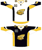
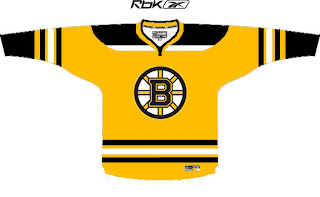
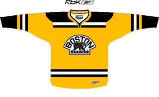
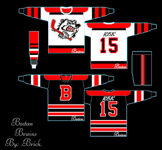
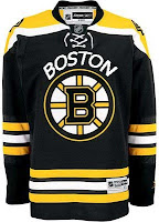
Let me begin by saying the new Bruins jersey is not something you'd be wanting to mess around with. Trust me. It's that awesome. Now, as far as this concept goes, history has taught me that logos like this were probably not originated by the creator of the jersey design itself. If anyone would like to explain from where this particular Bruins logo is derived, leave a comment.
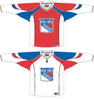
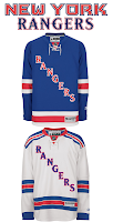
The Rangers jersey is interesting because there's actually a logo on it. A novel concept, not exactly, but it's something I feel the Rangers have struggled with. The 1970s taught us that this might not be the best use of the logo. I'm also concerned about the whole Broadway Blueshirts thing. For those of you lacking the ability to tell one color from another, that is red.
I will say this though, I am a huge proponent of the Lady Liberty logo and those jerseys. They've used a blue one and a white one and both looked better than anything the Rangers have ever worn. I might even go so far as to say it's the best any team has ever worn. But my suggestion to the Rangers is go with the NYR logo full time, and save the current sweater as a third jersey — beginning next season of course.
But who would want to listen to me anyway?
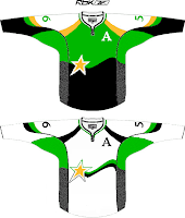
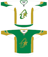
I haven't yet been able to fully grasp what's going on here but near as I can figure, we're looking at a couple of concepts for the Dallas Stars/Minnesota North Stars franchise. I get the shooting star thing in the one on the left, but I really can't work out what's going on in the one on the right. If you have any ideas I'd be happy to hear them. Comment away.
But that's not all. I'll leave you with one more today.
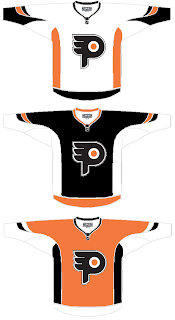 I understand what the designer is trying to do here, but I don't think the "P" in the real logo is that difficult to see. It doesn't jump out at you, but it shouldn't. Logos are meant to be looked at over and over again, so they're more effective when you discover something new every time you see it.
I know a lot of folks would disagree with me on that, but I think it's the reason the Minnesota Wild's logo is so spectacular.
But back to this. The striping is not great and the logo doesn't really need a change. But I feel like an ass for having nothing good to say about it. It's not like it's the worst thing in the world, I'm only thinking that Philly fans would revolt.
But that's all just my opinion. Feel free to share yours below.
And if you or someone you know has been afflicted by the concept art disease and would like help with public dissemination, you know how to reach me. Send an email to nhllogos@gmail.com.







 1995
1995 1924
1924 1948
1948 1932
1932



 Ottawa Senators
 Boston Bruins

