NHL Tournament of Logos

Entries in canadiens (59)

Tuesday
Jul032007

Penguins vs Canadiens


vs
PENGUINS
CANADIENS
0-3
4-1

The Aesthetics
For clever design I'm going to award this point to the Canadiens. The Penguins logo loses it because of the blatant hockey stick that penguin is holding.
Canadiens

The Nickname
Canadiens and Penguins both live in the arctic. But humans can be vicious and penguins are not and so's the way it goes.
Canadiens

The Analysis
In prior matches, I've talked about how cool the Canadiens logo is for working in that mysterious "H." Some will say it stands for "hockey" but I like to think there's something more behind it. Something French, perhaps so as to tie the logo to its home city of Montreal. Meanwhile, the Penguins logo has no connection to Pittsburgh and might as well be from Kansas City. And as for the logo itself, I was always more a fan of the '90s penguin.
Canadiens


WINNER
3-0


Monday
Jul022007

Canadiens vs Hurricanes


vs
CANADIENS
HURRICANES
4-0
4-0

The Aesthetics
We're looking at a couple of very strong logos here, based on their records. It's hard to determine which is the more aesthetically pleasing of the two. I'm going with the Hurricanes with their more contemporary look. I think the Canadiens could stand to liven things up a bit.
Hurricanes

The Nickname
A Canadien wouldn't know his way around a Hurricane and would almost surely drown or be blown away.
Hurricanes

The Analysis
Both team names are appropriate enough that an element symbolizing the home city is not entirely necessary. As for the logos themselves, I'm a fan of subtlety and the Hurricanes logo has a puck while the Canadiens logo has an "H" which I've been told stands for "hockey." This is also a difficult decision but the Hurricanes is an undeniably great logo that may just be one of those classics.
Hurricanes


WINNER
3-0


Sunday
Jul012007

Canadiens vs Maple Leafs


vs
CANADIENS
MAPLE LEAFS
3-0
0-5

The Aesthetics
They're two of the most storied teams in the league and one of the biggest rivalries in all of professional sports. But when it comes to which of the two has a better logo, the answer is pretty clear.
Canadiens

The Nickname
A Canadien dude walking down the street crushes many Maple Leafs under his feet. That's just how it goes.
Canadiens

The Analysis
Both logos are simple but its the red that makes the Canadiens logo stand out. The spelled-out name only detracts from the Maple Leafs logo, because I think the leaf silhouette is great. I'm a little disappointed that simple letter "C" — with a subtle "H" hidden inside — is all that is meant to symbolize the team. But sometimes you get a name that's difficult to do more than a letter with. The Habs complete the sweep.
Canadiens


WINNER
3-0


Friday
Jun292007

Islanders vs Canadiens


vs
ISLANDERS
CANADIENS
0-3
2-0

The Aesthetics
The Isles have yet to win match while the Habs have yet to lose. Let's see if anything changes. Now I like circular logos, but I hate the spelling out of team names. It seems so unnecessary. Logos that stem from a single letter are usually lazy but in this case, there's something special about the Canadiens.
Canadiens

The Nickname
I'm not sure why a fisherman and a Frenchman would ever come to blows, but in a straight-up fistfight, my money is on the Islander over the Canadien.
Islanders

The Analysis
The Canadiens logo is one of those old traditions so I'll probably get crucified for bad-mouthing it. But that's okay. I understand. I would just like to know what makes it unique to Montreal. At least the Islanders logo has a map of Long Island despite its use of both a hockey stick and puck. However its the very use of those two elements that defaults the point to the Canadiens.
Canadiens


WINNER
2-1


Sunday
Jun242007

Senators vs Canadiens


vs
SENATORS
CANADIENS
2-1
1-0

The Aesthetics
It's another all-Canadian match. And I don't think there should be much question that the Canadiens get this point. Simple design and great use of color. Not that the Senators logo really lacks that but here again I feel like a simpler design would work better. (Hint: Less of the thin lines.)
Canadiens

The Nickname
A Senator is a lawmaker. A Canadien is a citizen. Easy.
Senators

The Analysis
Here we have two logos, neither of which I can really complain about. But the rules of this competition state that only can take the point in each category. In the end, I'm going to give it to the Canadiens because executive decisions are my forte. Also that "H" gets me every time!
Canadiens


WINNER
2-1


Tuesday
Jun192007

Rangers vs Canadiens


vs
RANGERS
CANADIENS
1-1
0-0

The Aesthetics
The blue, red and white abound here. Truthfully, I like the Canadiens logo's blue is better. It's a little deeper and contrasts the red nicely. Unfortunately for the Rangers, the spelling out of the team name and city always makes for an unwelcome distraction. The Canadiens logo not only has a "C" but a subtle "H."
Canadiens

The Nickname
A park Ranger is a big fella who lives in the wilderness. A little French Canadien would get pounded in a fistfight. No chance.
Rangers

The Analysis
For both teams, the nicknames make it difficult to come up with a logo that pushes beyond letters. Both logos come from Original Six teams and so have been around a number of years. Their staying power is impressive but do they really represent their team names? The Rangers logo utilizes a simple shield common in many logos while the Canadiens actually works in a subtle "H" that means something to French fans. For being clever, the Canadiens squeak by with the point.
Canadiens


WINNER
2-1


Sunday
Jun102007

HF&P, Part 29: Montreal Canadiens II

Can you believe the tournament begins in only two days? I can't. It's going to be a lot of work — but also a lot of fun. Be sure to check in on Tuesday to be part of that fun.

In the meantime, the "Hockey Fans & Photoshop" series continues as we look at uniform designs for the Montreal Canadiens once again. We previously saw fan artwork for them in Part 5 of this series.

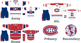
This design indicates how striping can work as that seems to be the primary complaint of ultra-traditionalists with regard to the new RbK EDGE uniform system. Seems like it will be just fine. I like the jersey designs here. They're classic and regal. Hard to complain. I don't get the secondary logo but maybe someone can explain that to me.

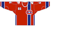
But wait, there's more. Yesterday we got a look at what might happen if the logo was moved to the side of the jersey and the number shown on the front by way of an Edmonton Oilers design. Well that same artist has taken a shot at the Canadiens — complete with the vertical stripe and off-center crest.

Like I said yesterday, it's different and that makes it cool in my eyes. I'm not sure how I'd feel about a team actually wearing it, but as a concept it's a good one. I've always like the giant crest in the middle of the front of the sweater. Strangely, it's not that common in professional sports.

And that does it for today. Tomorrow will be the last day before the tournament begins so I've saved up something special — it's another fan-made design for the Tampa Bay Lightning. They're my team so they have to get special treatment. You're sure to enjoy it.

Along with that, I've also come across some rather interesting concept logos if various clubs were to change theirs. Not only that but I have a few bonus fan-designed jerseys to share before this blog becomes almost completely about the tournament.

Saturday
May192007

HF&P, Part 5: Montreal Canadiens

The "Hockey Fans & Photoshop" series continues with Les Habitants. Le Tricolore. Le Bleu-Blanc-Rouge. The Habs.

When it was announced that the new uniform changes would be league-wide, ultra-traditionalists freaked. They went crazy talking about how the horizontal stripes would have to go and that was the worst thing that could ever happen. Personally I think global starvation is the worst thing that could happen, but whatever.

This design tries to show that horizontral stripes can work on the new uniforms. Well, this is a bad example. Don't cut the stripes off in midstream guys, seriously. Anyway, this design also assumes the front-shoulder numbers will be adopted league-wide though there is not yet evidence to prove that theory.

All in all, I would say it's not that bad. It's better than the graphic you see here to the right. This isn't that much different, but it shows how too much stripage can hurt rather than help. We don't like that.

Once again before I go I want to acknowledge the work of the designers behind these renderings. Again, it's not my work, I'm just re-posting what I've come across. If any of the designers would like to get in touch, drop a line via the comments. I'd love you hear from you regarding your work.

Coming tomorrow: the Ottawa Senators.

Monday
Apr302007

Canadiens


Montreal CANADIENS


Team Information
Team Colors / red, white, blue
Inaugural Season / 1917-18 (90 years)
Current Logo / 1952-53 (55 years)

Tournament History

2007 Qualifying Tournament
10-4, 25 pts
Finished 4th in East; 8th overall

Page 1 ... 2 3 4 5 6