NHL Tournament of Logos

Entries in canadiens (59)

Saturday
Dec082007

Just To Freak You Out XVIII

It's time for another belated edition of the Freak Out series. Hopefully I'll get over this cold soon. It's making me very unreliable here at NHLToL. And it's supposed to be Freak Out Friday, right? Anyway, let's dive in.

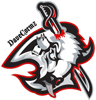
Wow, that was awfully violent. Who's hungry for buffalo tongue?!

I got a ton of submissions this week for the "If They Mated" category. And these are all about rivalries.

I don't even know what to say about this. Except that once again, don't send me hate mail as I am excessively illiterate and wouldn't understand it anyway. Also I didn't make these.

Perhaps slightly less inflammatory are these.

Everything's gone haywire. But wait it gets better. Sure anyone can mix two teams in a blender, but it takes a special kind of talent to do three.

Presenting the Anaheim King Sharks. Let me break it down for you. You've got the Sharks logo in Kings colors on a Ducks jersey. Can't get much more to the point than that.

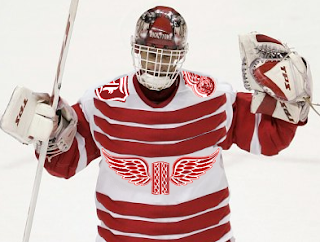
While we're still on the topic of ridiculous jerseys, do you remember the crazy Red Wings design I posted a while back. (It's the second one down in that post.) Were you wondering what it might look like on Dominik Hasek? Wonder no more.

Don't know what he's so happy about. Hideous if I do say so.

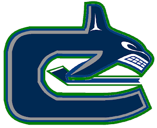
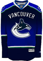
Here's a scary merging of the current and original Canucks logos.

Whales that play hockey. I love it.

To finish up this morning's post, I've got a couple more whacked out logos. I'm pretty sure these come from a Quebecois looking to break away from Canada. It's like if Texas decided it wanted to be its own country. I laugh. But then I am a lousy Floridian who knows nothing of the politics of Canada. Look!


But wait, there's more!

So what do you guys think?

Oh and I'm just warning you now that any comments with discussion of politics will be promptly removed. Go elsewhere for that.

In the meantime, I hope I managed to freak you out a little. Until next time.

Friday
Nov232007

Just To Freak You Out XVI

It's another Freak Out Friday here at NHLToL and boy have I got some weird crap today. I have to start out first with something that might cause you to fall out of your chair laughing.

The funny part is I think that's what Homer Simpson would look like if here were an Indian. Anyone agree with that?

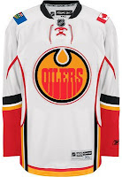
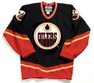
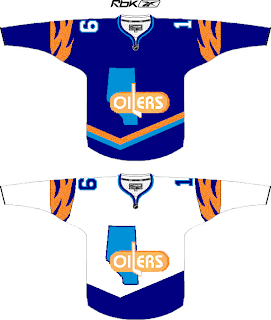
The next image is sure to stir the pot a little bit. It's like one of Conan's "If They Mated." Albertans might not be able to take this. Imagine if the Oilers and Flames got together.

We should make a habit out of that. Pretty funny stuff.

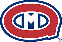
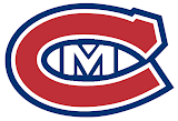
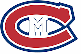
This cracks me up. Twice in the same week, two separate people emailed me concept logos for the Montreal Canadiens — replacing the "H" with an "M."

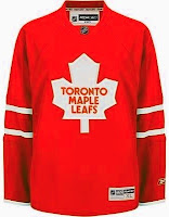
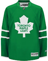
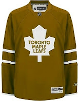
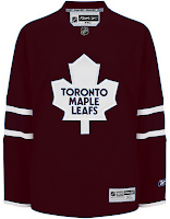
The graphic on the right incorporates the old Montreal Maroons logo so that's kind of cool. But regardless, it's still just weird seeing that. Let's keep it in southern Canada for a moment. A few different readers felt like giving new colors to the Toronto Maple Leafs' uniform. Everything but blue.


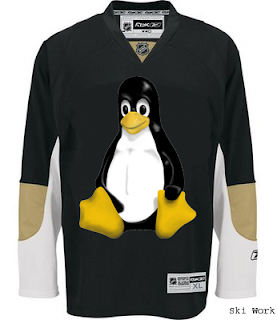
We'll finish off this week's Freak Out Friday on a fairly obvious route.

Yes, that's the Linux penguin. Can't believe I didn't get that one sooner.

Hope those served up a good laugh, or at the very least made you smile on the inside. And don't forget to send in your Freak Out art for next Friday's post. Enjoy your weekend!

Saturday
Nov172007

More Habs Anyone?

On Thursday, I ran an Atlanta-themed concept post. Tonight, it's all about the Montreal Canadiens. I have several concepts I feel like sharing.

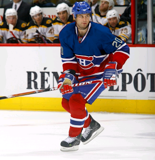
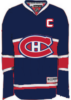
Last week I posted a bunch of third jersey artwork which included a half blue, half red Habs sweater. I wondered aloud what such a thing might look like on a player. And because you guys are just awesome like that, someone took to Photoshop and here is the result.

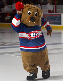
I'm thinking that's probably a no. But as far as a blue Canadiens jersey goes, we shouldn't toss out the idea altogether should we? The AHL's Hamilton Bulldogs handled a similar jersey effectively — as proven by the club's mascot.

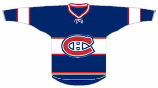
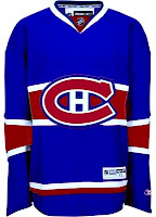
Here's what that would look like in Rbk EDGE template form. They could do a lot worse. That's all I'm saying.

Though there is one element here that doesn't work well. The white stripe across the middle makes it difficult to put contrasting numbers on the back. The cure for that is running a red stripe in its place.

I'm posting both of these graphics to show different possibilities for the shade of blue. Personally, I'm more a fan of the darker blue.

Overall, I think blue would be a good direction for the Habs if a third jersey is in their future. I never cared much for the white ones they used to sport. What do you guys think? Post your comments below.

Friday
Nov092007

Just To Freak You Out XIV

It's the end of another work week and we all know what that means — Freak Out Friday! A series, which by the way, has become very popular. So as long as you guys keep sending in crazy crap, I'll keep posting it every week. I'll start things off tonight in New York.

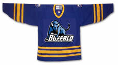
I felt I couldn't properly begin a Freak Out Friday without involving the Buffalo Sabres somehow.

See? This is what happens. What is that anyway? Somebody call Paul Bunyan. We found his ox. Yay.

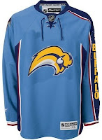
Easily the most maligned logo in the NHL, imagine the "Buffaslug" on what's been one of the most maligned jerseys here at NHLToL. How much do you guys love this concept right here?

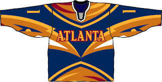
Not that much? Just when you thought it couldn't get any worse. Anyway, while we're on the subject of the Atlanta Thrashers, see if you can endure this monstrosity.

I know that wasn't easy, but don't worry, it's over now. Let's not let this happen again, all right?

Gradients on jerseys is a personal pet peeve of mine. Who was it that thought these looked good?

Oh yeah, those guys did.

Have you ever tried to use red, blue and black together? Here's why you don't.

And here's another reason.

Finally, I'll leave you this evening with one simple concept and a profound statement.

Only you can prevent forest fires.

Until the next time, try not to freak out too much.

Tuesday
Nov062007

Third Jersey Concepts

In honor of the new Third Jersey Logo Tournament, I've got a fitting theme for today's concept art post. Check it out.

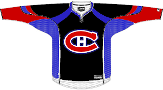
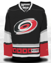
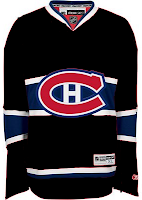
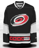
One cool suggestion for a Hurricanes alternate sweater could be achieved by going all black. I say change the black sweater cuffs to red and you've got yourself a winner. As for the Habs, this may not be perfect, but it's pretty damn close. I'm a big fan of this design. I'm curious to see what it would look like on the ice.

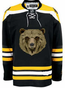
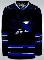
But back to black third jerseys, consider these.

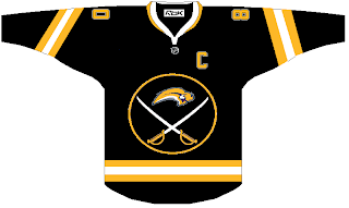
I actually like this. But I was a big fan of the black and red days of the Sabres. They never looked better — especially in those red third jerseys.

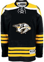
And what about the Predators? Obviously, this design was created entirely based off of the Bruins' new sweaters, but it's not bad. I sort of like the 3D sabre-toothed tiger head, myself. But my preferences have never really been on par with most people. And I'm okay with that.

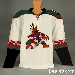
Finally, based off the idea of teams going with a retro look for alternate jerseys, how about something like this for Phoenix?

It's not like I hate the current look of the Coyotes, but I always thought they looked awesome in brick red and green. You have to admit, though, this jersey is pretty sharp looking.

But you probably disagree with me about something. Tell me about it below in the comments.

UPDATE (6:36 PM): Well our lovely designer Michaela got right on it with my suggestion to add red to her Canes concept above. Check it out.

I think it looks great with that small touch. Thoughts on that?

Friday
Nov022007

Recolor This

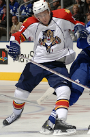
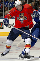
Today's concept post will deal strictly with recoloring things. Yes, that's right. For instance, let's suppose the Florida Panthers had opted for the more traditional red home sweater over the blue one they actually went with.

Not bad, but despite the fact that I loath the Stinkin' Panthers, I prefer the blue. The old red sweaters were nice, but I don't care much for this one pictured here. But that's just me.
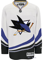
Speaking of me being a Lightning fan, someone remade the Sharks' and Habs' sweaters with Bolts colors.

I don't know. No. They'll always be a teal team. That's just who they are. Don't question it. As for the Habs, you can't have that jersey in anything but red. Even blue would be weird.
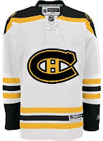
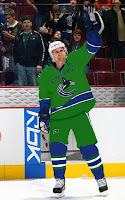
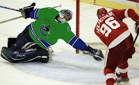
Here's something else that might make you question whether this is the Freak Out Friday post. Not quite yet. Just a misguided attempt at giving the Canucks new colors.

I'm all for the return of a green team to the NHL, but this is not how that is achieved. No, no, no. I know I'm sounding very negative right now, but just no.

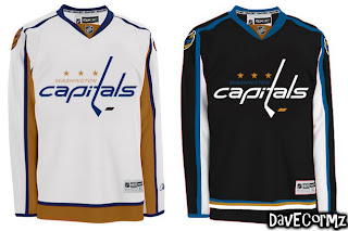
Anyway, here's something I like. The Blue & Bronze Age of the Washington Capitals was my favorite. Even though it fits them perfectly, thematically speaking, the red/white/blue combo is so overused in this sport. Check out the current EDGE unis in the old colors.

It may not be the most brilliant thing you've ever seen, but come on. That's not too shabby. I like the white "capitals." Very sharp, right there, if you ask me. I'd just like to see the black jersey in blue instead. I was more a fan of the blue '90s jerseys for the Caps. I like the black one as a third jersey — not so much a primary home sweater.

And finally, we'll finish off with something a bit different. This is the Islanders uniforms recolored — but for a different team.

Wow, no. I'm sorry, but those sleeves don't look good on any team if you ask me. The more I see it, the less I like it. Granted it looks better in black and orange than blue and orange, but still, I'll pass on this one.

What do you guys think? Any winners here? Or should we go back to the paint bucket?

Saturday
Oct202007

Just To Freak You Out XI

Finally! I know I failed you guys yesterday in that Freak Out Friday never came to pass. But perhaps you'll allow me to get away with a Freak Out Saturday. The Everblades game aside, yesterday was a very busy day for me. Not to mention Blogger has been having issues with image uploading, an important piece of this puzzle. Anyway, here goes.

We'll kick things off with the team whose logo was named the champion here at NHLToL — the Montreal Canadiens. Some very strange artwork has made its way to my inbox — and now to your computer screen.

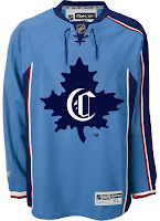
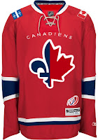
The concept on the left makes use of a little-known logo that the Habs wore back in 1910, prior to the formation of the NHL. As you can see it's on a Thrashers home jersey, which is weird, for more reasons than the light blue. The one on on the right is just as intriguing if not more so. It's a half maple leaf, half fleur-de-lis. And check out the Flames-influenced shoulder patches. The 100-year logo at the bottom is what puts it over the top. Well, then there's that logo of course. And the team name above it.

There just aren't any words for that. Nightmares.

Speaking of nightmares, the Nashville Predators have been trying to get more folks in the building this season so as to avoid something like this from happening.

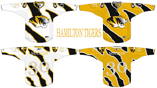
Somebody really wants a hockey team in Hamilton? Raise your hand if you think that's going to happen. Now keep your hand up if you think they'd wear a jersey like this. Put your hand down. You're looking at a computer screen.

Before I leave Canada, I just got this one emailed to me today. It may be a little harsh that I'm sticking it in the Freak Out post, but it scares me just a little.

I realize I suggested attempting to work Alberta into the logo, but I'm not sure this is the winner. I do like the wordmark part (not as a primary!), but the province is weighing the whole thing down on the left side.

Wow I just had a weird visual. Imagine going on one of those insane diet pills. Maybe they get the formula wrong and you only lose weight on your right side. Sorry, just freaked myself out there. What's going on with me tonight?

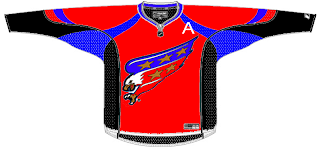
Anyway, I know the new Washington Capitals secondary logo has been a big hit, but here's exactly how not to use it.

That's so bad I almost want to see what it would look like on a player. Damn.

Since we're on the subject of really bad, we'll top things off tonight with my team.

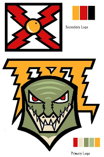
I was seriously considering posting this and trying to make you guys guess what team this logo concept was designed for, but I'm not sure you'd ever figure it out. I think the secondary logo is meant to resemble the state flag of Florida. Hmm. But as for the primary, I have no clue what's going on there. However, I have woken up in the middle of the night in a cold sweat with this as the last visual in my brain.

As we inch ever closer to Halloween, the freak-outs seem to be getting more freaky. Thanks to everyone who's sent in work!

And if you have any of your own or have spotted anything crazy out there on the web, feel free to email it to me at nhllogos@gmail.com and I may make it part of next week's Freak Out Friday. (And I plan to actually post it on Friday this time.)

Wednesday
Oct032007

Rbk EDGE Review: Canadiens

Part 10 of 30. All 30 NHL clubs have unveiled new jerseys under the new Rbk EDGE Uniform System for the 2007-08 season. Here at the NHLToL, we're going to review every one of them. Read up and then rate the new sweaters. We'll do a full ranking after completing all of the reviews.

Rbk EDGE Uniform System

Montreal Canadiens


New Uniforms

Old Uniforms

The Unveiling
Tuesday, September 4. The Canadiens unveiled their new jerseys to fans via their official web site. Players in attendance a golf tournament that day in Montreal also wore them.

Home vs. Road
Home: Red. Road: White. The two sweaters feature rather different striping patterns.

The red home jerseys have a thick blue stripe that wraps around the chest, bordered by two thinner white stripes. The primary logo, serving as the crest, is placed over these stripes. Similar blue stripes outlined by thinner white stripes wrap around the elbows. Thin white-blue stripes wrap around the waist a few inches above the bottom of the sweater. The collar is white with blue trim on the inside.

The white road jerseys have a red shoulder yoke, rounded at the ends. The cuffs are red extending several inches from the wrist. Thin red-white-blue stripes wrap around the waist a few inches above the bottom of the sweater. The primary logo serves as the crest and the collar is white with blue trim on the inside.

In The Details
The crest sits slightly higher on the white jersey than the red one. This is so that the logo can be properly centered on the blue stripe across the chest of the red jersey. The same numbering and lettering style has been retained.

New & Old
There is hardly a difference at all between the two uniforms. The old design was simply adapted to the new EDGE cut. The one noticeable difference is in the collar, which now, like all new jerseys, features the NHL shield.

Standard FAQ
Numbers on the front? No.
Laces at the collar? No.

NHLToL Editorial by Chris
I'm reviewing the Canadiens because of their big championship victory in the logo tournament today. There are some things you just don't mess with. And as liberal as I am when it comes to changing a team's jersey design, I still think you cannot mess with the Habs. I'm rather glad they left everything alone. My one nitpick is that I feel this would be one of the best jerseys for the lace-up collar. The Rangers and Bruins are the only Original Six teams that have it. And I am a little bothered by difference in positioning of the logo but that's something most people will never notice since only in rare cases will you see both jerseys side-by-side this way. Anyway, we're a third of the way through the reviews now, and for the most part, I'm liking what I'm seeing. 5/5


Buy your new Canadiens jersey!

Wednesday
Oct032007

Result: Canadiens vs Blues


CANADIENS LOGO VOTED CHAMPION!

Congratulations go out to the Montreal Canadiens' logo! It has been declared by the voters at the NHL Tournament of Logos to be the best logo in the National Hockey League right now.

I can't believe it's finally over. After nearly eight long weeks of voting in a competition that involved all 30 NHL logos, the best one has come out on top. It's been a great ride — despite its bumps — and I appreciate every single one of you who dropped in to cast your votes.

Now you no longer have to wonder which logo is really the best. Now you know. It's the logo of the Montreal Canadiens! Habs fans, bragging rights are yours!

By the way, we'll be raising the Championship Banner in the sidebar on Friday night. Be sure to check it out!

Montreal Canadiens
55% 9,144 votes
CHAMPION

St. Louis Blues
45% 7,525 votes
RUNNER UP

16,669 total votes votes


Poll opening date
Sep 27 @ 5:37 PM
Poll closing date
Oct 3 @ 5:00 PM

07CHTRN | #5 | MTLvSTL

Monday
Oct012007

Result: Canadiens Logo History

BEST ALL-TIME
1952

90% 4,147 votes

4,604 total votes

1925
10% 457 votes


Poll opening date
Sep 24 @ 4:26 AM
Poll closing date
Oct 1 @ 11:59 PM

07BONLH | LHMTL