NHL Tournament of Logos

Entries in canadiens (59)

Tuesday
Sep042007

Canadiens Unveil New Uniforms!

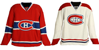
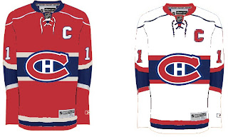
This morning, the Montreal Canadiens unveiled their brand new Rbk EDGE uniforms to little fanfare. Overall, there were no major changes. The jerseys were merely adapted to the new style and cut, just as we'd expected. I have all the juicy details and photos below.

Before I go on though, I really need to send a huge thanks to the huge number of readers who emailed in links and photos. You guys are awesome! And you're the reason why I write this blog! I'm sorry I couldn't get stuff posted earlier, but I was amidst a live television show that begged my full attention. Moving along now.

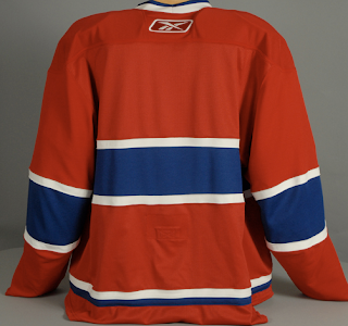
Here's a shot of the back of the home sweater.

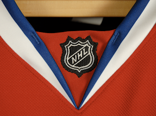
I also got an email with someone wondering whether the LNH logo would be used on the collar as opposed to NHL.

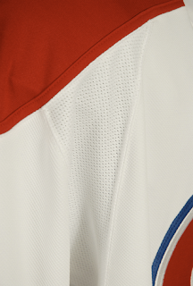
There's your answer. One last extreme close up photo and then I'll turn it over to you all for your comments.

I think these uniforms are great! Habs fans should be proud. Enjoy your big day!
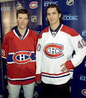
UPDATE (1:40 PM): It's always nice to see what these jerseys actually look like on players. Here you see Cristobal Huet and Maxim Lapierre donning the new duds.

Remember you can find these and many other photos of all the new sweaters in my official Rbk EDGE photo gallery.

And if you have other photos of the jerseys that I haven't posted, send them along and I'll add them to the gallery.

Monday
Sep032007

Prepping For Habs' Big Day

Along with the Calgary Flames, the Montreal Canadiens will be unveiling their new Rbk EDGE uniforms tomorrow. To get everyone ready for that, I have concepts.

Unlike the the Flames, the Habs haven't really leaked anything whatsoever regarding their new sweaters. I don't know of one solid rumor or suggestion thereof that we have to go on. It's going to be a total surprise. Or else, they won't change a thing and simply adapt the present design to the new cut and style like the Red Wings and Rangers have.

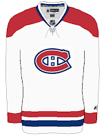
This concept is based off of the New York Islanders' new duds. They're pretty sharp and would probably go without too many complaints from Habs fans.

This fan-created design is closest to what the Canadiens wear as a road jersey at the moment. The white one above seems more like the vintage alternate jersey.

Not that there would be anything wrong with either. But I've been reading comments from Habs fans who would like to see a new road sweater more similar to that one.

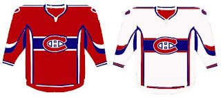
If you're a fan who fears these uniforms will be too busy and feature an overabundance of striping, don't look now, but we have concepts to scare you.

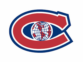
Whoever wears those jerseys will need pretty big shoulders to fill them out. I'm not entirely convinced those aren't football jerseys. Anyway, I've also got a fan-created logo redesign to show off. What do you think?

Personally, I like it with the "H" in the middle and would hate to see it change. Furthermore, it won't change. The world will end before the Canadiens get a new logo, of this I'm quite certain. Perhaps it's my crystal ball or perhaps it's an understanding of human behavior and an overwhelming hatred of change in the hockey world.

Anyway, hope you've enjoyed what you've seen while you wait for the new sweaters to be unveiled tomorrow at some point. This goes for the Flames as well as the Habs, but naturally, as soon as I can post pictures, you know where to find them.

Saturday
Sep012007

Habs Unveiling Date Is Official

The Montreal Canadiens have confirmed the unveiling date of their new Rbk EDGE uniforms via their official web site. The date will be Tuesday, September 4 (just like the Calgary Flames) as I'd previously reported. That date is already in the sidebar countdown. Here's the graphic from their site.

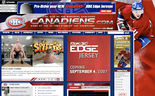
Since that graphic doesn't actually reference the Habs specifically, here's a shot of their web site. You can see they're also taking pre-orders of the new sweater via the NHL.com Shop.

I doubt they'll do much to change it — just merely adapt it to the new cut like the Detroit Red Wings did. Looking forward to seeing on Tuesday. It'll be another big day in Canada.

Tuesday
Aug282007

Poll: Penguins vs Canadiens


vs
Pittsburgh
PENGUINS
Montreal
CANADIENS


Place your vote and then feel free to leave a comment as to how you came to your decision. Tell all your friends to drop in and vote! The more voices heard, the more accurate the results!

Poll opening date
Aug 28 @ 4:21 AM
Poll closing date
Sep 4 @ 11:59 PM

07CHTRN | #E2B | PITvMTL

Thursday
Aug232007

Result: Canadiens vs Islanders

Montreal
CANADIENS

78% 8,100 votes

New York
ISLANDERS

22% 2,307 votes

10,407 total votes

Montreal Canadiens
Advancing to Quarterfinals to face Pittsburgh Penguins

New York Islanders
Eliminated


Poll opening date
Aug 16 @ 4:38 AM
Poll closing date
Aug 23 @ 11:59 PM

07CHTRN | #E1C | MTLvNYI

Thursday
Aug232007

Canadian Team Unveiling Dates

Yes, I have just a little more Canada for you guys. I almost forgot about this. With the Senators having released their new Rbk EDGE jerseys, that leaves five other Canadian teams left to do so. Only the Canucks and Flames have made official statements. Vancouver will do the deed on August 29 and Calgary on September 4.

The Oilers, Maple Leafs and Canadiens have yet to announce official dates, but I've been told of likely dates for unveilings for those teams that I've added to the sidebar countdown. Apparently, Montreal will go on September 4. Toronto shows off their duds on September 13 — this according to CBC. And Edmonton will supposedly unveil theirs on September 16.

Once again, those three dates are speculative until the teams make official announcements. But the sources seem reliable enough to add the dates to the countdown.

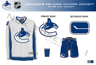
And all right, Canucks fans, I won't leave you out. I mean, how could I in good conscience share Nordiques and Jets concepts and not Canucks?

One fan designed this concept based on the teaser photo on Vancouver's official web site. Have a great night, all!

Thursday
Aug232007

Hey, Canada! Part 3

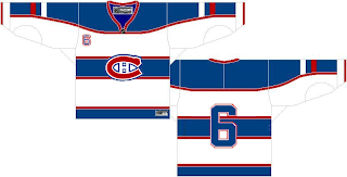
I'm heading to Quebec for the next stop on my trek across Canada today. The only team there today is the Montreal Canadiens. So let's start with them. I was emailed a concept design that is rather unique.

Interesting choice with the striping. What do you Habs fans think? Do you like the bars across the chest?

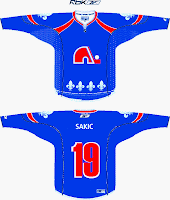
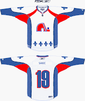
I got a really cool piece sent to me recently, as well, for a team that now exists under a new moniker in a new city. This designer contemplates what the Quebec Nordiques might look like in the "new NHL."

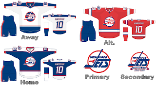
Gets you all nostalgic, doesn't it? Speaking of nostalgic, let's "jet" on over to Manitoba and muse on what the Winnipeg Jets might hve looked like in Rbk EDGE jerseys, had they not moved to Phoenix.

Talk about a trip down memory lane. Feel free to leave a comment about any of these designs. I'm sure their creators are interested in your responses.

Still to come today: A preview of the new uniforms of the Toronto Maple Leafs.

Friday
Aug172007

Getting All Conceptual On Logos

One of my favorite things is seeing the ideas people have come up with for new team logos. I always like to start off with the most outrageous stuff. So Montreal Canadiens fans, prepare to gouge out your own eyes (because I know you will).

That's an idea someone came up with to update the Habs' logo. Personally, I think it's interesting but that it doesn't outdo what they have now.

I'm sure the Montreal faithful have lost their lunch, but I'm all right with that. But in all fairness, what do you guys think? Is it really that bad, or would this be the way to go if things needed to change?

This next concept logo comes from designer Ian Baker. He worked on an idea for the New Jersey Devils.

It's interesting, I kind of like it but again I'm not sure it would be much of an improvement on what they currently wear. I really like the Devils logo. It's one of those logos that will live on as an NHL classic a century from now.

It turns out the same ad agency who designed the first Tampa Bay Lightning logo I posted on Wednesday, came up with another idea. More of a word mark, but here it is.

It's pretty cool. I don't like the puck in it, but that's just me.

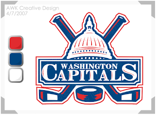
And finally, I'll leave you with a design that I feel would actually be an improvement for the Washington Capitals. I don't really like their new logo. I was a fan of the bronze and blue. But even if they had to switch back to the red, white and blue, what about keeping the logo. Something like this?

If you've got any thoughts or comments on these designs or any others, you know where to put them. Right down there in the comments section.

Thursday
Aug162007

Poll: Canadiens vs Islanders


vs
Montreal
CANADIENS
New York
ISLANDERS


Place your vote and then feel free to leave a comment as to how you came to your decision. Tell all your friends to drop in and vote! The more voices heard, the more accurate the results!

Poll opening date
Aug 16 @ 4:38 AM
Poll closing date
Aug 23 @ 11:59 PM

07CHTRN | #E1C | MTLvNYI

Monday
Aug062007

Bruins vs Canadiens


vs
BRUINS
CANADIENS
8-4
9-4

The Aesthetics
Ah, old time hockey at its finest. I think the Canadiens could stand a logo upgrade in the vein of the Bruins. Not that there's anything wrong with how it is right now, I'm just in the mood of modernizing logos. It's looked exactly the same for almost 60 years. Anyway, forget that. Don't change it. I like it just the way it is. But the Bruins get this point for being cooler.
Bruins

The Nickname
I would say that a Bruin could eat a Canadien like it was nothing, but I've recently been informed that a number of Canadians are rather rugged folk so I'll have to put my money on them taking out the bear with their rifles and stuff.
Canadiens

The Analysis
I like the symbolism in both logos that alludes to the history and home cities of each club. More than that though, I still keep thinking I'd rather see an actual bear in the logo as opposed to the traditional spoked "B." This isn't to say the "B" has no place on the uniform. Place is on the shoulder. But take the new secondary logo and use it. But the spoked "B" is such a classic. What would the NHL be like without it? It's really a tough call. Anyway, there's no confusion with the Habs' logo. It is and always will be a classic. And that's all there is for the Canadiens in the qualifying round.
Canadiens


WINNER
2-1