NHL Tournament of Logos

Entries in canadiens (59)

Sunday
Sep302007

Mailbag: For The Habs' Shoulders

I got an interesting email the other day with a new concept logo for the Montreal Canadiens. It wouldn't replace the primary, but rather serve as a secondary.

I don't think it's a necessary addition to the Habs' look, but I still like it a lot on its own merits. The designer, Gary, had this to say about it in his email to me.

There's two motivations behind it. One is political, the fleur de lis within the maple leaf clearly shows Quebec as a part of Canada, and not a seperate entity. However, using it as the base of the maple leaf is symbolic of the fact that the true Canadian identity requires a strong Quebec. The other reason is to honour Quebecs former NHL team, the Nordique, who proudly displayed the fleur de lis on their jerseys. Despite the rivalry between the Nords and Habs, NHL in Quebec City was great for the province and country.

I've had the idea for a long time but never tried it out. Your blog/website gave me the motivation to give it a try today while I should have been working.

We appreciate his work and he even went the extra mile to show us how it might look on a couple of jerseys.

I have to say, I don't hate it and it goes rather well with the logo and uniform. My only problem is that when I look at it all I see is Nordiques. And I'm pretty sure they don't exist anymore.

So what do you guys think? Love it? Hate it? Have any suggestions for improving it? Comment away.

Thursday
Sep272007

Poll: Canadiens vs Blues


vs
Montreal
CANADIENS
St. Louis
BLUES

If for no other reason than the support I've been getting from you guys, I'm going to give this thing another shot. All votes cast prior to today are gone. Please place your votes again and this time we'll all try to be mature people about it. I really want this to work out because I think it's really fun. I don't want to take away the voting because I feel like the best aspect of this site is the interaction I get with everyone via the polls. So vote and be merry!

We're now in the final round of the NHL Tournament of Logos. One of these two logos will be crowned by you all as the best in the NHL. It's been some stiff competition all the way through but the Montreal Canadiens have been proven the best in the East and the St. Louis Blues the best of the West. It's been a pretty exciting run so far!

I would like to encourage everyone to go out and get as many people as they can to vote. Post the link on blogs, message boards or wherever else you can. Let's get as many people as we can to vote on this final round!

As a side note, one difference you might notice in this poll is that while it still closes after one week, I've changed the closing time to 5:00 PM so we can announce the winner just prior to the first games of the new hockey season. Also, we'll have to count yesterday as a lost day. But I'm not worried about it because everyone who wants to cast their vote should be able to access the internet at least once a week. (Or so I would hope.)

By the way, once the season has started, I hope you guys will continue to return to the blog and vote on all the logos. I'll be starting up a new tournament as early as next Friday. If you have any suggestions that you think will keep you interested in coming back, feel free to let me know either by email or in the comments. Thanks, all!

Poll opening date
Sep 27 @ 5:37 PM
Poll closing date
Oct 3 @ 5:00 PM

07CHTRN | #5 | MTLvSTL

Monday
Sep242007

Result: Canadiens vs Flyers

Montreal
CANADIENS

61% 8,386 votes

Philadelphia
FLYERS

39% 5,270 votes

13,656 total votes

Montreal Canadiens
Advancing to face Oilers or Blues

Philadelphia Flyers
Eliminated


Poll opening date
Sep 17 @ 4:22 AM
Poll closing date
Sep 24 @ 11:59 PM

07CHTRN | #E4 | MTLvPHI

Monday
Sep242007

Poll: Canadiens Logo History


1925
1952


Place your vote and then feel free to leave a comment as to how you came to your decision. Tell all your friends to drop in and vote! The more voices heard, the more accurate the results!

Poll opening date
Sep 24 @ 4:26 AM
Poll closing date
Oct 1 @ 11:59 PM

07BONLH | LHMTL

Friday
Sep212007

Just To Freak You Out VII

I've decided to make the Freak Out series into a weekly feature to be posted on Fridays from now on as long as crazy artwork keeps landing in my inbox. And man, do I have some stuff for you this week.

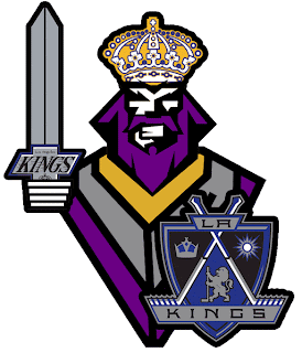
We'll begin with our friend Pfizer who's created mish-mash logos for the likes of the Vancouver Canucks, Buffalo Sabres and New York Islanders (check out the Freak Out series for those if you haven't yet). Now comes another shot at logo merging for the Los Angeles Kings.

For my money, it's not his best effort, but it makes me laugh no less. I'm a little disappointed he couldn't find a way to work in the current crown logo. But then it does feel a little thrown together. You have to admit, though, that king face is a great logo. Don't mess with that son of a bitch.

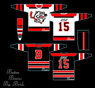
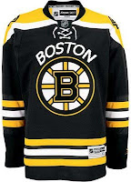
Meanwhile, I've got some completely new takes on a couple of team logos and uniforms. Imagine the Boston Bruins swapping out the yellow for red. Then imagine a cartoon bruin the likes of which might be owed money by Yogi Bear.

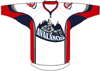
He's come to collect. Then imagine the Colorado Avalanche adopting a yeti for their primary mark. Might it frighteningly go a little something like this?

We should hope not. Lest ye bear the brunt of the abominable snowman's ever-clenched fist. And what's up with the upside-down feet on the shoulders?

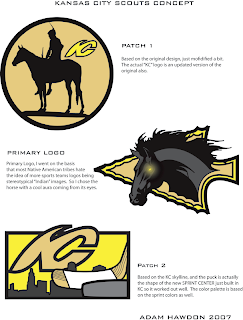
Speaking of what-ifs, let's say the Kansas City Scouts were to make their glorious return to the NHL. Let's also say their return was marked by the uprooting of the Pittsburgh Penguins. Yes, this design was made in the days when the Pens' future was uncertain. I point that out merely to explain its color usage.

If you enlarge the image, you can read the designer's explanations of the three logos, so I'll spare you the details here. What I will say is that I like Patch 2. I'm a big fan of city skylines in logos, though you don't see that a whole lot. What's cool about this one is the new Sprint Center being placed to look like a puck. Clever.

The horse's eyes are freaking me out, by the way.

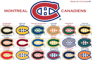
This next image is probably best viewed while high. I don't condone drug use, but chances of one having an "experience" are rather great. See for yourself.

Someone with a good deal of free time and an inability (or not) to cure boredom came up with this. He basically recolored the Montreal Canadiens' logo in the colors of various teams around the league. Conspicuous is the absence of the Tampa Bay Lightning's colors. But I guess not everything is about the Lightning.

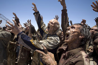
Now I want to show you some of the scariest things of all — because they're real! Okay zombies aren't real, but movies are real. A reader emailed me a production still from the new Resident Evil movie. One of the zombies appears to be wearing an old Nashville Predators sweater.

Talk about foreshadowing. That's not even right.

And finally, a reason for all those NHL fans out there bemoaning the arrival of the new Rbk EDGE jerseys to quiet themselves. It could have been so much worse. A fact proven by the AHL's Philadelphia Phantoms.

AHL fans, continue your bemoaning. It's perfectly warranted.

Freak.

Out.

Monday
Sep172007

Poll: Canadiens vs Flyers


vs
Montreal
CANADIENS
Philadelphia
FLYERS


We're really coming down to the wire here. It was the tightest race yet that led the Flyers here to the fourth round to face the Canadiens. One of these two logos will be voted best in the East!

Place your vote and then feel free to leave a comment as to how you came to your decision. Tell all your friends to drop in and vote! The more voices heard, the more accurate the results!

Poll opening date
Sep 17 @ 4:22 AM
Poll closing date
Sep 24 @ 11:59 PM

07CHTRN | #E4 | MTLvPHI

Wednesday
Sep122007

Result: Devils vs Canadiens

Montreal
CANADIENS

64% 11,920 votes

New Jersey
DEVILS

36% 6,698 votes

18,618 total votes

Montreal Canadiens
Advancing to face Senators or Flyers

New Jersey Devils
Eliminated


Poll opening date
Sep 5 @ 4:27 AM
Poll closing date
Sep 12 @ 11:59 PM

07CHTRN | #E3A | NJDvMTL

Friday
Sep072007

Just To Freak You Out... Some More!

Yes, you read that title right. Back by popular demand, I'm going to get your weekend off to a kicking start. I have the weird and crazy; a whole slew of new and wacky concept designs just meant to freak you out. So buckle in, it's going to be a long one.

I'm going to have a theme of red and black tonight. You'll see what I mean, but first I need to show you this.

From the brilliant creator of the Sabres and Canucks mish-mash logos comes this gem. True art in its rawest form. I dare anyone to attempt to improve upon that.

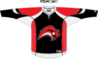
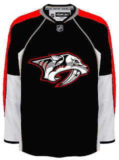
But since you can't, we'll move along. Do you like the color combination of red and black? Sure, if you're a Devils, Hurricanes, Senators or Coyotes fan. But what about Sabres, Predators and Canadiens fans? What about Leafs fans? Look on if you're brave enough.

It's a little blinding, isn't it? You might be surprised to discover that these designs all came from different people. Bad enough to have one disturbed mind out there Devil-ifying all these jerseys. There are at least four.

This Canadiens concept just scares me so I want to stop looking at it. The Sabres one just looks like a bloody slug (I knew that comment was coming so I wanted to head it off). And the Predators... well that doesn't look half bad if you ask me.

But imagine what kind of disturbed mind I must be to posting this stuff.

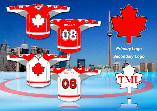
Wait. You need to catch your breath before you see this. Maple Leafs fans, ready your eyeballs for this one.

Wow, you're still here. I'm impressed.

All right, now I'm going to ease off a little bit. These designs are not so much horrifying as funny.

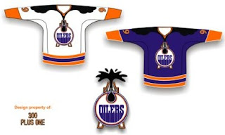
Dude, you spilled some oil on your— oh, wait... I see... yikes. Yeah. Oilers fans, I'm genuinely interested to know how you feel about this particular concept. I know it's been floating around a little, but it's just so... out there.

So what if the Rangers did this?

We probably ought not think about it.

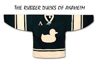
Someone spent at least 30 seconds making this.

A missed opportunity, I say.

As a tribute (or not so much) to what I'm going to start calling the "VANCOUVER Incident," someone had some fun with other jerseys.

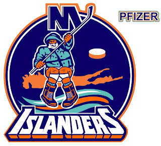
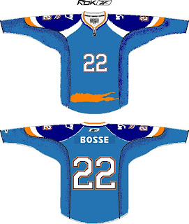
Similar work on the Sens, Isles and Jackets can be found in the Concepts Gallery. Now I'm going to wrap up where I began — Long Island. Imagine if Reebok decided the NHL should go the way of basketball.

Check out that outline of the island in place of a horizontal stripe. All is well.

Just remember, you guys asked for this. Let this be an object lesson in the notion of being careful what you wish for. Actually, if this keeps up, we'll make it into a weekly feature. So if you've made or found crazy crap like this, feel free to send it my way at nhllogos@gmail.com and who knows, you just might freak somebody out.

Wednesday
Sep052007

Poll: Devils vs Canadiens


vs
New Jersey
DEVILS
Montreal
CANADIENS


Round Three has begun! We're getting closer to determining the best logo in the NHL! Place your vote and then feel free to leave a comment as to how you came to your decision. Tell all your friends to drop in and vote! The more voices heard, the more accurate the results!

Poll opening date
Sep 5 @ 4:27 AM
Poll closing date
Sep 12 @ 11:59 PM

07CHTRN | #E3A | NJDvMTL

Tuesday
Sep042007

Result: Penguins vs Canadiens

Montreal
CANADIENS

56% 12,077 votes

Pittsburgh
PENGUINS

44% 9,645 votes

21,722 total votes

Montreal Canadiens
Advancing to Quarterfinals to face New Jersey Devils

Pittsburgh Penguins
Eliminated


Poll opening date
Aug 28 @ 4:21 AM
Poll closing date
Sep 4 @ 11:59 PM

07CHTRN | #E2B | PITvMTL