NHL Tournament of Logos

Entries in flames (53)

Friday
Jul272007

Possible New Flames Uniform?

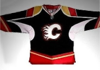
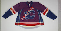
While perusing a Calgary Flames fan message board, I caught a glimpse of what could be the Flames' new Rbk EDGE jersey. I apologize in advance for the crummy quality of the image below.

The story is that a friend of the person who posted it supposedly works in the arena and got a chance to see one of the mock-ups for the Flames. He snapped it quickly with his cell phone and here we are. If it does turn out to be real, I'd have to say the design elements on the sleeves are an interesting choice.

But as of now, we don't really know anything official from Calgary. So take this for what it's worth. What do you think of it?
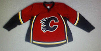
UPDATE (1:31 PM): A helpful reader just pointed me to this image to the left. It's certainly not as scary as the black one, but I'm not wild about the vertical black stripes up the side. Other than that, it seems to be in keeping with the current Calgary uniforms.

But wait, there's more!


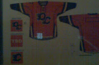
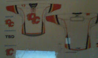
UPDATE (5:18 PM): As a follow-up to one reader's comment regarding the Quad City Flames jerseys. I knew I'd seen them earlier and I just found them again so I figured I'd post them so we're all on the same page with regard to that.

Forgive the crappy image quality but they appear to be photos taken covertly probably with a cell phone or the like. If the Calgary Flames jerseys end up looking like this, I don't think anyone will be able to complain. They look pretty sharp.

For what it's worth, I really don't think the black looks very good with a white flaming "C." The red jerseys look a lot better with the black "C."
UPDATE (6:51 PM): This just in: It was a Flames fake-out! In one of the best Photoshop examples I've seen to date, it turns out the red Flames jersey I posted in the 1:31 update is not a photo of an actual jersey at all! A message board post — to which you can find a link below in the comments — all but proves that this jersey was made using a photo of the blue Rangers jersey unveiled yesterday as a template — only flipped over. It's a good example of what the artistically inclined among us can do with our spare time. Color me impressed.

As a reader also pointed out, though, this jersey appears to be based on the Quad City Flames jersey I posted photos of earlier this evening, so it may not be out of the realm of possibility that something like this graces the Saddledome ice come the fall. It's all a game of wait and see. I'll let you know when anything becomes official. In the meantime, thanks for reading.

And hopefully that will be the last update to this post. It has gotten very long.

Thursday
Jul262007

Ducks vs Flames


vs
DUCKS
FLAMES
1-10
8-1

The Aesthetics
Is it wrong of me to keep hating on the Ducks logo? I like the colors but the wordmark just rubs me the wrong way as far as crests go. Meanwhile, the flaming "C" continues to impress... me. Let's clean things up on the Ducks side and make the duck foot the primary and lose the rest of the letters. Then maybe they'll have a real shot in this competition.
Flames

The Nickname
What do you get when you cross a Duck and a Flame? Dinner. (You knew I was going there.)
Flames

The Analysis
For many teams, I understand it's a difficult task to find some way to represent the home city visually in a way that would be universally recognizable. Anaheim and Calgary are two such cities I would lump in that category. So instead, I'm looking at the basics. Do we see ducks and do we see flames? In fact, I do see flames attached to a "C" meant to do its best job of representing both Calgary and even Canada. As far as ducks, all I see is a footprint, meaning that duck was there. Or it's just a duck foot indicating to me what was left after the stew was made.
Flames


WINNER
3-0


Tuesday
Jul172007

Wild vs Flames


vs
WILD
FLAMES
7-0
8-0

The Aesthetics
This is going to be hard to watch. Two completely undefeated teams. And somebody has to lose. Here, though, you can't deny the beauty of the Wild logo. Great colors and a rather unique design.
Wild

The Nickname
The Wild cannot stand up to a wildfire. Flames can engulf a forest and leave nothing but ashes in its wake.
Flames

The Analysis
I'm convinced the Minnesota Wild logo is one of the most under-appreciated in the National Hockey League. How can you not admire it though? Not that it should take away from the Flames logo at all. I'm not sure how you could make it any better. I was one of the few, however, that liked the flaming horse logo from the third jersey. Still, that's not in competition here. So when comparing these two logos, the Wild has to win out.
Wild


WINNER
2-1


Sunday
Jul152007

Flames vs Stars


vs
FLAMES
STARS
7-0
3-3

The Aesthetics
I really think the Stars logo would be so much improved if they did away with the words in it. Still it's in part the reason why this point goes to the Flames logo.
Flames

The Nickname
Burning hot Flames and a burning hot Star. Now that seems like a draw. But in fact, fire is just part of a star. There's so much more.
Stars

The Analysis
Appropriate logos. Strong colors. I like them both. The Stars logo needs a bit of work. Liven things up. Bring it into the 21st century a little bit. The Flames logo can probably stay like it is forever. Nothing wrong with that. Its staying power will help give it this point.
Flames


WINNER
2-1


Tuesday
Jul102007

Predators vs Flames


vs
PREDATORS
FLAMES
6-2
6-0

The Aesthetics
It's interesting to see the stronger logos going up against each other in this tournament. The tough part is for me in figuring out which deserves points. Here, the Predators logo outweighs by a very slight margin the Flames for the use of color and sleek design. The Flames have a great logo but I feel like it could be updated somewhat. The Flames on the left side seem unbalanced.
Predators

The Nickname
Funny thing about Flames. They burn everything, even Predators.
Flames

The Analysis
What I do like about the Flames logo is the prominent use of the "C" for Calgary. The Predators logo doesn't really have any elements that represent Music City. While their colors are great and their design is spectacular, it's really the Flames that deserve this point.
Flames


WINNER
2-1


Saturday
Jul072007

Kings vs Flames


vs
KINGS
FLAMES
2-4
5-0

The Aesthetics
Solid color schemes and unique outlines are what we have here. The Kings logo is a little complicated but I like the subtle hockey sticks at the top of the crown. As for the Flames, simplicity can sometimes not work out. The flames on the left side of the logo seem unbalanced (which in some cases can be good), but I like the symmetry in the Kings emblem.
Kings

The Nickname
Flames could completely burn down everything the King's land and there isn't a whole lot he can do to stop it.
Flames

The Analysis
Nothing says Kings like a crown but the Flames logo actually has flames — and a "C" to symbolize Calgary. I also like the subtle suns on the sides of the crown to remind us the Kings live in California. It's a tough choice, but ultimately, the Flames get the point.
Flames


WINNER
2-1


Friday
Jul062007

Flames vs Coyotes


vs
FLAMES
COYOTES
4-0
2-1

The Aesthetics
In an odd twist, both of these logos feel animate to me. I can almost see the flames flickering and hear the coyote howling. That's what you call strong logos. The reason that the Coyotes are getting this point over the Flames is that it feels a little more polished. That's understandable though, when you consider the 25 years difference in the age of the logos.
Coyotes

The Nickname
Fire pretty much burns up everything and if the Coyote couldn't escape the Flames, well, he'd be... toast.
Flames

The Analysis
Here's where we determine the winner of this match. The Coyotes logo is great but on looking at it, you don't really get a feel for where its from. And while you could make the case that the obvious desert colors point us to the southwestern U.S., I'd make the case that the flaming "C" will always stand for Calgary (despite anything I might have previously said that could indicate the contrary). Find me a Calgarian who doesn't recognize it. Or any hockey fan.
Flames


WINNER
2-1


Thursday
Jun282007

Red Wings vs Flames


vs
RED WINGS
FLAMES
1-3
3-0

The Aesthetics
For excellent use of color and simplicity over detail, this point goes happily to the Flames. The Red Wings could use a contemporary update to what is becoming a stale logo. Detroit fans, please don't lynch me. You know it's true.
Flames

The Nickname
Fire burns just about everything — even Red Wings would go up in Flames. End of story.
Flames

The Analysis
This is where the Red Wings logo can take the point. I really like the wheel attached to the wing. It shows a connection to the team's home city of Detroit. The Flames logo is top-notch, no doubt, but what in it symbolizes Calgary aside from the "C" which could symbolize any city whose name started with that letter? Maybe next time.
Red Wings


WINNER
2-1


Tuesday
Jun262007

Flames vs Sharks


vs
FLAMES
SHARKS
2-0
3-0

The Aesthetics
A couple of strong, undefeated logos here. For its simplicity and the Sharks logo's overuse of detail and underuse of color, the Flames will win this point.
Flames

The Nickname
Thanks to good ol' water and the depth of the oceans, a Shark never has to worry about being engulfed in Flames.
Sharks

The Analysis
Here we have two logos that are very good at symbolizing their team names. What I have to take issue with is the Sharks logo's lack of color. The teal and grey are used only in a thin outline of the triangle surrounding the shark. The Flames' "C" logo is a classic and the fire coming out of its back is scary.
Flames


WINNER
2-1


Thursday
Jun212007

Oilers vs Flames


vs
OILERS
FLAMES
1-3
1-0

The Aesthetics
Both logos have very nice eye-catching colors, but the Oilers logo has lost several points for its use of the name. This time won't be any different. The flaming "C" doesn't help them very much either.
Flames

The Nickname
Fire and oil do not mix. An Oiler would be lit up by Flames and that would be the end of the story.
Flames

The Analysis
As mentioned the flaming "C" of the Flames logo works extremely well and is one of hockey's classic logos. The Oilers logo could be better as I've discussed before and as the Flames proves, sometimes simplicity is what's required for a great team icon.
Flames


WINNER
3-0