Result: Flames Logo History
 Sunday · Sep 23 · 2007 | 11:31 PM PDT
  2 Comments
2003
69% 4,375 votes
6,342 total votes
 1980
198031% 1,967 votes
| Poll opening date Sep 16 @ 7:35 AM | Poll closing date Sep 23 @ 11:59 PM |
07BONLH | LHCGY

6,342 total votes
 1980
1980| Poll opening date Sep 16 @ 7:35 AM | Poll closing date Sep 23 @ 11:59 PM |
07BONLH | LHCGY
 |  |
Place your vote and then feel free to leave a comment as to how you came to your decision. Tell all your friends to drop in and vote! The more voices heard, the more accurate the results!
UPDATE (9/17 3:03 PM): Hi guys! I know a lot of you have been asking a valid question about this poll and I apologize for not responding sooner. Many of you are wondering why there's no red C among these logos. First off, the way I see it, the Flames haven't really had a logo change since they moved from Atlanta. The basic flaming C has been the same all these years. The first change was in 1995 when a black outline was added. So basically, the question is, do you prefer the C with the black or without it?
As far as there being no red C, the format I'm using for the logos on this site precludes me from using white or black as a background color for the box. I'd just prefer not to do it. If I were to use a red C on a red box, it would blend in too much. (And I tried it on a yellow box and it looked horrible.) So again, you're really just voting on the flaming C with the black versus without the black. Hope that explains things. Happy voting!
| Poll opening date Sep 16 @ 7:35 AM | Poll closing date Sep 23 @ 11:59 PM |
07BONLH | LHCGY
The Calgary Flames have become the 14th NHL team to unveil their new Rbk EDGE uniforms. Check out Craig Conroy modeling the newest in the progression of Flames sweaters.
The element that seems to be causing the most controversy is the patch on the right shoulder which is the flag of the province of Alberta.
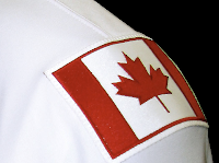
 The left shoulder of the jersey features the Canadian flag. From the team's official release: “Among the enhancements, we are pleased to carry our National and Provincial flags on our home and road jerseys this season,” said Flames President & CEO Ken King.
“As proud Canadians and proud Albertans, our desire is to display the identity of our country and province and carry them throughout North America and the world. Our jersey incorporates our strong history, the latest in technology, and is something our players and fans will be proud to wear.”
These new jerseys are very nice and Flames fans should be thrilled! Enjoy your big day!
Coming tomorrow... the Pittsburgh Penguins.
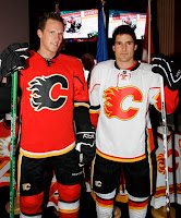
 UPDATE (5:06 PM): Thought you guys might like to see these jerseys on players in full gear. Here, Dion Phaneuf and Matt Lombardi model the new uniforms at the unveiling ceremony at Flames Central today.
I can't say I have any complaints. I'm really liking the giant logos on the front. I never liked the huge jerseys with such small logos on the front. Never really made any sense to me. It's your team's symbol. Show it off, dammit!
Anyway, thanks for the comments you guys have posted so far. I'm sure there will be many more to come. As for my two cents, I think the flag shoulder logos are a very nice touch. I don't think the blue flag clashes at all. I think it just stands out.
I also like the idea someone suggested of the Oilers incorporating a new shoulder logo with the outline of Alberta. The Lightning's secondary logo has an outline of the state of Florida and I really like that.
The Calgary Flames won't make an official announcement until later today, but here's what their new Rbk EDGE uniforms look like. A couple of fans got their hands on the official online photo gallery this morning before it was taken down.
I'll obviously have more later today. Until then, notice the new shoulder patches. Canadian flag on one side. Albertan flag on the other. Very unique.
As you all know, the Calgary Flames unveil their new Rbk EDGE uniforms tomorrow. So to prepare, I've got concept art.
We'll start out with the most promising. From everything we've read and heard about the new jerseys, the following image most likely best represents what we'll see tomorrow.
Rumor has it that the Flames will be introducing a new shoulder patch, which may feature the Albertan coat of arms. Oilers fans, don't go getting your knickers in a knot just yet. Nothing's been confirmed. Wait one more day.
Overall those jerseys are pretty sharp. Here's hoping the Flames live up to that standard. For something a little different, check out these.
They're nice designs — if you can live with the numbers on the front — but feature the horse head secondary logo we've heard is going away. Personally, I always liked that logo. It made for one of the best third jerseys in the league, I thought.
Before I go, I've got one last concept to post that might make you rub your eyes or scratch your head.
I'll let you all find the words to describe that. Meanwhile, Flames fans, what are you hoping to see tomorrow when your team shows off their new threads?
The Calgary Flames officially announced plans via their web site to unveil their new Rbk EDGE uniforms to the public. They will be holding the event on Tuesday, September 4 at Flames Central. The unveiling will happen at 3:30 PM my time. I'll post photos as soon as they're available.
This image comes from the Flames' web site, indicating the big day. With the Canucks having unveiled their jerseys, the Flames are up next. Reports also suggest the Canadiens will unveil theirs on Tuesday as well. The team has yet to announce anything official in that regard.
We're all excited to find out what jersey comes next in that series. Exciting stuff!
Yes, I have just a little more Canada for you guys. I almost forgot about this. With the Senators having released their new Rbk EDGE jerseys, that leaves five other Canadian teams left to do so. Only the Canucks and Flames have made official statements. Vancouver will do the deed on August 29 and Calgary on September 4.
The Oilers, Maple Leafs and Canadiens have yet to announce official dates, but I've been told of likely dates for unveilings for those teams that I've added to the sidebar countdown. Apparently, Montreal will go on September 4. Toronto shows off their duds on September 13 — this according to CBC. And Edmonton will supposedly unveil theirs on September 16.
Once again, those three dates are speculative until the teams make official announcements. But the sources seem reliable enough to add the dates to the countdown.
And all right, Canucks fans, I won't leave you out. I mean, how could I in good conscience share Nordiques and Jets concepts and not Canucks?
One fan designed this concept based on the teaser photo on Vancouver's official web site. Have a great night, all!
My Canadian road trip today continues with some interesting artwork out of the province of Alberta. So as not to offend anyone, I'm flipping a coin. Heads, Oilers. Tails, Flames.
... flipping ...
Heads. Okay, first up is the Edmonton Oilers. I was emailed these concepts based off of the new Florida Panthers uniforms.
It's all dark blue and copper here. But if what you seek is a revival of days gone by, I have a treat for you. WHA/Gretzky-era Oiler fans, eat your heart out.
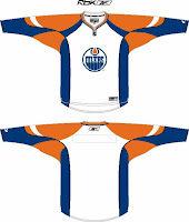
 One reader emailed me this concept design based off of the all-star game template I posted in the sidebar. Not too shabby. Good ol' blue and orange.
And remember the extremely orange fan creation I posted last week? I was sent a logo based on that concept. You can see it below along with a recolored version of the oilman logo — which we've heard is not long for this earth. The Oilers will likely go without a shoulder patch this season, but they also might get a completely new one. We'll just have to wait and see.
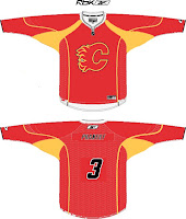
But that's not all. I also promised some fan-created artwork for the Calgary Flames. See that below.
That jersey is on fire! But like the oilman logo of the Oilers, this horse logo will likely become part of the Flames' history this summer. Word is a new secondary logo is on the horizon. With that in mind, let's look at an Rbk EDGE template.
 Very, very red. What is it with all the red anyway these days? That's the most popular color in the NHL. But I know, it's the Flames. Red is one of their obvious colors. All I'm saying, is that the black jersey might look good with a red flaming "C." In the alternative, a black flaming "C" would be the only way to go on a red jersey.
Any thoughts, Albertans? Please don't bicker. Lively back-and-forth, I can deal with. Resist the urge to pick on your fellow countrymen if you can.

Calgary
FLAMES
43% 5,351 votes
12,405 total votes
 Chicago Blackhawks
 Calgary Flames
| Poll opening date Aug 15 @ 4:24 AM | Poll closing date Aug 22 @ 11:59 PM |
07CHTRN | #W1B | CHIvCGY
Just wanted to keep everyone up to date on a rumor that's been floating around regarding the Calgary Flames new duds. It's been widely reported that the horse head logo with the flaming nostrils will bite the dust in favor of a new secondary logo. Some believe that secondary logo will prominently feature the flag of Alberta in a shield sort of style.
For an example, check out this fan concept that was emailed to me recently.
The designer used the Albertan coat of arms as a jumping-off point in coming up with this idea. Some people wonder whether this would stir up unhappy feelings in the Edmonton Oilers, also based out of Alberta.
As an interesting corollary, the Oilers are also reportedly dropping the secondary logo they've used for the last decade. Word is, the oil man on the shoulder will be gone. Are plans in the works for a new Alberta-related secondary for them too? Should be interesting.
Any Albertans out there? What do you guys think of all this?
UPDATE (5:58 PM): Unfortunately I made the mistake of pitting Flames and Oilers fans against each other. I don't know what I was thinking. Just to avoid things getting out of hand, I'm shutting down comments on this post. Thank you to those of you who posted comments with civility in mind (apologies for closing them down). To the rest, I can live with a few jabs back and forth in good fun, but I won't tolerate attacks of any kind. We're all just trying to enjoy ourselves here.

