NHL Tournament of Logos

Entries in flames (53)

Wednesday
Aug152007

Flames Post Online Jersey Teaser

The Calgary Flames have formally announced September 4 as the date for their official jersey unveiling. A date I already have in the sidebar countdown.

Unfortunately, the image they posted is merely a teaser and while can't see the finer details of the jersey — such as a shoulder patch — it does appear that the home sweater will be red with a lace-up collar. Pretty nice. Can't wait to see the rest of it.

By the way, big thanks to alltherage for pointing out this information. For a quick link to the order form, check it!

Wednesday
Aug152007

Poll: Flames vs Blackhawks


vs
Calgary
FLAMES
Chicago
BLACKHAWKS


Place your vote and then feel free to leave a comment as to how you came to your decision. Tell all your friends to drop in and vote! The more voices heard, the more accurate the results!

Poll opening date
Aug 15 @ 4:24 AM
Poll closing date
Aug 22 @ 11:59 PM

07CHTRN | #W1B | CGYvCHI

Tuesday
Aug142007

Conceptualizing The Flames, Blues

It's another one of those slow news days. So to help fill the void, I have chocola— er, I mean jersey concepts. Let's start out with some Calgary Flames action.

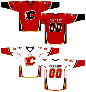
It's pretty basic, though a lot like other stuff we've seen. My only complaint is the clashing of vertical and horizontal stripes at the base of the jerseys. You know my old line. Go all horizontal or go all vertical, but don't go both. Yeah, I've never used that line before but it's probably a good one.

Also, word is those shoulder logos with the horse dealing with some serious sinus issues are toast. (Ha.) In fact, word on the street is there may be an entirely new shoulder patch introduced this fall. We'll wait and see, of course. The official word comes down from the team on September 4 if all goes as planned.

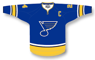
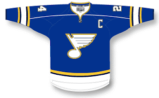
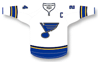
I've also got some fan-designed St. Louis blues jersey concepts to share with you. They're pretty simple, harkening back to the old days. Nothing drastic, but I expect to see something a little different with the real Blues uniforms.

Again, we'll have to wait around for official news from the club. We don't have a hard date as of yet for the unveiling, though their first pre-season game is on September 16 if you wanted to pencil that in on your calendars.

Then I thought I'd leave you with this.

What if they changed their name to the St. Louis Whites? No, but seriously... If you feel inclined to comment, you may do so in the marked area below. Thanks again for your patronage!

By the way, I should point out that a lot, and I mean a lot of people have sent in jersey concepts over the last few days. Unfortunately, I can't post them all right away. But with any luck, if you've sent one in, chances are you'll see it on this blog one of these days. Don't lose hope.

Tuesday
Aug072007

Flames vs Blackhawks


vs
FLAMES
BLACKHAWKS
12-1
2-11

The Aesthetics
Both of these teams wrap up their schedule today. Let's see how they fair. You probably already know who I like better for this category. And if you don't, it's the Flames. What's going on in the Blackhawks logo? Do they have a defined color scheme? Is there a way to find it in the logo? No? Meanwhile, the flaming "C" is cool, especially in black.
Flames

The Nickname
Humans have never been able to really control fire, not even Chief Blackhawk himself. A few Flames get out of control here and there and suddenly the entire state of California is under a wildfire watch.
Flames

The Analysis
Many have argued that I'm insane because I don't agree with "many other sports fans" who consider the Blackhawks logo to be one of the best ever. Thing is, I'm insane for so many reasons, and that's not any of them. It's a good solid logo as far as that goes. But as for what makes it one of the best in all of sports, I am at a loss. It looks to me like a well-drawn Indian head that was scribbled on at one point — and then left that way. But, as I've said before, who am I to say? You guys will get to decide once and for all. Voting starts on August 12. Mark your calendars! In the interim, it's a season finale sweep for the Flames.
Flames


WINNER
3-0


Monday
Aug062007

Mailbag: Flames Concept Logo

I had a reader send in this Calgary Flames logo which seems pretty cool. It gives a new perspective on the recent secondary logo that featured a horse with flames in its nostrils.

Flames fans might also notice the similarities between the flames coming off the traditional "C" and the mane of the horse in this fan-designed concept logo. It's pretty sharp. But can anything really be better than the flaming "C" or should the Flames go in this artistic direction?

As a side note, it also seems that we'll be getting a first look at the Calgary Flames new uniforms at the Flames Celebrity Charity Golf Classic on September 4. I can't completely vouch for the reliability of this info, but what could it hurt to add it to the sidebar countdown? Check it.

Monday
Aug062007

Blues vs Flames


vs
BLUES
FLAMES
5-8
11-1

The Aesthetics
Well, it's the end of the line for the Blues today. Good or bad, its their final match. And it's a tough one for me. One little nitpick I have on the Blues logo is how the top yellow line inside the "wing" goes too far to the left, almost touching that indented area. I don't know why it bothers me or how it can be properly rectified. And anyway, what's cooler than the flaming "C" logo?
Flames

The Nickname
Flames would burn a Blues man and melt his trumpet. He should stay away from fire.
Flames

The Analysis
I always sort of liked the secondary logo the Blues wore back in the mid-'90s during the period when red was one of their colors. I think a trumpet would make a great logo for them, not that the musical note isn't. But you know me, always one for change. Except for the Flames logo. That one is cool. You know why. Sorry, Blues fans. Not feeling it today, I guess. It was a good run.
Flames


WINNER
3-0


Saturday
Aug042007

Flames vs Avalanche


vs
FLAMES
AVALANCHE
10-1
11-1

The Aesthetics
Despite what some readers may think, I actually like letter-based logos. We've got flames on a "C" and an avalanche on an "A." Plus, I've said before that I feel like the Avalanche logo will be an all-time NHL logo classic. But that's not to say the Flames logo isn't already. However, when we look at the elements of these logos, the avalanche is being led by a subtle puck and that is cool.
Avalanche

The Nickname
This is the ultimate battle. Fire and ice. The Flames melt the Avalanche, turning it into a waterfall which extinguishes the fire. That was a pretty good one.
Flames

The Analysis
This is another hard call to make. If you want to know my thoughts on these logos, you should go back and read their previous matches since I'd rather not go through it all again. The deciding factor, though, will be that as one of the few Canadian teams, the Flames logo's "C" can stand for Calgary or Canada. The "A" is only for Avalanche.
Flames


WINNER
2-1


Friday
Aug032007

Oh, Canada!

I just posted Maple Leafs news with a tidbit about the Oilers' unveiling date. But wait! I have three more Canadian teams to work in today. Let's start out with the Montreal Canadiens because I haven't really had anything to post for them.

This is allegedly a photo of the Habs' new Rbk EDGE road jersey. But so much about it jumps out at me indicating that its not the real deal. First off, it's ugly as fuck (pardon that, please). Apologies to the person who designed it, but the stripage — yeesh! Anyway, the color at the cuff is off and the whole thing just feels very... fake, to me. Anybody else getting that feeling?

Next, we have another alleged photo of a Calgary Flames home jersey.

Don't we love how all these photos look so crystal clear? I get that many cell phone cameras are substandard, but are we to assume that everyone who has sneaky access to the new uniforms can't afford better than a $20 phone? And, exit soap box.

It's an interesting design and one that feels like something we've seen before. Anyway, if anyone can cull anything from that secondary logo, let us know. Can we find it on the shoulder of some minor league team someplace? Or are the Flames actually getting a new one as the horse with the flaming nostrils meets his maker?

Finally, I wanted to leave you with something to laugh at. It is in fact a Photoshop job, just as the upper right corner of the image informs us. The designer was just adapting a photo to the potentially leaked images we saw the other day if for no other reason than to supply us with a better visual.

So what are your thoughts everybody? The only other Canadian team I didn't cover today is the Ottawa Senators but we took care of them on Wednesday.

Monday
Jul302007

Flames vs Canucks


vs
FLAMES
CANUCKS
9-1
5-6

The Aesthetics
Both of these logos are made from the letter "C." One forms a Haida-style whale while other emits fire. I like the simplicity of the Flames logo but also the color scheme of the Canucks logo. Since word on the street is that these colors aren't long for this earth, I'm going to give them this point.
Canucks

The Nickname
Flames burn everything, Canucks included.
Flames

The Analysis
Looking at the Canucks logo, I'm continually confused by the whale. This isn't to say that I believe the orca has no connection to the Canucks as a team (as opposed to the organization), but I really like the design John Slabyk came up with. You know the one. Anyway, they can't win for the "C" (symbolizing "Canucks" and "Canada") because the Flames have one of those too. Plus, how can you improve on a logo for a team called the Calgary Flames, anyway?
Flames


WINNER
2-1


Sunday
Jul292007

Some Flames, Flyers Jersey Design Concepts

One fan designed this Calgary Flames concept based off of the infamous all-star jerseys. It has the horse shoulder logo though we've heard that's no more, but I thought we'd all might like to have a look anyway.

If not, I've still got more. We got a little sneak peek of the new Philadelphia Flyers Rbk EDGE jersey last week and a few fans have taken it upon themselves to make designs based on that.

So here's one.

I think it's more wishful thinking than anything from a fan who doesn't want to see the jerseys change very much if at all.

One other thing I've noticed. If the jerseys that have already been unveiled are any indication, the crests are growing on all these new jerseys. So expect to see a much bigger Flyers logo on the front of that bad boy when it finally gets unveiled.

And for what it's worth, I like the logos on the chest being bigger. Let's make sure we can all see it from the nosebleed seats.