NHL Tournament of Logos

Entries in flames (53)

Sunday
Dec162007

Painted On

I think you guys know by now one thing I'm a fan of is concept designers putting the extra effort in and painting their designs onto player photos. It's the closest thing we'll get to seeing what these jerseys might look like on the ice without them actually being stitched together.

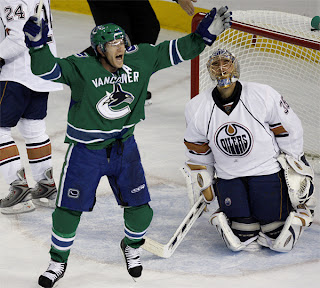
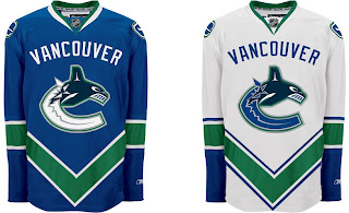
Tonight's post is all about that. I'm starting with my favorite of the bunch. Why don't the Canucks wear green? Why isn't there any green in their logo?

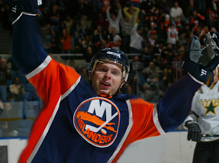
Here's a new idea for the Islanders. I like it better than their real jerseys, but that's just my opinion.

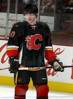
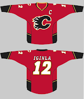
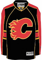
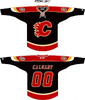
Imagine the Flames in a black jersey. (Not sure what's going on on the shoulder there.)

Frankly, anything with a flaming C on it disgusts me right now after the 9-6 stomping the Lightning received at the hands of the team they once defeated for a Stanley Cup championship. Or did we forget that part?

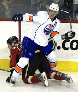
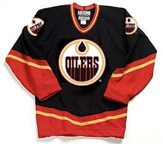
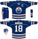
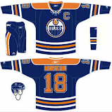
Sticking to Alberta, many Oilers fans have been praying for the day that their club returns to their original colors.

While I'm on the subject, apparently word has been floating around that the Oilers have designed a third jersey that's awaiting NHL approval and will be worn next fall. I'm sure everybody's looking forward to that. I'll be sure to post something when I have more information.

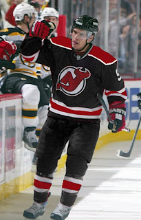
And finally, we have black for the Devils.

If you have comments, you know what to do.

Saturday
Dec082007

Just To Freak You Out XVIII

It's time for another belated edition of the Freak Out series. Hopefully I'll get over this cold soon. It's making me very unreliable here at NHLToL. And it's supposed to be Freak Out Friday, right? Anyway, let's dive in.

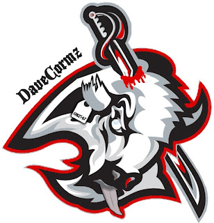
Wow, that was awfully violent. Who's hungry for buffalo tongue?!

I got a ton of submissions this week for the "If They Mated" category. And these are all about rivalries.

I don't even know what to say about this. Except that once again, don't send me hate mail as I am excessively illiterate and wouldn't understand it anyway. Also I didn't make these.

Perhaps slightly less inflammatory are these.

Everything's gone haywire. But wait it gets better. Sure anyone can mix two teams in a blender, but it takes a special kind of talent to do three.

Presenting the Anaheim King Sharks. Let me break it down for you. You've got the Sharks logo in Kings colors on a Ducks jersey. Can't get much more to the point than that.

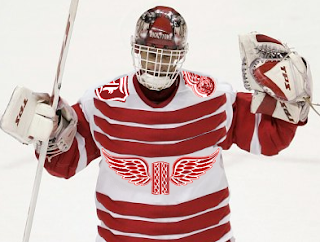
While we're still on the topic of ridiculous jerseys, do you remember the crazy Red Wings design I posted a while back. (It's the second one down in that post.) Were you wondering what it might look like on Dominik Hasek? Wonder no more.

Don't know what he's so happy about. Hideous if I do say so.

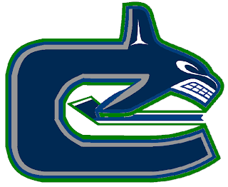
Here's a scary merging of the current and original Canucks logos.

Whales that play hockey. I love it.

To finish up this morning's post, I've got a couple more whacked out logos. I'm pretty sure these come from a Quebecois looking to break away from Canada. It's like if Texas decided it wanted to be its own country. I laugh. But then I am a lousy Floridian who knows nothing of the politics of Canada. Look!


But wait, there's more!

So what do you guys think?

Oh and I'm just warning you now that any comments with discussion of politics will be promptly removed. Go elsewhere for that.
In the meantime, I hope I managed to freak you out a little. Until next time.

Friday
Nov232007

Just To Freak You Out XVI

It's another Freak Out Friday here at NHLToL and boy have I got some weird crap today. I have to start out first with something that might cause you to fall out of your chair laughing.

The funny part is I think that's what Homer Simpson would look like if here were an Indian. Anyone agree with that?

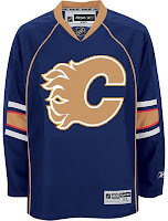
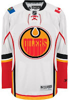
The next image is sure to stir the pot a little bit. It's like one of Conan's "If They Mated." Albertans might not be able to take this. Imagine if the Oilers and Flames got together.

We should make a habit out of that. Pretty funny stuff.

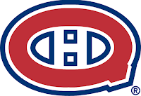
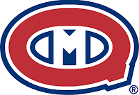
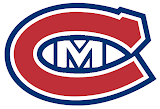
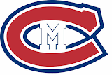
This cracks me up. Twice in the same week, two separate people emailed me concept logos for the Montreal Canadiens — replacing the "H" with an "M."

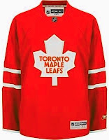
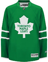
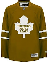
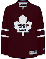
The graphic on the right incorporates the old Montreal Maroons logo so that's kind of cool. But regardless, it's still just weird seeing that. Let's keep it in southern Canada for a moment. A few different readers felt like giving new colors to the Toronto Maple Leafs' uniform. Everything but blue.


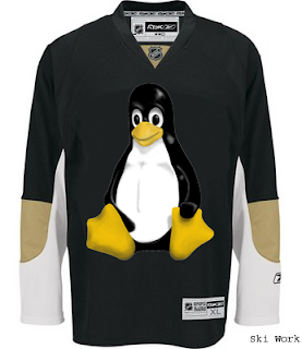
We'll finish off this week's Freak Out Friday on a fairly obvious route.

Yes, that's the Linux penguin. Can't believe I didn't get that one sooner.

Hope those served up a good laugh, or at the very least made you smile on the inside. And don't forget to send in your Freak Out art for next Friday's post. Enjoy your weekend!

Wednesday
Nov072007

Poll: Flames vs Sabres


vs
Calgary
FLAMES
Buffalo
SABRES


Place your vote and then feel free to leave a comment as to how you came to your decision. Tell all your friends to drop in and vote! The more voices heard, the more accurate the results!

Poll opening date
Wed Nov 7
Poll closing date
Sun Nov 11

07TJTRN | #1C | CGYvBUF

Wednesday
Oct312007

Flames, Here's How You Fix It

Haven't done one of these in almost a month. Got some good stuff, though. Here are some suggestions for the Calgary Flames on how to fix their new Rbk EDGE jerseys — not that they will.

On the left, we see two simple fixes. One, you drop a stroke around the Albertan flag since blue on red looks bad — but that's only true on TV and computer screens. When looking at the shoulder patch with my own eyes, I think it looks fine. Good, even.

And two, for the piping haters, let's grab the bucket tool and fill in everything below that black stripe. I guess that's preferable to dumping the stripe altogether. But what do I know? On the right is a different idea which involves switching to a black jersey with a red flaming C. It's also got a shoulder yoke that extends to the elbows. Of which, I am not a fan.

So then what about just simplifying? Ease off on all the striping a little. These here, they work. I'm still a little weirded out by the piping thing under the arms. Looks strange there. But I like the more classic feel of the arm stripes.

Anyway, those are just a few of many options for the Flames. But they're on the ice now. Nothing will change at least for a little while.

Friday
Oct262007

Just To Freak You Out XII

Welcome to the 12th installment of the Freak Out Fridays. Hope you enjoy this one. We'll kick things off with one of the craziest things I have ever seen.

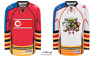
Like the designer said, who needs a logo when you've got municipal and provincial art to plaster across your sweater? And I counted well over 50 stripes on each sweater. I love those right sleeves. So much so that I've gouged out my eyes. The rest of this will be written by touch-typing.

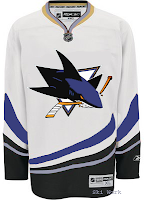
Now keeping it in the Western Conference, check this out.

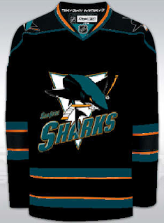
I guess what troubles me the most is that someone has removed the shark's fin. That's just cruel.

Speaking of cruel...

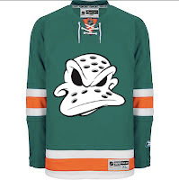
I dare any league to dress any team in that uniform. Make that a double dare! (Actually, I'm half-expecting to see that duck morph into a dolphin.)

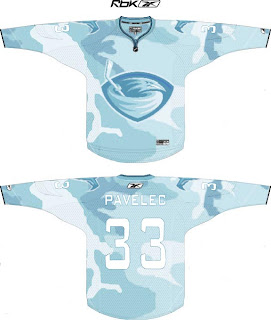
But wait, there's more. Say you're a team looking to blend in with your surroundings. Let's say your hunting ducks, for instance. Might this be a good way to camouflage yourself?

I think it might.

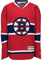
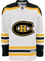
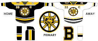
And finally, anybody here watch Conan? One of my favorite segments is "If They Mated." Someone sent in a concept that fits into that category well. What if we mated the Boston Bruins and Chicago Bears (of the NFL for those of us who think football is a waste of time and energy)?
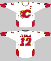
Behold the answer.

I just don't know how I feel now. A little dirty. A little freaked. A little worried about the nightmares I'll have tonight.

Anyway, I hope you guys have enjoyed this Freak Out Friday. Looking forward to finding some great content in my inbox this week for the next episode! You can email me at nhllogos@gmail.com.

Monday
Oct222007

Poll: Flames Franchise Logos


FLAMES
(Atlanta)
FLAMES
(Calgary)


Place your vote and then feel free to leave a comment as to how you came to your decision. Tell all your friends to drop in and vote! The more voices heard, the more accurate the results!

Poll opening date
Mon Oct 22 @ 4:08 AM
Poll closing date
Fri Oct 26 @ 11:59 PM

07BONRF | RFCGY

Monday
Oct152007

Northwest Division Art

Wow. Keeping two blogs is a lot more work than I thought it would be. Hopefully I'll get in the rhythm of it soon so neither one has to suffer. I really apologize for the lack of posts lately. I'll get back in the groove soon enough. In the meantime, I have some concept art for you to gaze upon. And as the title of this posts suggest, these come from the Northwest Division.

I think we all recognize this as the Florida Panthers' uniform with some colors changed. Any takers? No? I can't imagine why.

Seriously though, red is definitely the way to go for the Calgary Flames' home sweater. Black makes a nice third jersey, but I don't know, I'm a fan of the black flaming "C," for one thing.

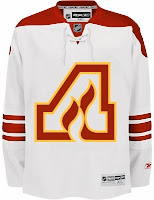
So here's something that hadn't really dawned on me before. When the Flames moved from Atlanta, they didn't really have to change their logo. They could've been named the Alberta Flames and kept the "A."

The two major problems with that would've obviously been that the team wouldn't have been able to create its own unique identity and the Oilers might've taken issue with the club claiming Alberta. Though, to be fair, the Panthers came in after the Lightning and claimed Florida. But I suppose that's different.

The irony is that today the Flames wear the Albertan flag on their shoulder and the Oilers — do not. Speaking of the Oilers, here are a couple of ideas of how the uniforms could be improved.

Wouldn't take much. Just a little will power. But what do I know, right?

And finally, I just wanted to toss this one in.

Like that "V" across the bottom. That's craziness right there. But hey, there's nothing wrong with adding a little green to the orca, right?

Saturday
Oct132007

Rbk EDGE Review: Flames

Part 20 of 30. All 30 NHL clubs have unveiled new jerseys under the new Rbk EDGE Uniform System for the 2007-08 season. Here at the NHLToL, we're going to review every one of them. Read up and then rate the new sweaters. We'll do a full ranking after completing all of the reviews.

Rbk EDGE Uniform System

Calgary Flames


New Uniforms

Old Uniforms

The Unveiling
Tuesday, September 4. The Flames unveiled their jerseys to fans at Flames Central in Calgary.

Home vs. Road
Home: Red. Road: White. The two sweaters are essentially mirror images of each other and feature national and provincial flag patches on the shoulders.

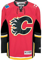
The red home jerseys feature a unique striping pattern. Black piping circles from the sides to the sleeves but stops short before meeting on the outside of the arm. Black-white-yellow-black stripes are featured beneath the piping up the sides and extend down to the bottom of the jersey. White-yellow trim runs across the bottom of the sweater horizontally, stopping at the vertical black striping on the sides. The sleeves feature a black stripe above thinner white and yellow stripes. Beneath that, the cuff is black. The lacing and collar are black and the black version of the primary logo serves as the crest.

The white road jerseys feature a unique striping pattern. Red piping circles from the sides to the sleeves but stops short before meeting on the outside of the arm. Black-white-yellow-red stripes are featured beneath the piping up the sides and extend down to the bottom of the jersey. Red-yellow trim runs across the bottom of the sweater horizontally, stopping at the vertical black striping on the sides. The sleeves feature a black stripe above thinner white and yellow stripes. Beneath that, the cuff is red. The lacing is red, the collar is black and the red version of the primary logo serves as the crest.

In The Details
On both jerseys, the right shoulder features the Canadian flag and the left shoulder features the Albertan flag. The same numbering and lettering style has been retained.

New & Old
The differences between the old and new sweaters is primarily the striping as well as the secondary logo patches. The striping has completely changed and the secondary logo has been eliminated and replaced by national and provincial flags.

Standard FAQ
Numbers on the front? No.
Laces at the collar? Yes.

NHLToL Editorial by Chris
I can't lie. Those stripes bother me on the Flames' sweaters. I think the striping on the sides is unique. But the piping is odd. Also, I feel like the horizontal stripes along the bottom clash with those vertical stripes. The jersey just feels poorly put together in that area. However, to balance that out, I do like the sleeve stripes, the collar style and the flag patches. So I can't reconcile calling it bad. It just averages out overall to me. 3/5


Buy your new Flames jersey!

Thursday
Sep272007

EDGE Makes Flames Sweaty, Too

I recently posted an article from the Pittsburgh Post-Gazette about members of the Penguins whining over certain aspects of the new Rbk EDGE jerseys. Well now, according to the Calgary Sun, the Flames have jumped on board.

Randy Sportak wrote this article on Tuesday. You can read it below.

September 25, 2007

New duds judged a dud

By Randy Sportak
Calgary Sun

Traditionalists still call a hockey uniform a sweater.

Having now sampled the new, high-tech togs unveiled by all 30 NHL teams this year for a handful of pre-season games, Flames players are understanding why the word sweat is in sweater.

"My undershirt is just soaked," said forward Owen Nolan. "I find I'm changing them in between periods and a lot more frequently than before. I feel like I'm working out in a sauna."

The new uniform system unveiled by RBK has benefits. Sweaters are lighter, are apparently more wind resistant and repel moisture.

However, while moisture doesn't soak in from the outside, it doesn't release from inside the uniform. That means players are becoming saturated in their own sweat.

"With the other ones, you had holes and got more of a breeze in there — maybe that's why you got that drying out effect," said blueliner Cory Sarich. "These seem to heat you up more because there's not that two-way air flow.

"Besides, the jerseys don't feel much different than the old ones. I don't know if they've accomplished what they want. From talking to guys, I don't feel they're making a difference on the ice."

Moreover, players around the league are complaining their gloves are becoming so full of sweat they have to change them constantly.

Also, their skates are filling like buckets, and that's not a piece of equipment they want to change mid-game.

The complaints don't end there, either.
To be form fitting over equipment, the sweaters are made of a stretchier material. Uniforms are tied down in the back to prevent an opponent from pulling it over their head in a fight, but it's now possible to 'jersey' somebody in a brouhaha.
"I know with the old ones, my sweater could only be pulled about halfway up my neck, but these come up over my head," said Warren Peters, one of the few Flames to drop the gloves this pre-season. "It's like they're elastic."

Forward Eric Godard hasn't been in a scrap yet, so he hasn't experienced the impact first-hand.

"The old jersey trick has been around a long time," he said. "Usually in a fight, I'm not worrying about the jersey. I worry about the other guy. If I start getting beat up, then I'll be saying, 'It's not fair.' "

And then comes the aspect considered most controversial about the new uniform. Some players prefer the uniforms being tighter, but the majority are partial to the old unis. In the development stage, RBK worked with player input, but still skaters feel restricted.

"I feel skinnier, but that's not the look I'm going for," Sarich said. "It takes me longer to get my sweater on because the shoulder pads and the elbow pads get tangled up in the sleeves."

"They're really tight," Nolan said. "I used to wear a really loose shirt because I want the freedom."

But, nobody's expecting the league to go back to the old ways, so it's best to accept it.

"You're soaked. But whatever sells jerseys, I guess," said defenceman Anders Eriksson. "Anyway, just give me a jersey, and I'll work with it."

Besides, seeing as the sweaters are supposed to be 9% more wind resistant, players must be 9% faster.

"Oh yeah, can't you tell?" Eriksson laughed. "I almost feel slower because everybody was telling me I was gonna be faster."

So essentially, the moral of the story is you cannot please everybody all the time. Hopefully we all knew that already, though.