NHL Tournament of Logos

Entries in islanders (60)

Wednesday
Jul042007

Islanders vs Rangers


vs
ISLANDERS
RANGERS
0-6
2-5

The Aesthetics
You've been waiting for it. The big New York showdown. And how fitting for Independence Day. (Yeah, actually I don't know what relevance that has either.) First off, both logos break the cardinal rule of spelling out the name. On the upside, the Islanders logo at least does it a bit more artfully. The problem I have is the hockey stick and puck. As for the other one, blandness thy name is Rangers. Seriously, two words. Lady. Liberty.
Islanders

The Nickname
You know frankly, there's no reason an Islander couldn't also be a Ranger. Conundrum. But for argument's sake, we'll say they're two separate dudes — in a straight-up fistfight. Fishing net versus tranq gun. I think we all know who gets capped in this one.
Rangers

The Analysis
So we're even going into this category, but if you've been reading long enough, you already know where I'm going. The Rangers logo makes no attempt at recognizing its home city — unless you want to say the shield itself has an extremely subtle NY in it. Personally, I don't. With Long Island making an appearance in the Islanders logo, I have to send the point their way for the modicum of effort. (First victory for the Isles in the tourney.)
Islanders


WINNER
2-1


Monday
Jul022007

Lightning vs Islanders


vs
LIGHTNING
ISLANDERS
1-3
0-5

The Aesthetics
With a combined one win and nine matches between them, these are two rather weak logos. Both spell out the team names and the creativity of making the bottom end of the "Y" in NY into a hockey stick almost overcomes the use of the stick itself and the puck. It's almost like choosing the lesser of two evils here. The Bolts will get the point.
Lightning

The Nickname
Lightning would strike an Islander dead, especially if he's out on his boat in the middle of a storm. Where do I come up with this shit?
Lightning

The Analysis
There'll be no sweep here. The Long Island map keeps winning me over, especially when the Lightning logo has no relevance to the Tampa Bay area outside of the wordmark.
Islanders


WINNER
2-1


Saturday
Jun302007

Flyers vs Islanders


vs
FLYERS
ISLANDERS
3-3
0-4

The Aesthetics
That's a lot of orange up there. We're almost going to have to start defaulting this point automatically to the team that does not use their name in the logo. The Flyers logo gets this point for showing a hair more creativity.
Flyers

The Nickname
I have no idea. We're just going to say that the Flyer is a nasty bird that poops on the Islander's head while he's out fishing.
Flyers

The Analysis
Here's where we have to give a little credit to the Islanders logo for the use of the map of Long Island. I would be thrilled if somehow the Flyers could work in the Liberty Bell or some other Philly landmark. Though I'm tempted to revoke this point from the Isles for the blatant use of a hockey stick and puck — the words notwithstanding. But I won't though, because this is where the Flyers falters.
Islanders


WINNER
2-1


Friday
Jun292007

Islanders vs Canadiens


vs
ISLANDERS
CANADIENS
0-3
2-0

The Aesthetics
The Isles have yet to win match while the Habs have yet to lose. Let's see if anything changes. Now I like circular logos, but I hate the spelling out of team names. It seems so unnecessary. Logos that stem from a single letter are usually lazy but in this case, there's something special about the Canadiens.
Canadiens

The Nickname
I'm not sure why a fisherman and a Frenchman would ever come to blows, but in a straight-up fistfight, my money is on the Islander over the Canadien.
Islanders

The Analysis
The Canadiens logo is one of those old traditions so I'll probably get crucified for bad-mouthing it. But that's okay. I understand. I would just like to know what makes it unique to Montreal. At least the Islanders logo has a map of Long Island despite its use of both a hockey stick and puck. However its the very use of those two elements that defaults the point to the Canadiens.
Canadiens


WINNER
2-1


Monday
Jun252007

Islanders vs Sabres


vs
ISLANDERS
SABRES
0-2
2-1

The Aesthetics
As much as Sabres fans in general have made well known their distaste for the new logo, it's actually a very strong sports team logo. Simple design, great colors. The Islanders, however, make use of an unnecessary hockey stick and puck. We already know it's a hockey team.
Sabres

The Nickname
Could an Islander really defend himself against a Sabre-wielding swordsman? I think not.
Sabres

The Analysis
Here is where the Islanders avoid getting swept. The map of Long Island in the background of the logo is great and the classic design is very recognizable. Unfortunately in a logo for the Sabres, there isn't a sword in sight. Why, I wonder. Why must every team from Buffalo use the animal in the primary logo? Stop it, already.
Islanders


WINNER
2-1


Saturday
Jun232007

Islanders vs Capitals


vs
ISLANDERS
CAPITALS
0-0
0-0

The Aesthetics
The Capitals' new logo debuts in the tournament today — a day after being officially unveiled — and sadly, there's nothing very impressive about it. Both logos manage to spell out the team names completely. And both incorporate a hockey stick. And a puck! Completely unnecessary, in my opnion. Neither team should get this point. But somebody has to. The Islanders logo is a lot easier on the eyes in comparison.
Islanders

The Nickname
It's in the Capital where laws are written that might affect Islanders and perhaps what fish they're allowed to catch or not catch. I suppose.
Capitals

The Analysis
As I mentioned in Aesthetics, both logos have hockey sticks, pucks and the team name spelled out. The difference (aside from color) is how they incorporate representations of their home towns. We have an orange map of Long Island on one which is fairly obvious. On the other we have a very subtle ode to D.C. with three stars above Washington which are culled from the District of Columbia flag. I love subtlety in logos.
Capitals


WINNER
2-1


Friday
Jun222007

More Potential New Unis

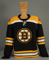
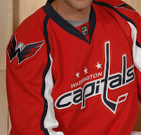
Today is Draft Day and that means each team has to break out the "07" jersey to throw on the backs of their new draft picks. But this year every team is getting new jerseys and the only ones we've actually seen at this moment are Boston and Washington. For a refresher, these are them:


Now for what you haven't seen yet. At least not here, that is. While scouring the internet as I do I came across possible designs and mock-ups for both the Dallas Stars and New York Islanders. Let's start with the latter.

This appears to be a cell phone photo taken possibly covertly. But now the world has it via the wonderful internet. Now as with anything I post that isn't official, do take it with a grain of salt. I'm not anymore connected than you are reading this. The jerseys hanging here definitely have some color issues. I can't say I'm loving all the striping but so far I haven't really loved any of the new Rbk jerseys we've seen. That includes the Bruins and Capitals — although I did like what they wore at this year's all-star game. Am I too picky? Usually I like change, but I haven't been wowed over yet. Yet being the operative word there.

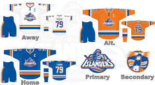
There's also this which might be better off the Hockey Fans & Photoshop series I just finished running a week or so ago. In fact the design even looks a little bit reminiscent of what I posted for the Dallas Stars during that series. Even if this is the team's actual design, it's not half bad. I don't hate it and I like the creativity with the crest on the dark jerseys. However, that in itself indicates a possible change back to the days when the home team wore white.

Don't you just love all this speculating. God knows I do. So that's that for now. Tune your sets to Versus tonight at 7 for coverage of the draft. We'll see if we get any sightings of new jerseys tonight. I'm sure we will. I'm also looking out for the possibility of new logos. I'm desperate for a new one from the Lightning and still expecting changes for Dallas, San Jose, Ottawa and Toronto.

More later tonight.

Wednesday
Jun202007

Islanders vs Thrashers


vs
ISLANDERS
THRASHERS
0-0
0-2

The Aesthetics
I've never been the biggest fan of words or hockey sticks especially in hockey logos. It's a little too on-the-nose if you ask me. The Islanders have both and for that reason they should lose the point. But then this logo is supposed to be traditional right? They've used it for a few decades now (minus those couple of years with the Gordon's fisherman). Still, the Thrashers logo is visually interesting and makes great use of color.
Thrashers

The Nickname
If a Thrasher was flying over an Islander, the bird would surely poop on his head. I know, effort.
Thrashers

The Analysis
It stood the test of time even when a mid-'90s mistake couldn't. The Islanders logo may only be 35 years old, but to many hockey fans, it's been around forever. But that doesn't automatically win you a point in this competition. You need to really show something. In this case, the Islanders logo shows a sense of where it's from with the map of Long Island featured. The Atlanta Thrasher? Maybe. But I'm not getting a feel for the city.
Islanders


WINNER
2-1


Sunday
Jun032007

HF&P, Part 15: New York Islanders

It occurs to me that I'm really running out of time if I want to get the "Hockey Fans & Photoshop" series completed by the time the tournament starts. It's only nine days away! That being said, I'm going to be a little ambitious leading up to it by giving you two posts a day! That's right, I said two.

There's no real reason why I couldn't continue this series into the tournament except for that I just don't feel like it. On the other hand, if I do come across new artwork, I'll be sure to pass it along. Now, on with it already.

Now before you say anything, I warned you last time that you would laugh your ass off on this design. That being said, changes like this fascinate me and therefore I love it. Of course it would send hockey's ultra-traditionalists into a tailspin. Maybe that's why this sport has never really gone mainstream — the traditionalists won't allow it.

That's disappointing, isn't it?

Anyway, there you have it. One fan's nostalgic throwback in the Rbk EDGE template. It's a beautiful thing. It's basically the same as the '90s logo that failed after just a season with the aqua color replaced by gray. So anyway, I don't hate it but I give it no chance of actually making it onto the backs of an Islander players.

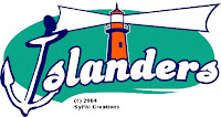
So speaking of getting all radical and crazy, I came across the coolest web site the other day. Somebody came up with a whole slew of concept logos for NHL teams. I'm going to put them all in one big post on Tuesday, but thought I'd give you a little preview today. Just look at that thing. I don't even know what pee wee team should have that lighthouse on their sweaters.

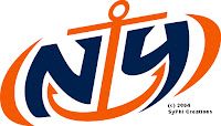
These works of art are nothing short of sheer genius. I mean, the "NY" cleverly placed within an anchor! Does it really get any better than this?

Okay, I'll stop now. While the Islanders have no intention — at least not publicly — of changing their logo, these logos are still fun. And they've been around several years, as indicated by the copyright date.

So I hope you enjoyed that at least a little bit. Just something to laugh at on your Sunday afternoon.

Up next: the New York Rangers — and that's coming later today in the second of two posts.

Monday
Apr302007

Islanders


New York ISLANDERS


Team Information
Team Colors / orange, blue, white
Inaugural Season / 1972-73 (35 years)
Current Logo / 1997-98 (10 years)

Tournament History

2007 Qualifying Tournament
2-12, 13 pts
Finished 13th in East; 25th overall

Page 1 ... 2 3 4 5 6