NHL Tournament of Logos

Entries in islanders (60)

Saturday
Feb022008

Poll: Mighty Ducks vs Islanders


vs
Anaheim
MIGHTY DUCKS
New York
ISLANDERS


REMEMBER: You're choosing the WORST logo!

Place your vote and then feel free to leave a comment as to how you came to your decision. Tell all your friends to drop in and vote! The more voices heard, the more accurate the results!

Poll opening date
Sat Feb 2
Poll closing date
Wed Feb 6

Sunday
Jan202008

Poll: Islanders vs Rangers


vs
New York
ISLANDERS
New York
RANGERS


REMEMBER: You're choosing the WORST logo!

Place your vote and then feel free to leave a comment as to how you came to your decision. Tell all your friends to drop in and vote! The more voices heard, the more accurate the results!

Poll opening date
Sun Jan 20
Poll closing date
Thu Jan 24

Friday
Jan042008

Just To Freak You Out XXII

I can't believe how long this series has lasted. At 22 and still going strong, what follows is another edition of Freak Out Friday. Where do I begin?

I think I'll start with a play on the Winter Classic which took place this week. It's an "If They Mated" featuring the two teams involved in the big outdoor game.

Curiously though, while the designer went with the original Sabres logo, they opted against the original Penguins colors.

Now is where I really get into the scary stuff, so be warned.

Though well executed, that can't be a good idea. Speaking of which...

Let the eye-gouging begin. It makes great use of the Panthers' colors but what is with all the suns? We get it they're the Florida Panthers!

Here's what we need.

Because nothing says we're getting rolled over like a jersey with tire tracks. A sentiment less suited for the Red Wings (first place) and more so for the Lightning (last place) who can't seem to remember how to win games. But I'm not bitter.

Speaking of the lackluster Lightning, the one color I hope is never incorporated into the Bolts' identity is yellow.

Did I mention how I hate the yellow?

And finally, it appears that not a lot of effort was put into this, but I thought the logo was funny enough to revisit.

Keep the crazy artwork coming so I can continue to frighten and freak out the readers here at NHLToL. Enjoy your weekend!

Saturday
Dec292007

Concepts On The Isle

I got a couple of nice New York Islanders concepts delivered to me. I felt like sharing them tonight. The first is a really simple improvement over the new design introduced this year.

It's not much, but it makes the sleeves seem like they're actually a part of the jersey. And it does away with the pointless piping around the shoulders.

Now if you just can't live without the piping, here's how you do it the right way. Tip: Use a different color for the shoulders.

Plus, I've always liked the Islanders in an orange jersey. Just like I preferred the Stars in green — even the Wild in green as well. It's almost like there was actually a mandate requiring teams to wear black, blue or red (the Sharks with the teal the only exception). Anyway, here's to orange jerseys and Mike Comrie.

Though he appears to be disintegrating as if in one of those sci-fi films.

I'll have more stuff to post tomorrow. I hope to make a large-scale update to the Concepts Gallery as well.

Friday
Dec282007

Just To Freak You Out XXI

The Freak Out series hits 21 this week — old enough to get hammered. And boy, I think some of the designers this week had to have been hammered. I mean, just look at this.

It might take a moment or two to notice that this is an "If They Mated" example. It's the new Sharks secondary logo merged with the Mighty Ducks third jersey of the mid-90s. But I love it!

This Flames jersey is on fire! Someone on eBay is really selling it. For real.

Sidney Crosby recently dropped the gloves in a rare on-ice event. This picture isn't real but it cracks me up nonetheless. There's just so much about it that's so wrong. I'm curious to see if the guys over at Pensblog have anything to say about this.

And finally, we have a plethora of "matings" here to share.

To sum things up, what you see above is the Flyers and Bruins, Rangers and Islanders, Devils and Sabres, Blue Jackets and Blackhawks, Avalanche and Wild, Blues and Red Wings, Canucks and Hurricanes (weird!), Bruins and Flyers (opposite of the first one) and Stars and Coyotes.

But wait, there's more.

This one is interesting because it's all opposites of the previous image. They are the Coyotes and Stars, Blackhawks and Blue Jackets, Hurricanes and Canucks, Islanders and Rangers, Sabres and Devils, Red Wings and Blues (what the—?), and Wild and Avalanche.

Hope you enjoyed being freaked out. Have a fantastic weekend!

Friday
Dec212007

Just To Freak You Out XX

The quality of Freak Out art I've become accustomed to was sorely lacking this week and that'll be clear after you get through tonight's post. It's not that nobody sent anything, it's that they were either trying too hard or not trying hard enough. I've got to have some standards, right? Perhaps not, but I'll forbear any further deliberation if for no other reason than to quite simply get on with it. Good plan?

What's wrong with this picture?

Yes, it seems like some of the colors there are a bit off. These too.

And don't even get me started on the absurdity of tropical storm flags surrounding a jersey with a Hartford Whalers logo on it. My head would explode.

Next is a Philadelphia Flyers concept logo that I think fits fairly into the "freaky" category.

At first, I liked this New York Rangers jersey. But the more I stare at it, the more it disturbs me. I don't care how old that team is. They need a new logo.

And finally, this one I just can't figure out. My brain tells me this is a nice Photoshop job, but a small part of me fears someone, somewhere actually made this jersey.

Islanders fans, I apologize. That's just horrible.

Anyway, that's all I've got for this week. Hope you got a little freaked out. And I hope you guys will keep sending in good Freak Out Friday material so we can keep this series going. Enjoy your holiday weekend!

Sunday
Dec162007

Painted On

I think you guys know by now one thing I'm a fan of is concept designers putting the extra effort in and painting their designs onto player photos. It's the closest thing we'll get to seeing what these jerseys might look like on the ice without them actually being stitched together.

Tonight's post is all about that. I'm starting with my favorite of the bunch. Why don't the Canucks wear green? Why isn't there any green in their logo?

Here's a new idea for the Islanders. I like it better than their real jerseys, but that's just my opinion.

Imagine the Flames in a black jersey. (Not sure what's going on on the shoulder there.)

Frankly, anything with a flaming C on it disgusts me right now after the 9-6 stomping the Lightning received at the hands of the team they once defeated for a Stanley Cup championship. Or did we forget that part?

Sticking to Alberta, many Oilers fans have been praying for the day that their club returns to their original colors.

While I'm on the subject, apparently word has been floating around that the Oilers have designed a third jersey that's awaiting NHL approval and will be worn next fall. I'm sure everybody's looking forward to that. I'll be sure to post something when I have more information.

And finally, we have black for the Devils.

If you have comments, you know what to do.

Friday
Dec142007

Just To Freak You Out XIX

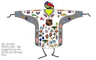
Finally, Freak Out Friday is back on Friday! And boy is this one a doozy. You won't believe some of the whacked out craziness your fellow readers have come up with this week. Let's start with an eyesore I probably never should've posted at all.

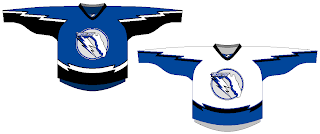
Yeah, there's no excuse for that. Speaking of inexcusable, here's a rather scary concept of a Tampa Bay Lightning logo.

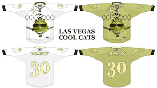
Oh wait, it gets better. You know how Las Vegas has been involved in all the buzz about a possible future expansion of the NHL? Here's what they shouldn't do when it comes to naming the team and designing a uniform.

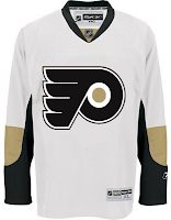
And then as always, we have our "If They Mated" blends. First, we have Pennsylvania's teams...

...and then all three New York clubs.

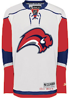
Plus as a special bonus, someone redesigned the Sabres' pants. But you know what I say? If the Lightning can have lightning bolts down their legs, than why can't the Sabres have swords?

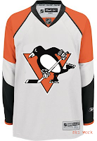
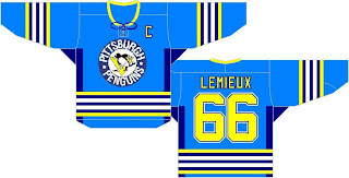
Oh, and I mentioned the Penguins a second ago. I need to post this just so it's out there. I'm all for the retro blue jersey for the Winter Classic, but let's not go too far. Here's something to avoid at any cost.

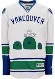
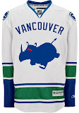
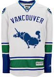
And finally, I can't determine whether the designer of these hates the new Canucks jerseys, or loves them. You be the judge.

Hope you enjoyed your week — or at least your Friday. Christmas comes in just 11 days and you know what that means!

See you right here for another Freak Out post next Friday! And remember you can send in your concepts for consideration to nhllogos@gmail.com. I look forward to seeing them!

Monday
Dec102007

Connected By Blue

So what do all of tonight's jersey concepts have in common? The color blue. That's it.

We'll begin with the Buffalo Sabres and a design that despite its stripes is actually rather cool.

Yeah, the striping does ruin it though, doesn't it? I like the logos and the colors (though I'd go with a white circle on the blue jersey) but I don't really understand the weird stripes. In case you can't really make it out, the logo on the shoulders appears to be the buffalo from the original '70s logo sans the swords beneath it.

These two deal with some simple modifications. The white Leafs jersey with the blue stripes leaves me wondering whether this would be a home or away jersey. It seems to have too much blue to be a road sweater yet it has too much white to be for home games. The Isles jersey, however, is a nice adjustment. Not great. But better.

Here are a couple of dark Thrashers jerseys. Your pick as to which is home and with is an alternate.

And finally, I promised a Blues fan I'd get this one posted tonight.

You know what to do now. Comment away. I'm interested in seeing what you guys have to say about these.

Wednesday
Oct242007

Couple Of Quick Concepts

Hmm. That may be misleading. I don't know how "quick" the concepts are, necessarily, but you should get through this post quickly. I'm keeping it short.

First, a New York Islanders logo I think is awesome!

I may stand alone in loving it, but so be it. My only suggestion for improvement would be to rid it of the text. Maybe save that for a secondary mark or something. But I like the lighthouse tack. I know certain "Islanders fans" are opposed to it, and being a Lightning fan, I'm sure I don't have the proper standing to say, but I just can't help myself.

And speaking of the Lightning...

You had to see that coming. First off, wow! That is an amazing looking sweater. That's how you make blue work as a Bolts jersey color. Save this and make it a third jersey. Don't want to wear it out by wearing it every night! I'd buy this one too.

That's all for today. Short and sweet. I'll attempt to have some more up tomorrow.