Result: Jets Logo History
 Tuesday · Oct 9 · 2007 | 11:31 PM PDT
  Post a Comment
1990
69% 2,346 votes
3,400 total votes
 1979
197931% 1,054 votes
| Poll opening date Oct 2 @ 4:57 AM | Poll closing date Oct 9 @ 11:59 PM |
07BONLH | LHWPG

3,400 total votes
 1979
1979| Poll opening date Oct 2 @ 4:57 AM | Poll closing date Oct 9 @ 11:59 PM |
07BONLH | LHWPG
 |  |
We've pretty much gotten through the league by now with the logo history polls. So we're hitting up a couple of deceased teams yesterday and today. If you think I left out anybody important, feel free to drop me a line in the comments or by email.
Place your vote and then feel free to leave a comment as to how you came to your decision. Tell all your friends to drop in and vote! The more voices heard, the more accurate the results!
| Poll opening date Oct 2 @ 4:57 AM | Poll closing date Oct 9 @ 11:59 PM |
07BONLH | LHWPG
Over the past week, I've been surprised at the number of concepts I've been sent featuring the Winnipeg Jets. Surprised because that team no longer exists. Still, all the work people put in made me think I should share some of what I received.
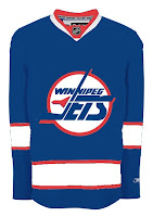
 Here's what the Jets might look like in a new Rbk EDGE jersey. This concept is based off of the new Canucks jersey. Not bad at all.
But with all the modernizing of this league, I have a feeling the logo would be different today. The logo you see on this jersey has been around since 1990. Don't get me wrong, I think it's a great logo, but I just feel like it would've been changed somewhere along the way.
Maybe to something like this.
The diagonal stripe in the red jersey freaks me out a little bit. Too steep? The designer wanted me to let everyone know that the shoulder patch emanates from the city of Winnipeg's coat of arms. I know it's small, but it's there.
A different artists had a different idea for a new Jets logo and uniform set. It's also quite impressive.
 I wish I could tell you it was an original design, but it's based entirely off of the AHL's Houston Aeros' logo. I do like the jerseys, though. Not too much to complain about there. A simple and classic sort of feel.
But despite all of this effort and toiling over Photoshop and Illustrator, the Winnipeg Jets moved to Phoenix in 1996 to become the Coyotes. So while I'm here, I also got emailed a great 'Yotes concept I can share.
One thing I don't like about the current Coyotes jerseys is the monochrome feel. Black is a big part of the logo so why doesn't it have any part of the uniform?
I like that a lot! Coyotes fans, do you have an opinion. Do you like these or are you more supportive of Wayne Gretzky's prescribed design which the team currently wears?
I'm heading to Quebec for the next stop on my trek across Canada today. The only team there today is the Montreal Canadiens. So let's start with them. I was emailed a concept design that is rather unique.
Interesting choice with the striping. What do you Habs fans think? Do you like the bars across the chest?
I got a really cool piece sent to me recently, as well, for a team that now exists under a new moniker in a new city. This designer contemplates what the Quebec Nordiques might look like in the "new NHL."
Gets you all nostalgic, doesn't it? Speaking of nostalgic, let's "jet" on over to Manitoba and muse on what the Winnipeg Jets might hve looked like in Rbk EDGE jerseys, had they not moved to Phoenix.
Talk about a trip down memory lane. Feel free to leave a comment about any of these designs. I'm sure their creators are interested in your responses.
Still to come today: A preview of the new uniforms of the Toronto Maple Leafs.
