NHL Tournament of Logos

Entries in news (596)

Friday
Jul202007

Canucks Jersey Concept Designs

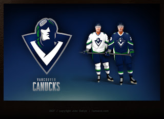
Last week, I posted some fan-made designs for the Vancouver Canucks' new logo and uniforms. We've heard that they're going to be unveiling a new logo this summer so everyone's wondering how it will look. So here are some more.


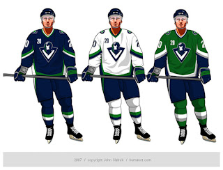
These way-too-cool designs come from John Slabyk, he of Blue & Gold Project fame. He's a graphic designer who was implored by fans to take his artwork to Larry Quinn with the Buffalo Sabres. They liked his work a lot but a meeting with the team's GM yielded nothing. Not to be discouraged, he has come up with a potential new design for the Vancouver Canucks.

And this is it. It's really cool but it's probably a little too high-quality for the NHL. The design is really clean and even incorporates the classic stick-in-rink logo of the 1970s while sticking with those traditional colors. So far, responses I've read to the design are mixed, though. I think the gist is that a lot of people like it but aren't naïve enough to think the design would actually ever been worn by the team.

Personally, I'm not giving up hope on the Canucks or the NHL. Anything is possible and one day soon I hope to see them donning a logo that doesn't feature a whale more prominently than, well, a Canuck.

Wednesday
Jul182007

Jersey Design Concept For Lightning

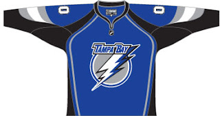
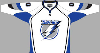
So I thought I was finished with that whole "Hockey Fans & Photoshop" series but it turns out there's more. After the possible leak of what may be the new logo for the Tampa Bay Lightning, a fan had some fun designing a uniform based on it. I honestly can't remember where I found it, but I'd have to guess ModSquadHockey since that's where I originally came across the logo itself.


This is what he came up with. It's pretty cool. I'm a big fan of switching to blue for the home jerseys. The black has gotten old. And despite there being a number of other teams that wear blue (the Thrashers, Rangers, Maple Leafs, Blues, Predators, Oilers, Blue Jackets and Canucks...) I still think the Lightning could pull it off. And should.

Obviously, it's not the offiicial design. If you consult the sidebar, you'll see we still have 38 days to wait for the big announcement and unveiling by the Bolts. Personally, I can't wait. I'm on pins and needles.

By the way, as a complete side note, I would like to thank those of you who drop by here on a regular basis. A while back I mentioned hitting a record of over 300 hits in a single day. That was surpassed yesterday with 514. I'm kind of surprised, actually. Incidentally, we're already over 400 today at it's not even 5 PM. It'll be interesting to see if we can beat yesterday's record.

Once again, thanks for dropping by.

Tuesday
Jul172007

Looking To The Future

The NHL Tournament of Logos is winding down but don't worry, it won't be over even when it's over. There's still the Championship Tournament where we'll pit the best of the East against the best of the West. That will be the ultimate decider of whose logo is really the best. Who will be able to stand up to the stiff competition in this marathon tournament.

I see a handful of you have voted in the poll I recently placed on the sidebar. I'm glad to see that. I'm also glad to see that no one has voted "no" so far. That's appreciated. Just so you know — if you're interested — I am working on a plan to implement a polling system for this site.

It likely won't be sorted out until after this tournament ends, but just so you know, there will be plenty to come. In future "mini-tournaments" I'll take random logos (secondaries and third jersey logos included) and place them in 16-team elimination grids and determine overall winners in a Stanley Cup playoff style competition (except not best-of-seven as that would not work). I may even go back in time and grab logos from teams that no longer exist. The sky's the limit, right?

Anyway, those are just some ideas I'm throwing around at the moment. If you have any suggestions for me, I'd love nothing more than to hear them. Drop me a line in the comments section and I'll certainly respond.

As a side note, it has come to my attention that I have a typo — I put "wade made" instead of "was made" — but unfortunately once votes have been cast I cannot make any changes to it. So there my typo will stay until I take the poll down. It pains me deeply but it is sadly out of my hands.

Sunday
Jul152007

Possible New Senators Logo?

For months we've heard rumors that the Ottawa Senators will be among the teams getting new logos this season. Could this be it?

Now if you feel like you've seen it before, it's really just an upgrade to the logo the Sens currently wear on their home and third jerseys. And it seems like the real deal. But as usual, we won't know anything for sure until the team makes its announcement. There's no word yet on when they plan to schedule such an announcement, but I'll keep my eyes and ears peeled for you.

Incidentally, this image was discovered a while back on an ad for NHL.com's online store. It was likely placed on the web by accident and then quickly taken down. I haven't seen it anywhere myself. You can see that ad in full just below.

Sunday
Jul152007

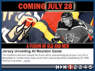
Panthers To Unveil New Uniforms July 28

On their web site, the Florida Panthers have announced they will be unveiling their new uniforms on July 28 at the "Year of the Rat" alumni game.

July 13, 2007
Dave Joseph / floridapanthers.com

Jersey Unveiling At Reunion Game

The Panthers will look toward the future while acknowledging its past July 28 at BankAtlantic Center when they unveil their new jersey while celebrating its 1996 Stanley Cup team.

Fans attending the ‘Year of the Rat’ alumni game beginning at 2 p.m., will be the first to not only witness the unveiling of the Panthers new jersey but season seat holders will be the first to order the new item.

Presale order forms for season seat holders will be available July 29 at FloridaPanthers.com. Presale forms will be available to the general public beginning Sept. 1. The jersey will be available at Pantherland Sept. 14 at BankAtlantic Center.

The new jersey features a new cut and lightweight advanced materials to provide increased range of motion, ventilation, durability and comfort. The jersey is also treated with new moisture, repellent technology.

Along with the unveiling of the new jersey, fans will watch favorites like John Vanbiesbrouck, Scott Mellanby, Brian Skrudland, Bill Lindsay, Tom Fitzgerald and Paul Laus from the ‘Year of the Rat’ team play an exhibition game against Panther alumni.

The ’96 Panthers, playing in only in third NHL season, were a longshot to make the playoffs. But before a home game in October of ’95 at the Miami Arena, Scott Mellanby one-timed a rat off the wall after the creature had found its way into the locker room. After Mellanby scored two goals to help the Panthers to a 4-3 victory over Calgary, goalie John Vanbiesbrouck credited Mellanby with scoring the “Rat Trick.”

And the Year of the Rat was born.

After each Panther goal the remainder of the season, fans would shower the ice with toy rats. A few turned into a dozen, and a dozen turned into thousands. By the time the Panthers found their way into the playoffs, the ice was flooded with rats and a local tradition turned into a national sensation.

The Panthers beatBoston, Philadelphia and Pittsburgh to earn the Eastern Conference championship before losing to Colorado in the Stanley Cup finals.

Panther alumni members participating in the game include Val Bure, Peter Worrell, Jesse Belanger and Trevor Kidd.

Saturday
Jul142007

Getting You Involved

I keep a hit counter on the blog so I can get an idea of how many people visit on a regular basis. Yesterday hit an all-time high of 321 page loads for a single day. I figure it had something to do with the "leaked" Sharks and Lightning logos I posted, but regardless, you all seem to be somewhat interested in the site.

My hope is to one day get this blog to the point where I no longer do the deciding on which logos are best. Rather, I'd like the readers to do the deciding by holding votes. Right now I'm just trying to gauge interest. Since you're reading this post, I'm directing this question at you. If I were to switch to a format where fans and readers got to pick the best (or favorite) logos, would you actually cast a vote?

If you'd like, you can comment and let me know what you think. Either that or you can vote in the poll on the sidebar to the right. Thanks!

Friday
Jul132007

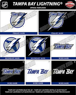
Possible New Lightning Logo?


If you thought the San Jose Sharks logo I just posted was bad, you ain't seen nothing yet. This gem was posted on the same web site and I just saw it on Boltsmag and needed to post it here.

It's not the best I've ever seen. The city is still there. See that one there labeled "secondary mark" underneath? Love that one! Put it on the front of the jersey! Anyway, there's no official word from the team yet so this may or may not be the real deal. I suppose we'll find out for sure sometime this summer.

Leave your comments below and let us all know what you think.

UPDATE (6:44 PM): According to Tampa Trib Lightning beat writer Erik Erlendsson, the Lightning will unveil their new logo and uniforms at a "fan festival" on August 25. This is the first I'm hearing of an actual date. Incidentally, Erik wrote that he knows of the leaked logos I posted earlier and seems to believe they are in fact the real deal. When asked, the Lightning would neither confirm nor deny their veracity. Regardless, we should know for sure 43 days from now.

Friday
Jul132007

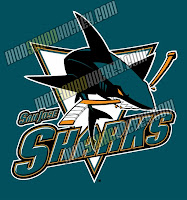
Possible New Sharks Logo?


A reader pointed me to this image of a potential new design for the San Jose Sharks logo. As I reported the other day, the Sharks will be unveiling a new logo on July 24.

Now if you want my opinion, take it with a grain of salt. It's a cool update on the current logo, but I think its just an artistically-inclined fan having a little fun on the internet. The way I understand it, the team is going with a complete redesign. It's rumored the new logo will feature an entire shark as opposed to just the front end. Now having said that, anything is possible and we won't know for certain for another 11 days, so check back here then.

In the meantime, feel free to leave your comments. What do you think it will look like? What do you think it should look like? What do you think of this design?

UPDATE (4:55 PM): Just came across this version of the Sharks logo. It actually shows the entire shark as I mentioned earlier. But its a wordmark, so it probably wouldn't be the crest.

What do you think of it? Great? Not great? Personally, I'm a little indifferent. It's an improvement on their current logo but I think they can do better.

Wednesday
Jul112007

"New Look" For Panthers?

I just noticed this on the Florida Panthers' web site today. I'm not sure how long its been there but its an ad suggesting the Panthers will have a "new look" this fall. If you click the graphic, the link takes you to the site of the team's arena, the BankAtlantic Center. Not sure what relevance it has. Are they renovating the arena?

I'm guessing they mean they'll have new jerseys. Haven't heard anything about a logo change at this point. I don't know if the jerseys will look completely different from those they wear now or if they're just saying that because the jerseys will be in a new style next season. Regardless, the ad says it's "coming in September 2007" so we'll have to wait until then.

Wednesday
Jul112007

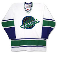
Canucks Fans Ponder New Logo, Uniforms


That's pretty interesting, right? There are rumors — likely started by fans — that the new Canucks uniforms will be a version of the orca logo that currently dons their sweaters. This version will revert to the team's original colors of blue and green. Just so you know, these are not actual photos and should be taken with a grain of salt. But I thought they'd be worth posting for anyone who's interested.

But wait, there's more.

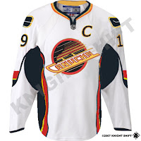
This funny design comes from someone who wondered what the '80s red, yellow and black logo would look like in the original Canucks colors. Well as you can see, there's nothing that can make that logo look good.

Still, I'm not a fan of the orca logo as it relates to the team. As a logo on its own, it's excellent. I love it. But for a team called the Canucks, its like how the Sabres logo has nothing more than a buffalo in it. I just don't understand these things.

And then there's this gem. It's basically a what-if similar to the jersey above except that it uses the actual colors for that logo. I'm not really a fan but I am amused by the classic stick-in-rink logo on the shoulder in those colors. Still, no way. It's terrible.

And of course as always, feel free to comment below with your thoughts on this or anything else. I'll have more to come shortly.