NHL Tournament of Logos

Entries in penguins (62)

Wednesday
Oct172007

Rbk EDGE Review: Penguins

Part 24 of 30. All 30 NHL clubs have unveiled new jerseys under the new Rbk EDGE Uniform System for the 2007-08 season. Here at the NHLToL, we're going to review every one of them. Read up and then rate the new sweaters. We'll do a full ranking after completing all of the reviews.

Rbk EDGE Uniform System

Pittsburgh Penguins


New Uniforms

Old Uniforms

The Unveiling
Wednesday, September 5. The Penguins unveiled their jerseys to fans at the Galleria at Pittsbrugh Mills. Several players, including Maxime Talbot, were on hand to model the new uniforms.

Home vs. Road
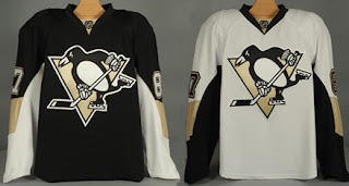
Home: Black. Road: White. The two sweaters are essentially mirror images of each other and both feature a specialty patch on the right shoulder.

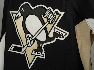
The black home jerseys have a gold panel on the elbows. The underside of the sleeves are white extending the length. There is gold side paneling toward the back of the sweater. The collar is black and primary logo serves as the crest.

The white road jerseys have a gold panel on the elbows. The underside of the sleeves are black extending the length. There is gold side paneling toward the back of the sweater. The collar is black and primary logo serves as the crest.

In The Details
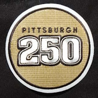
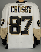
The patch on the right shoulder reads "Pittsburgh 250" in honor of the city's 250th anniversary. It will only be worn this season. The numbering and lettering style has been retained.

New & Old
The striping on the new jerseys has been altered significantly. The slanted stripes at the corners of the sweater are gone as well as the stripes on the sleeves. They've been replaced with unique sleeve paneling which meshes with fabric paneling of the sweater itself. Most notably, however, is the elimination of the secondary logo from the shoulders.

Standard FAQ
Numbers on the front? No.
Laces at the collar? No.

NHLToL Editorial by Chris
These are very plain jerseys. I think the Penguins had it right on the money before, but it would seem this is a case where Reebok missed the mark. I'm not saying there was a lot going on with the old jerseys but the design was very appropriate, especially to the logo. That's not really the case anymore. In fact, the striping pattern is almost identical to what the Senators are wearing (more on that later). That being said, it's still a very nice jersey. It doesn't knock my socks off, but it's a solid effort that shouldn't be tossed aside. 3/5


Buy your new Penguins jersey!

Tuesday
Oct162007

Result: Rockies vs Penguins

Colorado
ROCKIES

55% 1,204 votes

Pittsburgh
PENGUINS

45% 966 votes

2,170 total votes

Colorado Rockies
Advancing to face Winnipeg Jets

Pittsburgh Penguins
Eliminated


Poll opening date
Fri Oct 12 @ 4:24 AM
Poll closing date
Tue Oct 16 @ 11:59 PM

07VNTRN | #1G | CORvPIT67

Friday
Oct122007

Poll: Rockies vs Penguins


vs
Colorado
ROCKIES
Pittsburgh
PENGUINS


Place your vote and then feel free to leave a comment as to how you came to your decision. Tell all your friends to drop in and vote! The more voices heard, the more accurate the results!

Poll opening date
Fri Oct 12 @ 4:24 AM
Poll closing date
Tue Oct 16 @ 11:59 PM

07VNTRN | #1G | CORvPIT67

Sunday
Sep232007

Rbk EDGE Makes Pens Wet

First off, sorry about the headline, but sometimes when these things come to me I can't resist.

Anyway, Dave Molinari of the Pittsburgh Post-Gazette wrote an article about flaws players are finding with the new sweaters' wick away material. I mean, we all knew this stuff was coming. It's a new technology.

You can read his story here or see excerpts below.

Right winger Mark Recchi, for one, understands what the league was trying to accomplish by adopting a sweater that does not absorb fluids, but does not think the designers took into account the moisture — to wit, perspiration — generated under a player's uniform.

"[The sweaters] don't soak anything in, which I guess is what they wanted," Recchi said. "But the problem is, it goes through all of your equipment. It goes into your gloves, goes into your skates."

And eventually saturates the leather in both, leaving the players feeling as if their hands and feet are immersed in liquid. Perhaps because, at least in some cases, they are.

"They do what they were designed to do, as far as repelling the water," defenseman Mark Eaton said. "But we've found, the last three or four days of wearing them, that, when the water's repelled, it has nowhere to go but into your skates and gloves.

"By the end of the second [period] or the start of the third, your skates are sloshing around and you have to change your gloves because they're [soaked]."

So, that's probably not a good thing. But it goes on.

"It's very good that the water doesn't stick on it, but the sweat all goes into our gear," goalie Marc-Andre Fleury said. "Sometimes, it gets really wet."

Veteran left winger Gary Roberts, who was to make his preseason debut when the Penguins faced Detroit at Mellon Arena last night, said he planned to withhold judgment until after wearing the new items in a game, but wasn't pleased with what he experienced during practice.

"My hands are soaked, my feet are soaked," he said. "I feel like it's May, in the playoffs, I'm sweating so much. That seems to be a complaint with a lot of guys."

So then there's the NHL's response.

Frank Brown, the NHL's vice president of media relations, said in an e-mail interview that "every equipment system requires a period of adjustment," and that the sweaters, which are made of four materials, are part of a uniform "upgrade" intended to "help optimize performance and protection."

Naturally.

So while we're at it, here's what else Mark Recchi says doesn't work.

While other elements of the equipment system also have gotten negative reviews — some players have mentioned that the socks that cover their shin pads are so taut that they are more prone to tearing than the looser-fitting ones worn in the past — the sweaters have received most of the attention.

Recchi suggested that, although some complications caused by the new sweaters will be evident immediately — like how some players will have to alter their in-game routines to deal with unduly wet equipment — others might not be apparent for a while.

"My gloves never got soaked like [they do now]," he said. "They're literally drenched by the end of an hour[-long] practice.

"I'm going to have to have two pairs of gloves ready [for games]. I've never done that. I've always used one pair a game. Some guys are used to that, but that's going to be different. Maybe I'll have to change my socks between periods, which I don't like doing. You start sloshing.

"I think you'll see skates break down quicker because of it; they'll absorb more [perspiration], because it's all going down into your skate and your socks."

Whether the league and Reebok will consider altering the material that goes into the sweaters to make them less moisture-repellent isn't clear — "They have a great feel, but I just think they have to find a way to maybe have some absorbency," Recchi said — so it's hard to say how long the current ones will stay in use.

At least a few players, though, would prefer to see the league go back to the uniforms players used to wear, although they realize that probably is not a viable option.

Sunday
Sep232007

Result: Penguins Logo History

BEST ALL-TIME
1971

33% 2,411 votes

7,348 total votes

2000
29% 2,109 votes

1992
28% 2,075 votes

1967
10% 753 votes


Poll opening date
Sep 15 @ 8:41 AM
Poll closing date
Sep 22 @ 11:59 PM

07BONLH | LHPIT

Friday
Sep212007

40 Years Of Penguins

When the Pittsburgh Penguins announced they'd be unveiling their Rbk EDGE uniforms, they said the sweaters would feature a special shoulder patch. Many, myself included, speculated on a commemoration of the Pens' 40th year in Pittsburgh. In fact, what the team really had in mind was a much bigger number — a commemoration of Pittsburgh's 250th year as a city.

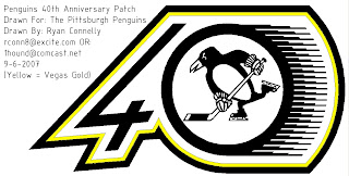
The patch has been "coined" the 250-cent piece in some circles. (Couldn't resist it.) But regarding that whole 40th anniversary thing, the Pens are celebrating this year their entry into the league along with the Kings, Stars, Flyers and Blues. So one fan came up with a concept logo.

It definitely feels like one of those old '90s commemorative patches, but hey, no one else seems to have come up with one. (Pens fans, correct me if I'm ignorant. Does the team have a 40th anniversary logo for marketing crap and such?)

Anyway, feel free to post your thoughts. We'd love to hear what you think. And if you have an idea for a 40th anniversary logo for the Pens or any of the other 1967 expansion clubs (hell, you could even do the Cleveland Barons/Oakland Seals if you wanted), feel free to send it along and I may even post it here on the blog.

Saturday
Sep152007

Poll: Penguins Logo History


1967
1971

1992
2000


Place your vote and then feel free to leave a comment as to how you came to your decision. Tell all your friends to drop in and vote! The more voices heard, the more accurate the results!

Poll opening date
Sep 15 @ 8:41 AM
Poll closing date
Sep 22 @ 11:59 PM

07BONLH | LHPIT

Sunday
Sep092007

Pens' Prospects Exhibit New Sweaters

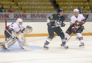
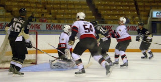
One last post today. We've got a few pictures of Pittsburgh Penguins prospects wearing the their new jerseys while playing the Ottawa Senators in Kitchener this weekend. Thought I'd share.

As has been pointed out, the players aren't wearing the new socks and pants, only the sweaters.

You know, the Panthers and Penguins come to town wearing their new Rbk EDGE uniforms. It begs the question: Why aren't the Sens' prospects wearing theirs? They've been unveiled already. Anyone know?

Anyway, for me it's just another example of the new Rbk EDGE jerseys looking better on players than hangers. We'll make t-shirts: "Better on players than on hangers." Have a great night all!

Friday
Sep072007

Pens' 250 Patch Is Only Right

Quick note for anyone interested in this aspect of the new Pittsburgh Penguins Rbk EDGE jerseys. I came across some definitive proof that the new "Pittsburgh 250" shoulder patch is only worn on the right shoulder.

The Pittsburgh Post-Gazette has posted a video from the unveiling event on its Empty Netters blog. Frankly, I'm surprised we didn't see it sooner. Following the ceremony, the video shows players being interviewed by the press. The cameras are on the left side of the players, clearly showing that there is no patch on that shoulder.

I'm almost positive that this is of absolutely no consequence or interest to anyone aside from Pens fans, but so be it. Have another look.

So to anyone who was still wondering, you can now put the thought from your mind. Right shoulder only. Now get ready for next week when the whole rest of the NHL unveils their uniforms. We're going to see 26 different new jerseys in the span of about a week. It'll be busy times.

UPDATE (8:03 PM): By the way, I'm not sure I've ever actually stated the significance of the "Pittsburgh 250" patch. And a few of you have indicated you weren't sure of it. The patch commemorates the 250th anniversary of the city of Pittsburgh, which was founded November 25, 1758. This is odd because the 2007-08 season will be over by the time that anniversary actually comes around.

If you ask me — and nobody is — I think they should've waited until the 2008-09 season to wear the patch and get the league to schedule them a game on that night... perhaps against Philly? Any takers? In any case, that's what it's there for, for better or for worse.

It is bland though. Isn't it?

Wednesday
Sep052007

Penguins Unveil New Uniforms!

The Pittsburgh Penguins have officially unveiled their new Rbk EDGE uniforms tonight!

The first thing you'll notice is the shoulder patch featured the recolored '90s logo is absent. I think some Penguins fans find that to be an upgrade. Though the general consensus seems to be that the jerseys are an overall downgrade.

From the side and back views, you can see the striping along the sides that coincides with the leaked images we saw back in July. Even the giant numbers on the back match. And maybe it's just me but those numbers do seem awfully large. Not a complaint, just an observation.

Not a bad uniform set, overall, if you ask me. Plain but elegant. And no matter what, you can't please everybody. You'll always have your critics. But personally, I offer kudos to the Pens for not going overboard.

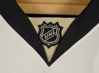
Before I take off, have a close-up look at the road jersey collar complete with the NHL logo.

And as always, you can find more photos of these new sweaters at my official Rbk EDGE gallery. Enjoy your night, Pens fans!

UPDATE (7:07 PM): A lot of you have been wondering what the new special shoulder logo looks like. This photo of Maxime Talbot modeling the new road jersey shows there's a patch there but doesn't offer a very good look.

When I come across a better photo, I'll post it right here.

UPDATE (9/6 2:21 AM): Thanks to everybody who emailed in this photo while I was asleep last. For anyone who hasn't seen it yet, have a look for yourself.

Here you see Talbot signing an autograph with a shoulder patch that reads "Pittsburgh 250" — not a 40th anniversary logo. Though I'm not even sure I'd go so far as to call it a logo. That's not a dig, I'm just saying.

Anybody know if that patch is on both shoulders or just the right? Seems like every photographer there was confined to the left side of the room because all the angles I've seen only show the right shoulder clearly.