NHL Tournament of Logos

Entries in rangers (58)

Saturday
Jun302007

Hurricanes vs Rangers


vs
HURRICANES
RANGERS
3-0
2-3

The Aesthetics
Straight off, the Hurricanes is obviously the more attractive logo. And that's what this point is for. The Rangers logo gets a demerit for spelling out the name of the team.
Hurricanes

The Nickname
Hurricanes sweep up everything, Rangers included.
Hurricanes

The Analysis
The Hurricanes logo is solid, symbolizes the team name and has great colors. My only wish is that it was more circular, less oval-shaped. Still, the Rangers logo doesn't really do anything to help its case to prevent the sweep. The logo is indeed a classic and I would probably be roasted for bad-mouthing an Original Six logo, but it needs an update. It gets one every couple of decades and I feel like now is the time for another change. Go with the Statue of Liberty head. I keep telling you that. The Hurricanes remain the only perfect team so far in this tournament.
Hurricanes


WINNER
3-0


Friday
Jun222007

Rangers vs Panthers


vs
RANGERS
PANTHERS
2-2
2-0

The Aesthetics
One is arguably too detailed and one is arguably too simplistic. My argument is the Rangers logo utilizes 14 letters and I'm not a fan of that as you well know. This point goes to the Panthers.
Panthers

The Nickname
It's nice to be a park ranger in a league filled with animal mascots. The Ranger protects the endangered Panthers and their habitat and so has the upper hand in this relationship. Count it.
Rangers

The Analysis
When looking at a logo for the Rangers, a shield of some sort is probably the smartest choice. But times have changed and this logo desperately needs a rejuvenation. It has one if you check the shoulder of the team's third jersey. In fact, check the crest on that jersey and let's just go with that one. But more than that, the Panthers logo is cooler than almost anything.
Panthers


WINNER
2-1


Wednesday
Jun202007

Flyers vs Rangers


vs
FLYERS
RANGERS
2-1
1-2

The Aesthetics
Both logos symbolize storied franchises but as I've said many times before, words can kill the aesthetics of any logo. That and I love subtle letters such as the "P" in the Flyers logo.
Flyers

The Nickname
As with any bird, it's the job of a Ranger to protect the Flyer, who therefore has the upper hand.
Rangers

The Analysis
Quite honestly, red, white and blue have never been such important colors to New York City than in the aftermath of the attacks of 9/11. That makes the Rangers colors very significant. Meanwhile, the Flyers logo doesn't go a very long way to symbolize its home city of Philadelphia.
Rangers


WINNER
2-1


Tuesday
Jun192007

Rangers vs Canadiens


vs
RANGERS
CANADIENS
1-1
0-0

The Aesthetics
The blue, red and white abound here. Truthfully, I like the Canadiens logo's blue is better. It's a little deeper and contrasts the red nicely. Unfortunately for the Rangers, the spelling out of the team name and city always makes for an unwelcome distraction. The Canadiens logo not only has a "C" but a subtle "H."
Canadiens

The Nickname
A park Ranger is a big fella who lives in the wilderness. A little French Canadien would get pounded in a fistfight. No chance.
Rangers

The Analysis
For both teams, the nicknames make it difficult to come up with a logo that pushes beyond letters. Both logos come from Original Six teams and so have been around a number of years. Their staying power is impressive but do they really represent their team names? The Rangers logo utilizes a simple shield common in many logos while the Canadiens actually works in a subtle "H" that means something to French fans. For being clever, the Canadiens squeak by with the point.
Canadiens


WINNER
2-1


Monday
Jun182007

Rangers vs Senators


vs
RANGERS
SENATORS
1-0
0-1

The Aesthetics
I know the Rangers logo has been around forever but it's a little boring. I'm also a little annoyed at the fact that, while it is the primary logo for the team, it never makes an appearance on any of the team's jerseys. The Senators, however, is a solid design that we actually see on the uniforms.
Senators

The Nickname
In a straight-up fistfight, a Ranger could totally take a Senator.
Rangers

The Analysis
The Rangers have been around forever, though there's a case to be made that the Senators have too — they just had to endure a long hiatus. Ultimately, though, I really think the Rangers need to upgrade their look and go with the third jerseys full time, including the primary and secondary logos. That's why they don't get the point.
Senators


WINNER
2-1


Tuesday
Jun122007

Thrashers vs Rangers


vs
THRASHERS
RANGERS
0-0
0-0

The Aesthetics
Even though I didn't like the team's name, I've liked the Thrashers' logo ever since it was first unveiled when the team started playing in 1999. The Rangers, on the other hand, not so much. I think they should upgrade to the shoulder logo on the third jersey. Much nicer.
Thrashers

The Nickname
If the Thrasher is living in a national park, the park Ranger is protecting it and therefore has the upper hand.
Rangers

The Analysis
I don't know why it is that almost all the pro sports teams in Atlanta have to be named for birds, but the hockey team got burned. Falcons and hawks are birds of prey and despite "thrashing" being a good verb for use in defeating opponents, the thrasher is what, a songbird? Come on. By default, the Rangers take this one.
Rangers


WINNER
2-1


Sunday
Jun032007

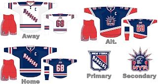
HF&P, Part 16: New York Rangers

That's right, two posts in one day, here as part of the "Hockey Fans & Photoshop" series. Like I said, I have tons of great new artwork from around the net but not enough days to post it all before the tournament begins.

Oh yes, it's the New York Rangers and it's a sight to behold. If I were redesigning the Rangers' uniforms, this is almost exactly what I would have come up with. I love the lettering on these jerseys. It's just what the Rangers need to give them a contemporary look. I've never liked their current logo. It's just too — pardon me — old-fashioned.

Anyway, that's all I have for New York today. Short post. Hope you enjoyed it.

Once again, though, kudos to the designer! Whoever that may be.

Up next: the San Jose Sharks.

Monday
Apr302007

Rangers


New York RANGERS


Team Information
Team Colors / blue, red, white
Inaugural Season / 1926-27 (81 years)
Current Logo / 1978-79 (29 years)

Tournament History

2007 Qualifying Tournament
3-11, 15 pts
Finished 12th in East; 24th overall

Page 1 ... 2 3 4 5 6