NHL Tournament of Logos

Entries in rangers (58)

Friday
Nov022007

Just To Freak You Out XIII

It's lucky number 13 tonight on Freak Out Friday. Hope you guys get weirded out by what I have to share here.

I don't quite know where to begin.

Wow, I don't know what you did to deserve that, but it must've been pretty bad. Now if you're thinking that looks somewhat familiar, consult a post from last month.

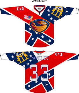
And the hits just keep coming. Flames, take a clue from the Thrashers. This is how you do it up if you really want your provincial/state flag on your jersey. The scary part is that half of it is what seems to be the Confederate flag. Yeah, 'cause rednecks and hicks just dig hockey.

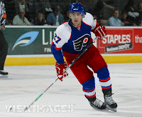
All right so let's head up north where they can really claim the sport. Scary thought alert. Imagine the Rangers and Flyers swapping colors.

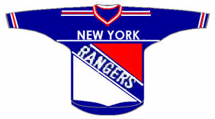
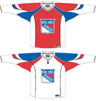
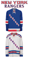
On second thought, don't. It's too horrible. Speaking of horrible, check out this Rangers jersey concept.

That's what scary is. I know the new EDGE jerseys are supposed to have larger crests, but somewhere a line's been crossed.

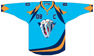
Anyway, let's head west. Here's a color combination that doesn't work on a jersey.

The Nashville Predators are a hockey team, not a figure skating team.

Right?

Yikes! That logo. And while we're on the topic of bad logos, consider the following.

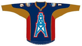
Oilers fans, you think you've got it bad now with your half-a-stripe elbows and practice-jersey looks. What if this happened? Don't even think about it too much. Your head will explode.

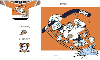
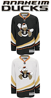
We'll wrap things up in California now, if you don't mind. And sometimes you have to reintroduce a winner — like the 1996 Mighty Ducks third jersey. Only the Ducks have new colors now.

That is something.

What we're finishing the night off with might be hard to look at. Remember the old Lightning third jerseys from the mid-90s? They had the rain pouring down, lightning bolts down the arms and — the selling point — the wild waves of the bay around the bottom. Well Sharks live in the water.

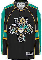
The waves have been stolen. And so has what little dignity might've been left in the new Florida Panthers uniforms when an attempt to create a San Jose concept went horribly awry. This is what happens when folks have too much time on their hands.

Well I hope you all got freaked out enough on this Freak Out Friday. If not, accept my apologies. Better luck next week. Until then, I'm waiting to see what you guys have in store for me next in terms of crazy artwork. Email it along.

Tuesday
Oct232007

Rangers Alter Sweaters?

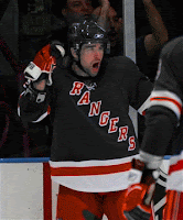
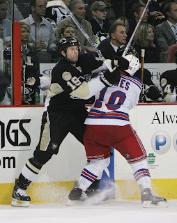
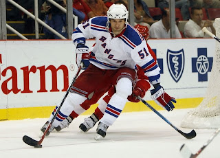
Apparently a handful of New York Rangers players have altered the back of the sweaters. Pictures taken at last night's game against the Pittsburgh Penguins indicate that the "tail" seems to have been cropped on a handful of jerseys.

It seems too straight to be a fold caught in the moment by the camera. That's why I'm assuming it's been cut. That, and the Rangers are our rebel-without-a-cause for the moment. (No, NHL, we don't like your web sites. Lawsuit. No, Reebok, we don't like your jerseys. Scissors.) Don't mind me, I'm easily amused.

The interesting thing is that this alteration wasn't made on all of the jerseys. So that leads me to believe it was a decision made by individual players and not the club as a whole.

What do you guys think about this? I know a lot of you were opposed to the curved hem at the bottom. Is this an improvement or does it just make the jersey look awkward?

Sunday
Oct142007

Rbk EDGE Review: Rangers

Part 21 of 30. All 30 NHL clubs have unveiled new jerseys under the new Rbk EDGE Uniform System for the 2007-08 season. Here at the NHLToL, we're going to review every one of them. Read up and then rate the new sweaters. We'll do a full ranking after completing all of the reviews.

Rbk EDGE Uniform System

New York Rangers


New Uniforms

Old Uniforms

The Unveiling
The Rangers held no unveiling ceremony and images of their new jerseys were the last to be posted at online stores selling NHL gear.

Home vs. Road
Home: Blue. Road: White. The two sweaters are essentially mirror images of each other aside from the patterns on the shoulders.

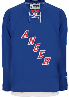
The blue home jerseys feature white-red-white stripes around the elbows and waist. Red letters with white trim spelling out "RANGERS" are positioned diagonally across the front of the sweater and the laces at the collar are white.

The blue home jerseys feature slightly spaced blue-red-blue stripes around the elbows and waist. The shoulder yoke is blue with spaced red-blue stripes on the outside. Blue letters with red trim spelling out "RANGERS" are positioned diagonally across the front of the sweater. A blue stripe wraps around the wrist. The collar is red and the laces are white.

In The Details
The Rangers are the only team that does not use its primary logo on either jersey. The same numbering and lettering style has been retained.

New & Old
There are no major differences between the new and old jerseys. Slight modifications have been made though, including the league-wide changed collar. Also, the letters on the front of the sweater have been vertically spaced more and at times may seem a little off center.

Standard FAQ
Numbers on the front? No.
Laces at the collar? Yes.

NHLToL Editorial by Chris
The Rangers' jerseys have always been fine. Nothing special to me. I understand tradition and this and that, but the Rangers were given a golden opportunity this season with the introduction of these new uniforms. If you ask me, they blew it big time. I've never been a fan of the text across the chest. I think hockey sweaters are meant to have logos. I also think the third jersey with the Lady Liberty logo is one of the best ever seen in the NHL. I would've quite possibly rated such a uniform 6/5 in this review. This may be a personal bias speaking, but I think the Rangers are one team in need of a sweeping makeover. But that will never happen. And that's really all I have to say on that. 2/5


Buy your new Rangers jersey!

Wednesday
Oct102007

Odd Art, Part II

First off, if you missed Part I then click here. Now that you know what's going on, let's dive right in. You know you like the weird stuff I post here.

We'll get things going with some imaginative Original Six designs.

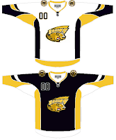
Let me begin by saying the new Bruins jersey is not something you'd be wanting to mess around with. Trust me. It's that awesome. Now, as far as this concept goes, history has taught me that logos like this were probably not originated by the creator of the jersey design itself. If anyone would like to explain from where this particular Bruins logo is derived, leave a comment.

The Rangers jersey is interesting because there's actually a logo on it. A novel concept, not exactly, but it's something I feel the Rangers have struggled with. The 1970s taught us that this might not be the best use of the logo. I'm also concerned about the whole Broadway Blueshirts thing. For those of you lacking the ability to tell one color from another, that is red.

I will say this though, I am a huge proponent of the Lady Liberty logo and those jerseys. They've used a blue one and a white one and both looked better than anything the Rangers have ever worn. I might even go so far as to say it's the best any team has ever worn. But my suggestion to the Rangers is go with the NYR logo full time, and save the current sweater as a third jersey — beginning next season of course.

But who would want to listen to me anyway?

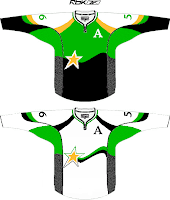
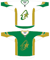
I haven't yet been able to fully grasp what's going on here but near as I can figure, we're looking at a couple of concepts for the Dallas Stars/Minnesota North Stars franchise. I get the shooting star thing in the one on the left, but I really can't work out what's going on in the one on the right. If you have any ideas I'd be happy to hear them. Comment away.

But that's not all. I'll leave you with one more today.

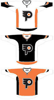
I understand what the designer is trying to do here, but I don't think the "P" in the real logo is that difficult to see. It doesn't jump out at you, but it shouldn't. Logos are meant to be looked at over and over again, so they're more effective when you discover something new every time you see it.

I know a lot of folks would disagree with me on that, but I think it's the reason the Minnesota Wild's logo is so spectacular.

But back to this. The striping is not great and the logo doesn't really need a change. But I feel like an ass for having nothing good to say about it. It's not like it's the worst thing in the world, I'm only thinking that Philly fans would revolt.

But that's all just my opinion. Feel free to share yours below.

And if you or someone you know has been afflicted by the concept art disease and would like help with public dissemination, you know how to reach me. Send an email to nhllogos@gmail.com.

Wednesday
Oct032007

Some Unusually Familiar Concepts

I got a funny email yesterday. Check out these. See if you notice a pattern.


I don't feel a need to explain or comment on them really. They sort of speak for themselves. Pretty clever, if you ask me. What do you think of them?

Saturday
Sep292007

Rangers Sue NHL

We finally have an answer to the reason for the delay in the New York Rangers adapting their web site to the new NHL.com format. According to CBC Sports, MSG has sued the NHL claiming violated antitrust laws by monopolizing control of team promotions.
The AP report can be found at CBC Sports' web site and below.

September 28, 2007

Rangers' owner claims NHL acting like 'illegal cartel'

The Associated Press

The NHL violated antitrust laws and is acting like "an illegal cartel" by monopolizing control of team promotions, Madison Square Garden claimed in a lawsuit Friday.

MSG, which owns the New York Rangers, said it filed the suit in U.S. District Court in Manhattan because the NHL would begin fining the organization $100,000 US per day starting Friday if the company did not give the league complete control over the Rangers' website and other promotions.

The league is seeking to control the licensing of teams for all commercial purposes and to stop teams from marketing apparel, merchandise and memorabilia, the suit said. MSG asked that a judge order the league to stop limiting team promotions, and it also wants the court to clarify the boundaries of the league's rights.

The company said the NHL had once worked with teams in a legitimate joint venture, but had more recently "veered into unlawful behaviour."

"By seeking to control the competitive activities of independent businesses in ways that are not necessary to the functioning of that legitimate joint venture, the NHL has become an illegal cartel," the suit said.

Scott Arthur Eggers, a lawyer for the NHL, said he had no comment.

The lawsuit said the NHL insisted last week that MSG transfer control over the Rangers independently produced website, including the "nyrangers.com" address so that the league could convert it into one of 30 "cookie-cutter" club websites at "nhl.com."

The lawsuit said MSG had spent years developing the site to market Rangers hockey in competition with other NHL teams. By seizing the site, the NHL would eliminate competition between teams and harm consumers.

"The NHL has no competitive justification for seizing the Rangers website, which MSG today uses as a competitive tool to generate and maintain fan interest in the Rangers in competition with other NHL teams," MSG said.

At the start of the playoffs last spring, MSG said it increased its competitive offerings by making Rangers-branded merchandise available through the Rangers website rather than a catalog, and by making Rangers games available to subscribers on its website.

The NHL forced MSG to withdraw the efforts when it imposed a penalty of $100,000 per day, MSG said. When the company refused to pay the fines, the league withheld $200,000 from third-party payments otherwise due MSG, the lawsuit said.

MSG gave in to the league's demands because it did not want to detract from the playoffs, and it hoped that it could negotiate a solution to NHL actions it thought were unwise and illegal, it said. "That hope was in vain," the lawsuit said.

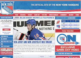
For the record, the Rangers' web site is currently in the new format. I'll be keeping an eye on how this plays out.

Friday
Sep282007

Just To Freak You Out VIII

The Freak Out series continues this week with a brand new episode. Some of this stuff is just unbelievable.

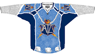
We'll kick things off with some small but significant Atlanta Thrashers concept attempts.

I'm not sure I can find the words to describe this. The thrasher head, while being used as a major element of the crest, has also been employed as a rather horrid stripe. It points up the arm the shoulders along the sleeves and runs across the waist.

The secondary logo is used on the front of the jersey on the right side while the player number is on the left. Captains be damned. The full primary logo is also featured on the front, but not as the crest. No, you'll find that at the bottom on the left.

The crest being used features only the bird's head on an "A." But hey, at least there's three to choose from. Also notice that the panel under the arms is blue on all three.

This jersey set is an eye sore of the worst kind. But just look at the socks. I've never seen a logo on a sock. These socks have three — each! And that's just the side we can see. Imagine if they appeared on twice or even three times.

It hurts my brain to imagine what these would look like on the ice.

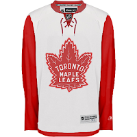
And then this. Anyone who thought the Maple Leafs introduced a rather plain jersey should see this.

And though I'm not sure who's conjuring the anger, I can only guess that it's fans who feel like they've been somehow cheated because the letters were spread vertically (not squeezed horizontally).

We're just now hearing of the NHL's plan to expand once again.

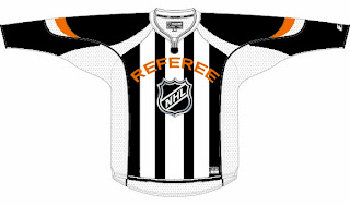
We don't yet know what city they'll play in, but the new club will be named the Referees. I don't know why this was made. But it made me laugh — and then it freaked me out some. Speaking of which, we've all seen the mish-mash logos created by Pfizer. Well this one was created by another artist, but it's almost equally as disturbing.

It seems some folks hate the slug so much, they feel a beheading is the only solution. Indeed.

Oh, this deserves an explanation. The fervor over the Calgary Flames claiming the Albertan flag on their shoulder has spurred the Toronto Maple Leafs to go all out and convert their entire uniform into a Canadian flag. With the vintage logo, of course. No other way to go.

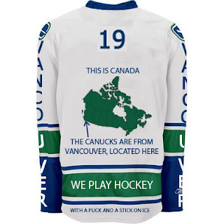
And finally, if you thought the text on the front of the new Vancouver Canucks jersey was as bad as it gets, wow. Just wait until you look at this.

I never cease to be amazed — or freaked out — by the things people send me. If you have come up with anything wacky and would like to make it a part of the Freak Out series, send it along to nhllogos@gmail.com.

I hope you all enjoyed your Freak Out Friday and are looking forward to the ninth installment coming in one week's time.

Can anyone tell me where the Canucks play? I seem to have forgotten.

Monday
Sep242007

Rangers Replica Photos

Apologies for the limited posting today but I've been preparing for the new Rbk EDGE Reviews. You can read the first review on the Boston Bruins' new unis today.

I have photos to share with you of the New York Rangers' new Rbk EDGE jersey. Jim, who just purchased his new replica road sweater, emailed them in this morning.

The lettering does appear to be placed somewhat differently than in the past, but it has a lot to do with the paneling of the various fabrics, I'd imagine. I wouldn't say it's a bad change at all.

With regard to the stripes you see here, Jim wrote, "I have to say I am very impressed with how every stripe is stitched on, so that it seems separate from the other stripes and the rest of the jersey, unlike the old replicas where the stripes would be continuous with the rest of the jersey." It's a very nice feature of these new Reebok jerseys.

And then there's the obligatory close-up of the new collar design with the lace ties. I really like that. Overall, they seem pretty nice. But I'm still in love with my Lightning jersey.

Sunday
Sep232007

Deterioration Of An "A"

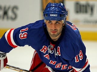
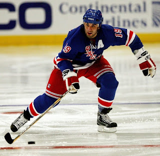
I don't want to step on the toes of the folks at UniWatch blog, but in going through pictures of last night's Rangers-Flyers game, I noticed something funny happen to Scott Gomez's uniform. This is why you don't iron things on an NHL jersey.

Early on, everything's fine. Gomez is looking all right in his new #19 uniform after losing a coin toss over the summer to Chris Drury. (Drury is wearing the #23 sweater.)

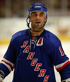
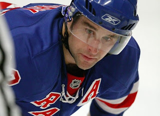
But after a while, that iron-on "A" on his shoulder is starting to have some problems. But, no, it couldn't fall off. This is the NHL, right?

Oh, oops. Let's hope that doesn't happen during the regular season.

For what it's worth, Drury's "A" didn't seem to suffer the same fate.

Just thought that was a bit funny.

Friday
Sep212007

Elusive Rangers Jersey Appears

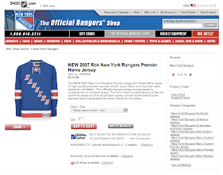
Just so as to put the matter to rest, I thought I'd point out that the elusive New York Rangers Rbk EDGE jersey has now made its long-awaited appearance on the NHL.com Shop.

As a corollary to that, the Rangers have said on their web site that the new uniforms will be debuting in tonight's preseason game against the Devils.

I guess, technically that means today is the "official" unveiling of their new uniform. However, I'm still going to count July 26 as the date because they first released pictures on their web site that day — despite the fact that they were removed only hours later.

Anyway, all this nonsense is for nothing because they're exactly the same as they've always been, adapted to the Rbk EDGE style and cut. I say "exactly" but I should clarify before I get a horde of comments about how the letters create a narrower diagonal than before. I think it's hardly noticeable, but then I'm not a Rangers fan.

So it'll all be cleared up tonight and photos from the game will be available soon enough. And we're probably just about finished with Rbk EDGE news. It's kind of sad. I've gotten so used to it over the last few months.