NHL Tournament of Logos

Entries in rangers (58)

Friday
Dec212007

Just To Freak You Out XX

The quality of Freak Out art I've become accustomed to was sorely lacking this week and that'll be clear after you get through tonight's post. It's not that nobody sent anything, it's that they were either trying too hard or not trying hard enough. I've got to have some standards, right? Perhaps not, but I'll forbear any further deliberation if for no other reason than to quite simply get on with it. Good plan?

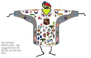
What's wrong with this picture?

Yes, it seems like some of the colors there are a bit off. These too.

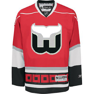
And don't even get me started on the absurdity of tropical storm flags surrounding a jersey with a Hartford Whalers logo on it. My head would explode.

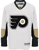
Next is a Philadelphia Flyers concept logo that I think fits fairly into the "freaky" category.

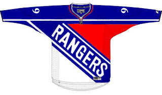
At first, I liked this New York Rangers jersey. But the more I stare at it, the more it disturbs me. I don't care how old that team is. They need a new logo.

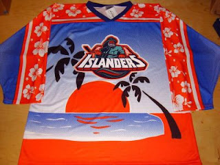
And finally, this one I just can't figure out. My brain tells me this is a nice Photoshop job, but a small part of me fears someone, somewhere actually made this jersey.

Islanders fans, I apologize. That's just horrible.

Anyway, that's all I've got for this week. Hope you got a little freaked out. And I hope you guys will keep sending in good Freak Out Friday material so we can keep this series going. Enjoy your holiday weekend!

Friday
Dec142007

Just To Freak You Out XIX

Finally, Freak Out Friday is back on Friday! And boy is this one a doozy. You won't believe some of the whacked out craziness your fellow readers have come up with this week. Let's start with an eyesore I probably never should've posted at all.

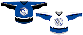
Yeah, there's no excuse for that. Speaking of inexcusable, here's a rather scary concept of a Tampa Bay Lightning logo.

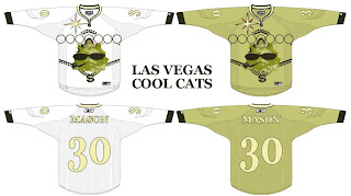
Oh wait, it gets better. You know how Las Vegas has been involved in all the buzz about a possible future expansion of the NHL? Here's what they shouldn't do when it comes to naming the team and designing a uniform.

And then as always, we have our "If They Mated" blends. First, we have Pennsylvania's teams...

...and then all three New York clubs.

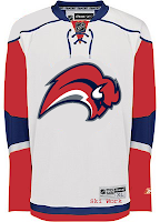
Plus as a special bonus, someone redesigned the Sabres' pants. But you know what I say? If the Lightning can have lightning bolts down their legs, than why can't the Sabres have swords?

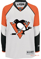
Oh, and I mentioned the Penguins a second ago. I need to post this just so it's out there. I'm all for the retro blue jersey for the Winter Classic, but let's not go too far. Here's something to avoid at any cost.

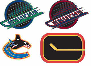
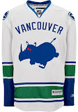
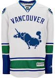
And finally, I can't determine whether the designer of these hates the new Canucks jerseys, or loves them. You be the judge.

Hope you enjoyed your week — or at least your Friday. Christmas comes in just 11 days and you know what that means!

See you right here for another Freak Out post next Friday! And remember you can send in your concepts for consideration to nhllogos@gmail.com. I look forward to seeing them!

Sunday
Dec022007

Result: Rangers vs Oilers


OILERS NAMED CHAMPION!


Congratulations go out to the Edmonton Oilers' third jersey logo this morning for being named by the voters here at NHLToL as the best! The Oilers finished the final poll with a 55% of the more than 2,700 votes.

Over 30,000 votes were cast in this tournament on the way to determining the champion. So as always, my biggest thanks go out to everyone who cast a vote. You guys are the reason I bother. Oilers fans, enjoy your bragging rights!

But it's not over. We'll be determining the best secondary logo in the NHL next. So stay tuned for that. I should have a bracket and first-round schedule posted soon.

Thursday
Nov292007

More Fancy Concept Jerseys

Do you guys remember the incredibly sharp concept art I posted back on Saturday? If not, I just linked to it, so go look at it. Anyway, a guy named Pete designed the jerseys and basically, he's got a lot more where that came from.

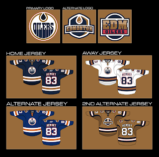
For example, you're about to see an Edmonton Oilers concept that I think rivals the Anaheim Ducks artwork created by GhettoFarmBoy. It's that good. Just look.

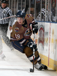
I like the idea of reworking the Oilers logo to have an oil drop in the proper color. Oil is black, not copper. However, I don't know how I feel about the copper circle. Might take a little getting used to. But my personal favorite is the copper "2nd alternate" jersey. I'm also a huge fan of that alternate logo. And if you were wondering what such a jersey might look like on a player, well look no further.

I would almost buy that if I were the kind of person who could buy a jersey that had anything but a Lightning logo on it. I like that uniform a lot. Can you tell?

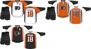
Anyway, Pete also did a little work on the Philadelphia Flyers. The striping pattern is unique — and not in a bad way.

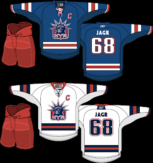
And finally, this isn't entirely the work of Pete. In Saturday's post, you saw his Rangers jersey with the words NEW YORK spelled out across the front instead of RANGERS. I suggested that the jersey might be improved with the Lady Liberty logo. So a couple of you made some modifications.

I think I was right. (Modesty is rarely my strong suit.) Thoughts?

Feel free to comment below. I'm sure Pete would like the feedback on his work — which is obviously rather excellent.

Tuesday
Nov272007

Poll: Rangers vs Oilers


vs
New York
RANGERS
Edmonton
OILERS


This is it for the Third Jersey Logo Tournament. The final round of voting. Time to determine a champion. Place your vote and then feel free to leave a comment as to how you came to your decision. Tell all your friends to drop in and vote! The more voices heard, the more accurate the results!

Poll opening date
Tue Nov 27
Poll closing date
Sat Dec 1

07TJTRN | #4A | NYRvEDM

Saturday
Nov242007

The Finer Art

A lot of the concept artwork I feature here on a daily basis is created by amateurs. It's fairly obvious and I think even the designers themselves wouldn't take offense to my saying that. But every so often, I come across work that could only have been created by a professional. It's the reason I have a blog like this.

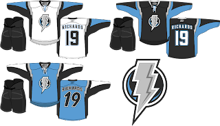
The template used for these concept designs is probably as close to perfect as we're going to get, visually speaking. I don't know the identity of the artist, but the work is stunning. I'll kick things off with my team — which I haven't really talked much about lately.

Personally, I love this idea. A new logo like this would certainly take some getting used to but the light blue on black accented by silver looks great! I'm also a big fan of the throwback numbers on the blue third jersey and the lightning bolts around the shoulders. Anyone feel like painting one of these onto a photo of a Lightning player?

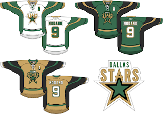
Next here we see an interesting take on the Dallas Stars' logo. I like it but proportionately it seems a bit... off. I think the city name above the logo needs to be in a smaller, wider type. Otherwise, I think the jersey striping looks fantastic and that gold third jersey would definitely get my vote.

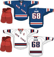
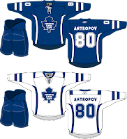
I love the striping on these Rangers jerseys, but the New York across the front isn't working for me. Swap it out with the Lady Liberty logo and I'm pretty sure nothing could compete with that look. I'm a little confused by the Maple Leafs lettering on the back of the jersey, however. Speaking of the Leafs...

The accent striping isn't much but it adds a lot to what are otherwise rather plain jerseys. Will it happen? No. But I think all of these are interesting to consider.

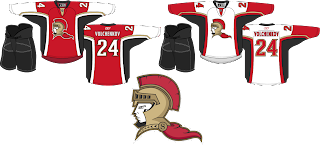
Lastly, we have an Ottawa Senators concept with a complete overhaul.

I think the logo would be better if the cape were either smaller or gone. It creates bad negative space. But once again I think the striping is excellent. Overall though, not a bad direction. By the way, I added Anton Volchenkov to my fantasy team. He hasn't really done anything for me yet.

Anyway, that's all for right now. I'll have some more rather brilliant work tomorrow as we stick to the more professional-looking designs this weekend. Hint: GhettoFarmBoy is back at it again.

Wednesday
Nov212007

Poll: Sabres vs Rangers


vs
Buffalo
SABRES
New York
RANGERS


The third round of voting has begun! Place your vote and then feel free to leave a comment as to how you came to your decision. Tell all your friends to drop in and vote! The more voices heard, the more accurate the results!

Poll opening date
Wed Nov 21
Poll closing date
Sun Nov 25

07TJTRN | #3A | BUFvNYR

Friday
Nov162007

Poll: Wild vs Rangers


vs
Minnesota
WILD
New York
RANGERS


Place your vote and then feel free to leave a comment as to how you came to your decision. Tell all your friends to drop in and vote! The more voices heard, the more accurate the results!

Poll opening date
Fri Nov 16
Poll closing date
Tue Nov 20

07TJTRN | #2C | MINvNYR

Sunday
Nov112007

Poll: Predators vs Rangers


vs
Nashville
PREDATORS
New York
RANGERS


Place your vote and then feel free to leave a comment as to how you came to your decision. Tell all your friends to drop in and vote! The more voices heard, the more accurate the results!

Poll opening date
Sun Nov 11
Poll closing date
Thu Nov 15

07TJTRN | #1G | NSHvNYR

Wednesday
Nov072007

Judge Dismisses MSG's Lawsuit

As a followup to a story I ran a couple months back, a judge has ordered the New York Rangers to relinquish control of their web site to the NHL. As expected, MSG is appealing the decision. What a bunch of whiners.

While I'll admit to the fact that the NHL's new web site system seems to be hurting the overall design of the individual web sites — and that's coming from a graphic design perspective only — as far as content, I couldn't be more pleased. Hey speaking of which, anybody interested in a team web site tournament? I think that would be kind of funny.

Let me know what you think of that in the comments. In the meantime, here's the article from the AP.

November 2, 2007

Judge refuses to block NHL from taking control of Rangers' Web site

Associated Press

NEW YORK — A judge refused to block the NHL from taking control of the New York Rangers' Web site despite claims that the league is acting like "an illegal cartel" by controlling team promotions.

U.S. District Judge Loretta A. Preska said Friday that the NHL seemed on solid legal ground when it decided to take control of its clubs' Web sites to strengthen the quality of its Internet relationship with fans and advertisers.

She said in a written opinion that her conclusion was "bolstered by the fact that MSG has shown no harm whatsoever to consumers, especially in light of the facts that the team maintains control over most of the content of the new Web site and fans can still get access directly to the Rangers site through newyorkrangers.com."

Preska also said evidence showed that fans prefer the league's new Internet strategy over one that left more control in the hands of the individual clubs.

The ruling said the league had decided it was necessary to create a league brand with centralized control of team sites to compete with other major sports entertainment providers.

Although the judge hasn't yet heard all of the evidence in the case, she refused to block the NHL in its efforts while the litigation proceeds, a process that could take months.

She said it seemed unlikely that MSG would succeed in claims contained in a September lawsuit.

In a statement, MSG promised to appeal, saying it still believed the Rangers will be irreparably harmed if the Web site is left in the NHL's hands.

"This decision is only one step in what will be a very long legal process and we look forward to having the opportunity to present the facts, which support our position," MSG said.

Earlier this year, at the start of hockey playoffs, MSG said it increased its competitive offerings by making Rangers-branded merchandise available through the Rangers' Web site rather than a catalog, and by making games available to subscribers on its Web site.

The NHL forced MSG to withdraw the plan by imposing a $100,000-per-day penalty. When the company refused to pay the fines, the league withheld $200,000 from third-party payments due MSG, MSG said.