Result: Whalers Logo History
 Monday · Oct 8 · 2007 | 11:09 PM PDT
  1 Comment
1992
79% 3,112 votes
3,934 total votes
 1979
197921% 822 votes
| Poll opening date Oct 1 @ 4:23 AM | Poll closing date Oct 8 @ 11:59 PM |
07BONLH | LHHFD

3,934 total votes
 1979
1979| Poll opening date Oct 1 @ 4:23 AM | Poll closing date Oct 8 @ 11:59 PM |
07BONLH | LHHFD
 |  |
We've pretty much gotten through the league by now with the logo history polls. So we're hitting up a couple of deceased teams today and tomorrow. If you think I left out anybody important, feel free to drop me a line in the comments or by email.
Place your vote and then feel free to leave a comment as to how you came to your decision. Tell all your friends to drop in and vote! The more voices heard, the more accurate the results!
| Poll opening date Oct 1 @ 4:23 AM | Poll closing date Oct 8 @ 11:59 PM |
07BONLH | LHHFD
Just wanted to pop in with some quick news and notes relating to the blog. As you know, September is upon us and that means 18 teams have about two weeks to unveil their new uniforms. It's going to be hectic this month but I mention it because this means I'll be more focused on actual jersey news than concept art. Not to worry though, I'll fit it in where I can and I'll keep adding stuff to the gallery.
Which brings me to my next point. I haven't written a lot of posts today, but I've been busy behind the scenes adding loads of new images to the two galleries I've set up. I've added at least one new image for every team in the Concepts Gallery. That's definitely worth a look. You'll find lots of new stuff all the time. I've been updating it nearly every day.
I've also been adding pictures to my official Rbk EDGE gallery — including the Philly and Minnesota leaks from the last couple of days. Even though the two teams haven't "officially" unveiled them, I'm counting them because they came through official team channels — the respective season ticket books.
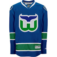
 It would be cruel of me to publish an entirely text-only post, so look at this. Somebody slapped a Whalers logo on the new Canucks unis. They forgot to write "HARTFORD" above it.
Anyway, I also wanted to let you guys know what I'm working on for the future of the blog. As you know, the primary focus of the site is the logo tournament. As of right now, nearly 225,000 votes have been cast. So I'd call it a success. A lot of you have emailed in asking what's next. The tournament ends on October 3 — opening night for the NHL. And as for the jersey news, they'll all be unveiled within the next few weeks.
Not to worry, though, NHLToL shall have life in October assuming you all want to keep coming back. Beginning on October 1, I'm going to start a month-long feature wherein I review all of the new Rbk EDGE uniforms. You'll be able to rate the uniforms and comment on the reviews.
On the tournament side, there will be plenty more where that came from. A new tournament is in the works. Beginning on September 17, you'll be able to vote on what the next one will determine. We can see who has the best vintage logo, secondary logo, even new uniform, or anything else you guys come up with. The new tournament will begin on Saturday, October 6.
I'm also working on a couple of spinoffs. We can do logo tournaments for the AHL, ECHL or any of the Canadian hockey leagues. That'll start some time later in the year at a new location. Expect to see the new Tournament of Hockey Logos coming soon. We'll have to get the word out to all our minor league friends.
I hope you'll all stay involved with the blog. I've really had a blast making it and I've been thrilled by the response. On the day the Canucks unveiled their uniforms, this site had a whopping 110,000 hits — the same day it crossed the one-million overall mark.
Anyway, keep reading and keep emailing me. I enjoy hearing the feedback and getting all your awesome concept jersey designs. Thanks so much for visiting!
So this week I'm running a series of crazy concept designs meant to freak you out a little bit. Let's get to it now.
I have to start with the colors we've all grown fond of this afternoon. Yes, you know the ones. But beware, you're about to see them on a jersey that will make you blink a few times and perhaps tap the side of your monitor. No need, though.
Being of generally slow wit, it took me a moment to realize that this Carolina Hurricanes jersey was being recolored based on the team it used to be. Yes, friends, the Hartford Whalers. But just look at that blue and green hurricane. Scary.
Somebody else had a similar idea. Look at that thing.
And then somebody with a twisted soul had an idea. Let's go all the way back to the New England Whalers... and kill Pucky... on a jersey... made by Reebok.
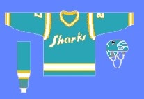
Yeah. And while we're on the topic of creatures of the deep, let's see what could've happened if certain fans had been asked to design the new uniforms and logo of the San Jose Sharks.
Huh? Wait, that one's actually kind of good. Dude, I like that logo. What is it doing here? Oh I remember. It's serving as a segue to this.
 I can hear the screaming all the way from here. But before you go all thinking this design is completely without merit, don't forget about our friendly California Seals. Yes, this design is based on that old '60s uniform.
Completely and utterly crazy if you ask me. And I know no one did, but I'm sharing my thoughts anyway.
Let's roll on, now. Because before I go, I need to show you this logo someone emailed me for the Dallas Stars. Yes, the Stars need a logo redesign, but is this really the answer?
There's only one way to find out. Comment now and come back tomorrow for Part 4.

