NHL Tournament of Logos

Entries in wild (53)

Thursday
Jul262007

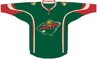
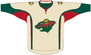
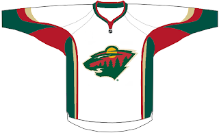
Some Wild Jersey Design Concepts

This is going to annoy those among you who are disturbed by the concepts being designed based solely on the look of the all-star game jerseys from this year. But, hey, it's out there and I feel like posting it for anyone who wants to see it. We've got a look here at some concept designs for the Minnesota Wild.


Take it as you will, knowing that in all likelihood, the actual Wild uniforms will not look anything like this. We don't have any official news from the team regarding an unveiling or announcement date, so stay tuned for that.

Thursday
Jul262007

Stars vs Wild


vs
STARS
WILD
5-4
10-0

The Aesthetics
These two logos seem to share a few colors. It makes the red in the Wild logo really stand out. But as far as who takes the point in this category, I think you already know who I'm going to pick. I really do think there are was of improving the Stars logo if you remove all the lettering from it. I like the star itself, though I admit it would look a little bare on its own. I've heard tale of a new Stars logo to be unveiled this summer. So we'll wait and see what happens.
Wild

The Nickname
What seems to keep working for the Stars is the fact that one is a giant ball of fire that you couldn't possibly imagine up close. Even the Wild would be consumed by its ferocity.
Stars

The Analysis
Now this one is harder for me, because it could almost go either way. The big "lone star" has Texas written all over it (I say that despite Dallas actually being written right there). The Wild logo continues to amaze me with all of its ingeniously combined elements. I wanted to give the Stars logo this point, but I can't in good conscience take it away from a logo this good. It's even got the "north star" as a tribute to Minnesota's hockey history. It was a close one, though.
Wild


WINNER
2-1


Wednesday
Jul252007

Wild vs Predators


vs
WILD
PREDATORS
9-0
7-4

The Aesthetics
These are two teams still working on their first decade in the NHL — though if certain billionaires have their way, the Preds won't make it beyond ten years. The most noticeable thing about these two logos is their similarities in shape. There are very distinct triangles make up the heads of some rather vicious animals. I think they are two of the league's best and that shows in the standings. Still, I think the Predators logo could use a little less minutia and final a real focus for the color scheme. The Wild logo already has all of that.
Wild

The Nickname
You might say a Predator is the king of the Wild, catching prey and dispatching of it.
Predators

The Analysis
By now, you already know the story of how the Predators got their name. Unfortunately, there's no sign of the city of Nashville in the logo, so it will be very easily transferred to Hamilton, er Kansas City, er... screw it. Anyway, I've also already talked in length about the greatness of the Wild logo in its ability to work in so much in such a small space.
Wild


WINNER
2-1


Wednesday
Jul182007

Red Wings vs Wild


vs
RED WINGS
WILD
3-6
8-0

The Aesthetics
I feel like the detail in the Red Wings logo is a little too heavy-handed and unnecessary. However, I don't see any upgrades coming for it in the near future. People in Detroit love their team and their traditional logo, in 80 years, we've yet to see even a secondary logo that veers from this design. Anyway, that forest scene in the Wild logo gets cooler every time I look at it.
Wild

The Nickname
There may be a bird in the wild with Red Wings, but the Wild is an unforgiving place with plenty of predators.
Wild

The Analysis
I've given this point to the Red Wings on many occasions for the wheel attached to the wing, signifying Detroit as the Motor City. But what better scene could you have to portray Minnesota? Plus the name itself gives you a clue as to the teams geographical location. I can't really think of how you could improve upon the Wild logo. Hence the sweep.
Wild


WINNER
3-0


Tuesday
Jul172007

Wild vs Flames


vs
WILD
FLAMES
7-0
8-0

The Aesthetics
This is going to be hard to watch. Two completely undefeated teams. And somebody has to lose. Here, though, you can't deny the beauty of the Wild logo. Great colors and a rather unique design.
Wild

The Nickname
The Wild cannot stand up to a wildfire. Flames can engulf a forest and leave nothing but ashes in its wake.
Flames

The Analysis
I'm convinced the Minnesota Wild logo is one of the most under-appreciated in the National Hockey League. How can you not admire it though? Not that it should take away from the Flames logo at all. I'm not sure how you could make it any better. I was one of the few, however, that liked the flaming horse logo from the third jersey. Still, that's not in competition here. So when comparing these two logos, the Wild has to win out.
Wild


WINNER
2-1


Monday
Jul162007

Wild vs Sharks


vs
WILD
SHARKS
6-0
4-4

The Aesthetics
I don't think it really even requires an explanation. The Wild logo just has so much to offer in such a small space. The Sharks logo has a broken hockey stick on which the tape doesn't even go around the stick.
Wild

The Nickname
You can make the case that Sharks live in the Wild. But its still dangerous for them.
Wild

The Analysis
I've talked before about how much the Wild logo manages to work in. The Sharks logo is all right but its not as fierce as it could be. And there's an awful lot of black used. It's a decent enough logo but perhaps it can get this point against another team.
Wild


WINNER
3-0


Thursday
Jul122007

Blackhawks vs Wild


vs
BLACKHAWKS
WILD
2-6
5-0

The Aesthetics
More times than I'd like to admit I've explained the problems inherent with the Blackhawks logo. And all the reasons I love the Wild logo. But all you really have to do is look at the two of them right next to each other to know who deserves this point. Creativity gets the Wild this point.
Wild

The Nickname
You're nuts if you don't think Chief Blackhawk knows his way around the Wild.
Blackhawks

The Analysis
What you see is what you get when it comes to these teams' names. The logos are appropriate symbols for the names but one clearly does it better than the other. Simplify the Indian head, already! You can do it, Chicago! I believe in you. Meanwhile, like I said yesterday, the Wild logo more than goes out of its way to fit in so many little bits that you can look at it a million times and see something new every time. That's what a logo really should be.
Wild


WINNER
2-1


Wednesday
Jul112007

Canucks vs Wild


vs
CANUCKS
WILD
3-4
4-0

The Aesthetics
This is a really difficult decision because I really like both of these logos. They're both attractive and use a unique color scheme. I also think its cool how they seem to be facing one another. Even though I'm a huge fan of the Canucks logo, the way the Wild logo works in a bear, a forest, a star, a river, mountains and a sunset all in one little graphic just floors me.
Wild

The Nickname
Right or wrong, we've been going on the idea that a Canuck is a woodsman of some sort. He therefore should be familiar with the Wild and know his way around.
Canucks

The Analysis
Even if the Canucks logo actually symbolized the team name — as opposed to being a whale — the Wild would still get this point. The star as the bear's eye conjures Minnesota's hockey history and the Minnesota North Stars. Subtlety works and I'm a big fan.
Wild


WINNER
2-1


Tuesday
Jul032007

Oilers vs Wild


vs
OILERS
WILD
1-7
3-0

The Aesthetics
This one so easy it's practically screaming in my ear. Need I really explain it?
Wild

The Nickname
What would an Oiler do if he found himself out in the Wild? Probably get eaten by a bear, I imagine.
Wild

The Analysis
When it comes to a logo that portrays a team name without actually being blunt about it, I think we all know who wins here too. The only thing missing from the Wild logo that you find in the wild of Minnesota are the lakes. But that would probably be difficult to work in. As for the Oilers, I've said it before. There's a shoulder patch and a third jersey crest that would make me much happier. Consider yourself swept, Oilers.
Wild


WINNER
3-0


Friday
Jun222007

Wild vs Kings


vs
WILD
KINGS
2-0
1-2

The Aesthetics
Don't let their record fool you, the Kings have a very strong logo. Unfortunately, it could use more color and a little less minute detail. So by a slight margin, the point here goes to the Wild.
Wild

The Nickname
The King may rule the land, but out in the Wild, he has no say. Bears would eat him.
Wild

The Analysis
If we look at the history of the Kings' logos, I'd say the best was the one just prior to this one. But this competition is about the current logo and ultimately it says "king" more than anything possibly could. It's a crown. The Wild by no means misses the mark in this category, though by the slightest of margins, they lose the point.
Kings


WINNER
2-1