NHL Tournament of Logos

Entries in wild (53)

Monday
Aug202007

Result: Wild vs Ducks

Minnesota
WILD

82% 6,986 votes

Anaheim
DUCKS

18% 1,584 votes

8,570 total votes

Minnesota Wild
Advancing to Quarterfinals to face Colorado Avalanche

Anaheim Ducks
Eliminated


Poll opening date
Aug 13 @ 4:38 AM
Poll closing date
Aug 20 @ 11:59 PM

07CHTRN | #W1A | MINvANA

Monday
Aug202007

Wild Uniforms Coming September 7

According to Michael Russo of Minneapolis' Star Tribune, the Minnesota Wild will likely unveil their new Rbk EDGE uniforms on Friday, September 7. I've added that date to the sidebar countdown.

You can read more here.

Big thanks to Paul for emailing in the link.

Monday
Aug132007

Poll: Wild vs Ducks


vs
Minnesota
WILD
Anaheim
DUCKS


Place your vote and then feel free to leave a comment as to how you came to your decision. Tell all your friends to drop in and vote! The more voices heard, the more accurate the results!

Poll opening date
Aug 13 @ 4:38 AM
Poll closing date
Aug 20 @ 11:59 PM

07CHTRN | #W1A | MINvANA

Friday
Aug102007

Wild, Lightning Fan Art

Like I said, it's a light day. Sorry about that. Things are going to get interesting this weekend though. I hope everybody drops in to start voting on Sunday. I need you all to decide which team has the best logo. Not me.

Here's a different sort of design for the Minnesota Wild.

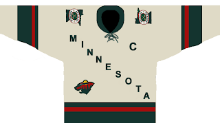
It sort of steals the whole text across the chest thing from the Avalanche — who stole it from the Rangers. I'm not sure how Wild fans will feel. Probably won't be "wild" about it. Get it? Okay, stop. That's enough. Kind of like the "State of Hockey" logo on the shoulder. Thoughts?

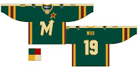
This design is a reimagining of this one I posted the other day. It's kind of funny. Not to worry though. Don't expect anything like this to ever seen the light of day.

But wait, I have more. I was sent a few designs for the Tampa Bay Lightning. See the following image.

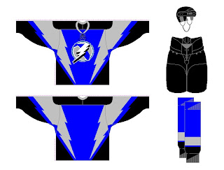
That blue might not be quite the right shade, but I've often wondered what the Bolts would look like in blue. The infamous third jerseys from the late '90s were mostly blue and I sort of liked those. As for the laced collar, I'm not sure that would work well for the Lightning.

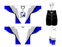
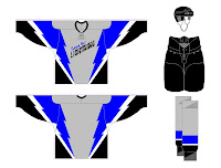
There were also these two designs. A lot of people have commented that a gray third might be the way to go for the Bolts. I'm not so sure, but I guess it would depend on the overall design so I don't really know how I'd feel about it.

How do you all feel about these designs? You think something along these lines would be the way to go for these teams or should we let it be handled another way?

Wednesday
Aug082007

Advancing A Minnesota Concept

Last Friday I posted a concept design for the Minnesota Wild that featured a new secondary logo. It featured a cool lake scene inside the outline of the state of Minnesota. If you read any of the comments, you know it was a big hit.

So apparently, that designer took another step with that design and created these.

It's pretty sharp though I still prefer the bear head design to the state design for the primary logo.

Then, how about that alternate jersey at the bottom? Any old North Stars fans out there feeling nostalgic? What do you think of that concept?

Friday
Aug032007

More Thoughts On The Wild

After I posted a Minnesota Wild uniform design yesterday, a reader pointed out another bit of fan artwork that made use of a really cool take on a secondary logo for the club.

If you ask me, that shoulder patch is seriously awesome! Like the Coyotes, I always thought the Wild would be a good team to use the outline of their home state in a secondary mark. This is just one example of how well that can work. This design is of major professional caliber if you ask me. I'd be surprised to discover it wasn't a pro behind it.

Anyway, I wanted to make sure this got posted today because I thought it was very interesting. Wild fans, I'm curious to know what you guys think of this concept. Could you see your team wearing these uniforms or are you happy with what they've got?

Thursday
Aug022007

A Wild Design!

Check this out, Minnesota Wild fans. Some among you seem to think your team can break from the pack and wear something other than white at home. Outrageous! Seriously, though. Check out this fan-created concept.

We have heard that the Wild will be converting their red third jersey to their permanent home jersey, dropping the greens altogether. But this design suggests using the wheat color on the road jerseys. A radical concept to be sure, I think it would be great! All that white... it blends into the ice, you know?

Actually, I like both of these designs a lot. I think they would be among the best in the entire league if the Wild go with something in this neighborhood. But I want to know what Wild fans think. Do you prefer the red or green at home? And would you like white or wheat for the road sweaters?

Sunday
Jul292007

Wild vs Coyotes


vs
WILD
COYOTES
11-2
5-4

The Aesthetics
Well this is it for the Wild — last match of the tournament. They're going to be the first ones finished. And for that, we're going to milk this forest scene for all its worth. If you don't see how cool it is, then I'm convinced you're blind. That coyote just looks awkward to me. But then again I didn't hate the original Coyotes logo from the late '90s.
Wild

The Nickname
The Coyotes live in the Wild, true. But so do bears.
Wild

The Analysis
I've said it all before about the Wild logo. I'm not sure what else I can add. It's really a great team icon. But just one more time for posterity: Inside the outline of a bear's head you've got a beautiful forest scene featuring trees, mountains, a river, a sunset and — wait for it — the north star in a fitting tribute to the history of The State of Hockey. Anything I missed? I think the Coyotes logo is designed well but it doesn't have nearly the depth of the Wild. And that's that for the Wild in this tournament.
Wild


WINNER
3-0


Saturday
Jul282007

Wild vs Blue Jackets


vs
WILD
BLUE JACKETS
11-1
7-1

The Aesthetics
These are the league's two youngest teams, part of the most recent expansion. As far as aesthetics, this is one of the most difficult matches to judge. This incarnation of the Blue Jackets is simply the best ever devised. At the same time The Wild logo is pretty awesome. Some may not necessarily agree, but they really have to want it to see it. I don't know who to choose. I'm tempted to flip a coin. But since I can't do that, I'm going with the Blue Jackets for reasons unknown.
Blue Jackets

The Nickname
A Blue Jacket should know his way around the Wild, but if he were to face a bear, I don't know that he could necessarily hold his own.
Wild

The Analysis
A clever forest scene of Minnesota versus an Ohio flag wrapped around a silver star. How do you decide? Somebody really knew what they were doing when they designed these. However, while the Wild logo could befit any forest-laden locale, the Blue Jackets logo is very specific to Ohio. My love for the Wild logo will have to be overtaken. I'm sorry to say.
Blue Jackets


WINNER
2-1


Friday
Jul272007

Wild vs Avalanche


vs
WILD
AVALANCHE
11-0
9-1

The Aesthetics
I've been dreading this match. How do you decide between two of the league's best logos? And while not everyone will agree with me, for now I'm the one having to decide. I'm going to go with the Avalanche logo but I can't really explain why. Just accept it.
Avalanche

The Nickname
If we assume the Wild is a forest and all the life that's part of it, then an Avalanche has the upper hand. The falling snow would completely take out everything.
Avalanche

The Analysis
This is where the Wild can truly earn a point. It's impossible to look at that logo and not see something different every time. You've got so many different things going on that it makes for a logo that's always interesting to look at — not to say that the Avalanche logo doesn't, but you can't expect to sweep a logo that looks that cool.
Wild


WINNER
2-1