NHL Tournament of Logos

Entries in wild (53)

Tuesday
Sep252007

Rbk EDGE Review: Wild

Part 2 of 30. All 30 NHL clubs have unveiled new jerseys under the new Rbk EDGE Uniform System for the 2007-08 season. Here at the NHLToL, we're going to review every one of them. Read up and then rate the new sweaters. We'll do a full ranking after completing all of the reviews.

Rbk EDGE Uniform System

Minnesota Wild


New Uniforms

Old Uniforms

The Unveiling
Friday, September 7. The Wild unveiled their new uniforms via their web site.

Home vs. Road
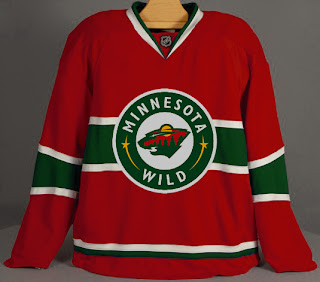
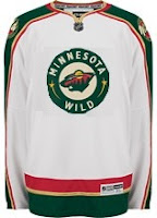
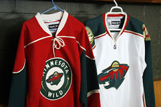
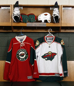
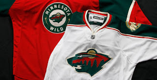
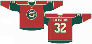
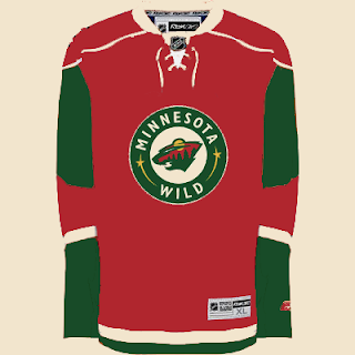
Home: Red. Road: White. The sweaters feature different crests and completely different designs. The standard primary logo serves as the crest on the white sweater while last year's third jersey crest is seen on the red jersey.

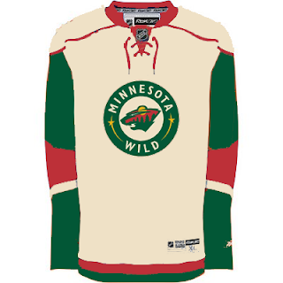
The red home jerseys feature thin, wheat-colored piping around the shoulders. The upper-arms are green extending to the shoulder at the top and bordered by a wheat stripe beneath. The collar is wheat and laced at the front. There are no stripes at the waist.

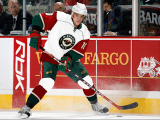
The white road jerseys feature a thick green stripe along the tops of the sleeves, outlined in wheat and red stripes. The secondary logo is on the shoulders. Thick red and green stripes go around the waist, padded by a thin what stripe. The collar is double-striped with wheat on the inside and red on the outside.

In The Details
The shoulder patches featuring the secondary logo are found on both shoulders of the road sweater while the shoulders of the home sweater are blank.

New & Old
The major change is that last year's green jersey is gone. While it may return in the future as an alternate, last year's third jersey design paved the way for this year's new home sweater — right down to the same crest with the bear head logo inside a circle with the team name and two stars within it. The white sweater, however, remains largely the same, adapted to the new Rbk EDGE cut.

Standard FAQ
Numbers on the front? No.
Laces at the collar? Yes, only on the home jersey.

NHLToL Editorial by Chris
The order of these reviews is random but like the Bruins, this is another uniform I really love. When the Wild first introduced their third jersey, I was an instant fan. I thought, if every team looked that good, the NHL would really be on to something. But then we all know that story, don't we. I like this combination, though. It retains an old-fashioned feel at home with a unique, updated look on the road. However, I don't care much for the collar on the white jersey or the shoulder patches — elements which prevent me from giving the uniform a perfect score. 4/5


Buy your new Wild jersey!

Sunday
Sep162007

Thinking About Minnesota

We're waiting for the Edmonton Oilers to show of their new uniforms today, the least I can do is offer up some Minnesota Wild concept art. Let's get right to it.

I don't think this design is trying to prove anything. Probably just a bored artist having a little fun. For those who didn't recognize it initially, that's the new Rbk EDGE home sweater for the Montreal Canadiens. The colors and crest have been changed. It's not bad, but I definitely think the Wild went with the right look.

With this concept, the designer was just trying to see what the crest on the home sweater would look like on the road. Once again, I think the Wild got it right by using the large bear head logo over this circular one.

Quite honestly, I really like the Wild's logo and uniform design. Some folks have lodged Christmas-related complaints with regard to the color combination, but I find fault with that. I think the wheat color

But let's mix it up a little. What if the Wild just recolored the home pattern white and called that the road jersey. Might it look a little something like this?

It just might. Anyway I've also got some concept logos that were sent to me by John.

This redesign morphed the bear head into an "M," keeping the major elements from the original. I'm a huge fan of the bear head, but this is not a terrible idea.

This logo is simply the Minnesota North Stars logo in the colors of the Wild. Personally, I think it was best like it was. But this does make me laugh.

So while we wait on the Oil, I might even have another concepts post at some point today. Hope you've enjoyed what you've seen here.

By the way, get ready as tomorrow I plan to open a poll where you all will get to decide on the subject of the next logo tournament.

Monday
Sep102007

Looking Ahead: Third Jersey Concepts

As we all know, the NHL is abandoning the third jersey program for this season. However, there are many indications that it will make a comeback as early as the 2008-09 season. Having said that, some people are getting a jump on things. Here I have a few alternate jersey concepts to share.

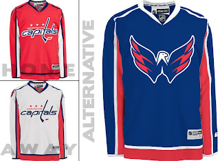
We'll start with the Washington Capitals. While the return to red, white and blue has grown on me, the wordmark logo has not. However, they've got a great shoulder logo that could use a little more mileage.

I especially like the idea of a blue jersey. Moreso than the red. Kudos to the designer on this one.

Keeping it in the Southeast Division, I've also been sent some Tampa Bay Lightning art.

Speaking as a Lightning fan, I do like the idea of a blue alternate jersey, but the logo needs the circle. What do you guys think of that? I think it looks even plainer without it.

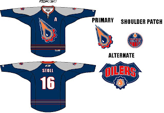
Moving on to the Northwest, check out this rather colorful Edmonton Oilers rendering.

I like the gear logo better in silver. But that's just me. Let's finish up with a look at some Minnesota Wild concepts.

I remember back in 2000 when the Wild first unveiled their logo — the crest you see on these jerseys — and I was horribly afraid the jerseys might look like this. (I was thrilled by the bear head logo.) However, I kind of like the green as an alternate for some time in the future. Might be a little much though. Thoughts?

Friday
Sep072007

Wild Unveil New Uniforms!

The Minnesota Wild have unveiled their new uniforms via their web site, today. Look at them here.

Same as we expected. No big changes. The old alternate is now the new home sweater. I also like the fact that they didn't use the circle logo on the road jersey. The bear head is awesome.

This is another shot of the jerseys hanging in the locker room.

You can see the detail of the jerseys a little better in this photo. Sorry they're so small, but the Wild have yet to post a photo gallery like most of the other teams have done. If I see better quality pictures elsewhere, I'll be sure to post them for you. In the meantime, any thoughts on these new sweaters?

Monday
Sep032007

Result: Avalanche vs Wild

Colorado
AVALANCHE

52% 8,078 votes

Minnesota
WILD

48% 7,441 votes

15,519 total votes

Colorado Avalanche
Advancing to Quarterfinals to face Blackhawks or Oilers

Minnesota Wild
Eliminated


Poll opening date
Aug 27 @ 4:22 AM
Poll closing date
Sep 3 @ 11:59 PM

07CHTRN | #W2A | COLvMIN

Friday
Aug312007

Wild Leak Jersey To Season Ticket Holders; Season Ticket Holders Leak Jersey To Us

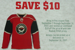
Minnesota Wild season ticket holders were treated to a photo of the brand new home Rbk EDGE uniforms when they received their ticket books. The image was featured on a coupon for the new sweater. Look!

Pretty much what we've expected. Basically the third jersey from last year. One would expect them to use this same template for the road whites. We'll find out when the Wild will officially unveil both uniforms a week from today.

Thanks to all of you who emailed in images, by the way. You're the reason this blog is so successful!

Thursday
Aug302007

Just To Freak You Out, Part 4 of 5

My week-long series meant to freak you out a little continues today. If you thought the last three days were something, just wait until you see what I have for you today.

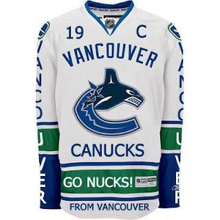
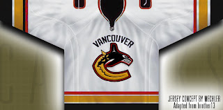
Canucks fans, a lot of you were unhappy with the new uniforms unveiled yesterday. But just remember. It could've been so much worse.

Told you. And what if they hadn't gone so far back to find vintage colors? What if they stopped in the '80s?

That's what.

Oh and I had to share this one. The Canucks seem to be all about mixing and matching. So here's what might've happened if they'd gone with this idea back in 1997 instead of the orca. A little scary but not horrible.

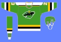
If you want to see horrible, imagine the Minnesota Wild in North Stars colors.

Try not to gouge your eyes out. It doesn't get any bigger for a reason. Quite frankly, I think the Wild have excellent colors. If you're among those who only see Christmas colors, I challenge you to find beige and yellow among the more common decorations. But that's neither here nor there.

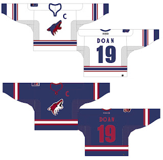
Moving right along. While we're on the topic of throwback colors, what if the Phoenix Coyotes had gone with Jets colors?

It's a rather frightening thought. You don't know what bad is until you see and red and blue howling coyote.

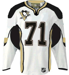
But I've saved the best for last, dear friends. My pals over at ThePensBlog.com came up with a good bit of satire that pokes some friendly jabs at the Reebok folks.

You may not realize at first glance, but that's the front of the jersey, not the back. I love the giant NHL logo at the bottom. If you want to see the number, there's the damn number. Crest be damned! But don't riot yet. You haven't seen the worst part.

Now you can riot.

Have a nice night. I'll be back tomorrow.

Monday
Aug272007

Poll: Avalanche vs Wild


vs
Colorado
AVALANCHE
Minnesota
WILD


Place your vote and then feel free to leave a comment as to how you came to your decision. Tell all your friends to drop in and vote! The more voices heard, the more accurate the results!

Poll opening date
Aug 27 @ 4:22 AM
Poll closing date
Sep 3 @ 11:59 PM

07CHTRN | #W2A | COLvMIN

Friday
Aug242007

Musing On Minnesota

With the Minnesota Wild releasing a teaser photo yesterday and the official unveiling date of their new Rbk EDGE uniforms, it's gotten the wheels turning within the graphically-inclined among you.

A widely held belief based on that image is that the Wild jerseys will closely resemble those unveiled by the New York Islanders recently. Here's the image I'm speaking of.

Colors aside, the basic design seems to match the Isles so far as we can see. Here's what one fan came up with.

I can't really lodge a complaint over that. I've always like the Wild's jerseys — green, white or red. These would be especially nice though. For another look, a reader recolored an Isles jersey for us.

Also pretty cool if you ask me. Now I'm asking you — Wild fans, especially. Are these the way to go? Would they make the Wild one of the NHL's best-dressed teams? Or do they leave you more or less indifferent?

UPDATE (4:10 PM): Our friend Lucas who came up with the concept based off of the Islanders new Rbk EDGE jersey, sent in a road version of the jersey. See what you think.

Thursday
Aug232007

Wild Make Unveiling Date Official

All right, I know I promised to be all about Canada today, but official news beckons.

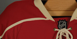
The Minnesota Wild have stated on their web site that their new Rbk EDGE uniforms will be publicly unveiled on September 7 — a date I first posted on Monday. They even released a teaser image of the new uniform. As expected, it's red, complete with a lace-up collar and everything.

They also have a countdown graphic on the right side of the page to when the jersey will be available for purchase. Think I have a case to sue them for stealing my idea? (No, I'm totally kidding.)

Anyway, there it is. Wild fans? Cause for pause? Or will this jersey kick all the other jerseys' asses?