NHL Tournament of Logos

Thursday
Oct182007

Rbk EDGE Review: Canucks

Part 25 of 30. All 30 NHL clubs have unveiled new jerseys under the new Rbk EDGE Uniform System for the 2007-08 season. Here at the NHLToL, we're going to review every one of them. Read up and then rate the new sweaters. We'll do a full ranking after completing all of the reviews.

Rbk EDGE Uniform System

Vancouver Canucks


New Uniforms

Old Uniforms

The Unveiling
Wednesday, August 29. The Canucks unveiled their jerseys to fans at GM Place in Vancouver.

Home vs. Road
Home: Blue. Road: White. The two sweaters are essentially mirror images of each other and both feature a secondary logo patches on both shoulders.

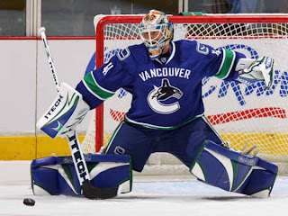
The blue home jerseys feature white-green-white stripes around the elbows and waist. The collar is white with blue trim on the inside. White text spelling out "VANCOUVER" is arched above the primary logo which serves as the crest.

The white road jerseys feature spaced blue-green-blue stripes around the elbows and waist. The blue on the sleeve beneath the green stripe extends all the way down the cuff. The collar is white with blue trim on the inside. Blue text spelling out "VANCOUVER" is arched above the primary logo which serves as the crest.

In The Details
The primary logo's coloring is slightly altered between the two jerseys. On the blue, the ice beneath the whale is white, while it's blue on the white jersey. The dark blue seen in the logo is featured nowhere else on the jersey itself. The stick-in-rink secondary logo featured on the shoulders is a modernized version of the classic crest worn in the 1970s. A new numbering and lettering style has been introduced.

New & Old
The most significant difference is the return to the team's traditional colors of green and blue along with the addition of the city name to the front of the sweater. The striping pattern is also completely different. The Canucks were going for a revamped look for this season and they achieved their goal.

Standard FAQ
Numbers on the front? No.
Laces at the collar? No.

NHLToL Editorial by Chris
All right, I'll come right out and say it. The Canucks hit it right on the mark with these sweaters. I hardly have a single complaint to lodge against them — realizing I'm in the minority by saying so. The colors are brilliant! The logos are improved. And they look great on the ice. While it's not my favorite element of the jersey, I'm not totally opposed to the wordmark above the crest, either. So it's not perfect, but it certainly has its redeeming qualities. I cannot get over the colors. Best color combination in the NHL if you ask me. (Well, second-best to the Lightning, really.) Color me impressed. 5/5


Buy your new Canucks jersey!

Thursday
Oct182007

Kids, Design An AHL Jersey!

I know this site is meant to be about the NHL, but this is really cool for any kids interested in jersey designs. It's a cross-post from ToHL.

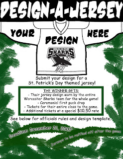
Here's a cool contest that a reader pointed out to me. The Worcester Sharks are now accepting submissions from kids ages 14 and under to design a St. Patrick's Day-themed jersey that will actually be worn in a game! It sounds like a fun little gimmick.

Here's a direct link to the Sharks' official site where you can get the full scoop on what's going on. Now's your chance to design a jersey that could actually be worn on AHL ice!

So basically, if you or someone you know is of the proper age group, get a design put together and submit it to the Sharks. And, being a reader of this blog, you might also want to send a copy to me as well as I can post it right here for everyone to see. I'm really interested in seeing what the kids come up with. Email me at nhllogos@gmail.com.

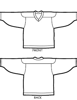
Here's the template the team is offering.

If you win, your design will be worn by the Sharks on March 16, 2008 in their game against the Hartford Wolf Pack. You also get free tickets for your entire class for that game. And you'll take part in a ceremonial puck drop at the beginning of the game. All of the jerseys will be auctioned off after the game to benefit Sharks Charities.

The deadline is December 21!

Good luck!

Thursday
Oct182007

Some Simple Fixes

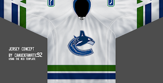
Here's the post I was trying unsuccessfully to bring you yesterday. In going through all the concept art you folks have sent, I've found some interesting stuff. These are some simple ways of fixing the Canucks' and Maple Leafs' jerseys — both of which have been met with distaste from fans.

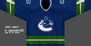
For the Vancouver Canucks, the biggest complaint seems to be the city name above the crest. This concept suggests removing that and simply reverting to the striping pattern of the old days — just with the new logos. I can't say I hate it. Though I figure myself as an oddball in all of this as I really like Vancouver's new sweaters.

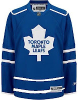
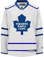
One new sweater set that struck me as a little too plain is that of the Toronto Maple Leafs. The lack of striping leaves us wanting more, I think.

This simple concept suggest striping at the waist and piping around the shoulders. While the shoulder piping has not impressed me much, I think it can work a jersey where not much is going on — perfect example.

I'd be curious to see what it would look like on the ice, but that curiosity will never be satisfied. In the meantime, we can only ponder what might have been and keep shouting our suggestions into the wind. Anyway, concepts are fun. What do you guys think of these?

Thursday
Oct182007

Poll: Capitals vs Maple Leafs


vs
Washington
CAPITALS
Toronto
MAPLE LEAFS


Place your vote and then feel free to leave a comment as to how you came to your decision. Tell all your friends to drop in and vote! The more voices heard, the more accurate the results!

Poll opening date
Thu Oct 18 @ 4:26 AM
Poll closing date
Mon Oct 22 @ 11:59 PM

07VNTRN | #2D | WSH74vTOR38

Wednesday
Oct172007

Result: Maple Leafs vs Scouts

Toronto
MAPLE LEAFS

67% 1,522 votes

Kansas City
SCOUTS

33% 748 votes

2,270 total votes

Toronto Maple Leafs
Advancing to face Washington Capitals

Kansas City Scouts
Eliminated


Poll opening date
Sat Oct 13 @ 7:17 AM
Poll closing date
Wed Oct 17 @ 11:59 PM

07VNTRN | #1H | TOR38vKCS

Wednesday
Oct172007

Rbk EDGE Review: Penguins

Part 24 of 30. All 30 NHL clubs have unveiled new jerseys under the new Rbk EDGE Uniform System for the 2007-08 season. Here at the NHLToL, we're going to review every one of them. Read up and then rate the new sweaters. We'll do a full ranking after completing all of the reviews.

Rbk EDGE Uniform System

Pittsburgh Penguins


New Uniforms

Old Uniforms

The Unveiling
Wednesday, September 5. The Penguins unveiled their jerseys to fans at the Galleria at Pittsbrugh Mills. Several players, including Maxime Talbot, were on hand to model the new uniforms.

Home vs. Road
Home: Black. Road: White. The two sweaters are essentially mirror images of each other and both feature a specialty patch on the right shoulder.

The black home jerseys have a gold panel on the elbows. The underside of the sleeves are white extending the length. There is gold side paneling toward the back of the sweater. The collar is black and primary logo serves as the crest.

The white road jerseys have a gold panel on the elbows. The underside of the sleeves are black extending the length. There is gold side paneling toward the back of the sweater. The collar is black and primary logo serves as the crest.

In The Details
The patch on the right shoulder reads "Pittsburgh 250" in honor of the city's 250th anniversary. It will only be worn this season. The numbering and lettering style has been retained.

New & Old
The striping on the new jerseys has been altered significantly. The slanted stripes at the corners of the sweater are gone as well as the stripes on the sleeves. They've been replaced with unique sleeve paneling which meshes with fabric paneling of the sweater itself. Most notably, however, is the elimination of the secondary logo from the shoulders.

Standard FAQ
Numbers on the front? No.
Laces at the collar? No.

NHLToL Editorial by Chris
These are very plain jerseys. I think the Penguins had it right on the money before, but it would seem this is a case where Reebok missed the mark. I'm not saying there was a lot going on with the old jerseys but the design was very appropriate, especially to the logo. That's not really the case anymore. In fact, the striping pattern is almost identical to what the Senators are wearing (more on that later). That being said, it's still a very nice jersey. It doesn't knock my socks off, but it's a solid effort that shouldn't be tossed aside. 3/5


Buy your new Penguins jersey!

Wednesday
Oct172007

Concepts On The Way

Sorry guys, I was trying to get you a concept art post today, but Blogger doesn't seem to want to cooperate with image uploading at the moment. As soon as they get that little problem fixed, I'll be able to bring you today's concepts — and they're pretty good ones, too.

In the meantime, if you haven't done so yet, go vote on the best vintage NHL logo or the best primary AHL logo. You could even go rate the new Rbk EDGE uniforms and read the reviews.

Anyway, I'm hoping to have a post up before I call it a night. Thanks for your patience!

Wednesday
Oct172007

Poll: Jets vs Rockies


vs
Winnipeg
JETS
Colorado
ROCKIES


Place your vote and then feel free to leave a comment as to how you came to your decision. Tell all your friends to drop in and vote! The more voices heard, the more accurate the results!

Poll opening date
Wed Oct 17 @ 4:34 AM
Poll closing date
Sun Oct 21 @ 11:59 PM

07VNTRN | #2C | WPG79vCOR

Tuesday
Oct162007

Result: Rockies vs Penguins

Colorado
ROCKIES

55% 1,204 votes

Pittsburgh
PENGUINS

45% 966 votes

2,170 total votes

Colorado Rockies
Advancing to face Winnipeg Jets

Pittsburgh Penguins
Eliminated


Poll opening date
Fri Oct 12 @ 4:24 AM
Poll closing date
Tue Oct 16 @ 11:59 PM

07VNTRN | #1G | CORvPIT67

Tuesday
Oct162007

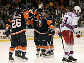
Rbk EDGE Review: Islanders

Part 23 of 30. All 30 NHL clubs have unveiled new jerseys under the new Rbk EDGE Uniform System for the 2007-08 season. Here at the NHLToL, we're going to review every one of them. Read up and then rate the new sweaters. We'll do a full ranking after completing all of the reviews.

Rbk EDGE Uniform System

New York Islanders


New Uniforms

Old Uniforms

The Unveiling
Thursday, August 16. The Islanders unveiled their jerseys via their official web site.

Home vs. Road
Home: Blue. Road: White. The two sweaters are essentially mirror images of each other and both feature a specialty patch on the right shoulder.

The blue home jerseys feature orange sleeves with a thick blue stripe around the elbows and a thinner white stripe beneath it. White piping wraps around the shoulders and a white-orange stripe wraps around the waist. The collar and laces are orange and the primary logo serves as the crest.

The white road jerseys feature orange sleeves with a thick blue stripe around the elbows and a thinner white stripe beneath it. Blue piping wraps around the shoulders and a blue-orange stripe wraps around the waist. The collar and laces are blue and the primary logo serves as the crest.

In The Details
The patch on the right shoulder features four stripes signify each of the Stanley Cup championship the Islanders have won. The numbering and lettering style have been slightly altered.

New & Old
The biggest difference between the new and old jerseys is the sleeve design as well as the numbers on the front.

Standard FAQ
Numbers on the front? Yes.
Laces at the collar? Yes.

NHLToL Editorial by Chris
It's interesting to me the number of teams whose new jerseys have been improvements as much as not. For me, the Islanders are running on the negative side. The shoulder piping, by and large, is not a big plus on this uniform, as was the case with the Hurricanes. It seems like if teams are going to do that, they need to recolor the shoulder yoke at the same time. Furthermore, the redesigned sleeves are are also not working and the addition of the number on the front only adds to the busy look of the jersey. It's not horrible, as it has managed to retain some of the elements of the great old jerseys, but it could certainly use some more work. 2/5


Buy your new Islanders jersey!